Selected work

01 / Agritech / Product Leadership

Would you put your money into a farm you’ve never seen?

UI/UX Designer; Head, Digital Marketing & Design; Head of Products and Program Management · Apr 2017 — Oct 2020

From Farmcrowdy's first design hire to product leader: rebuilt how Nigerians sponsored farms, took first-time mobile conversion from 18% to 60%, and helped the wider business scale.

18% → 60%
Mobile sponsorship conversion
$1.86M → $9.14M
Tracked sponsorship volume
Read the case study →
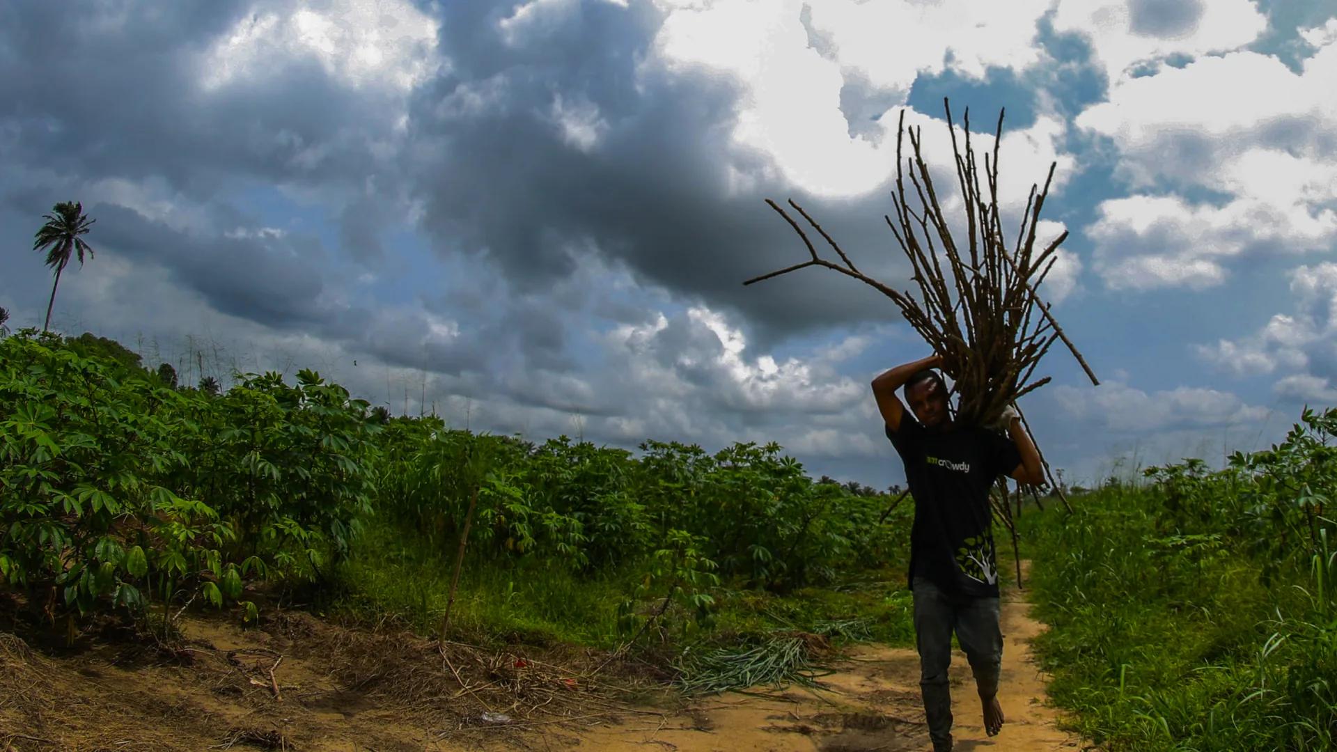
A Farmcrowdy-branded farmer carrying firewood along a farm path between rows of cassava, under a stormy sky.
Farmcrowdy connected urban sponsors to smallholder farmers across Nigeria's livestock and crop value chains.
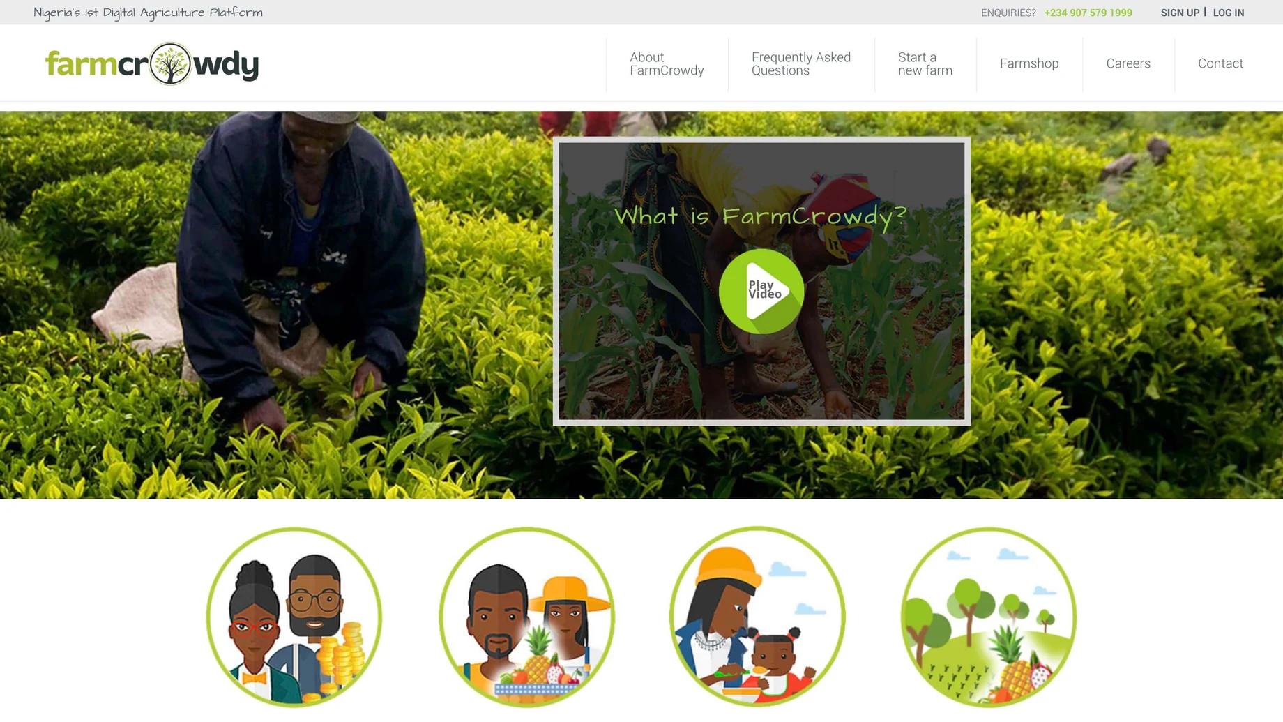
Archived earlier Farmcrowdy homepage design
Earlier public site
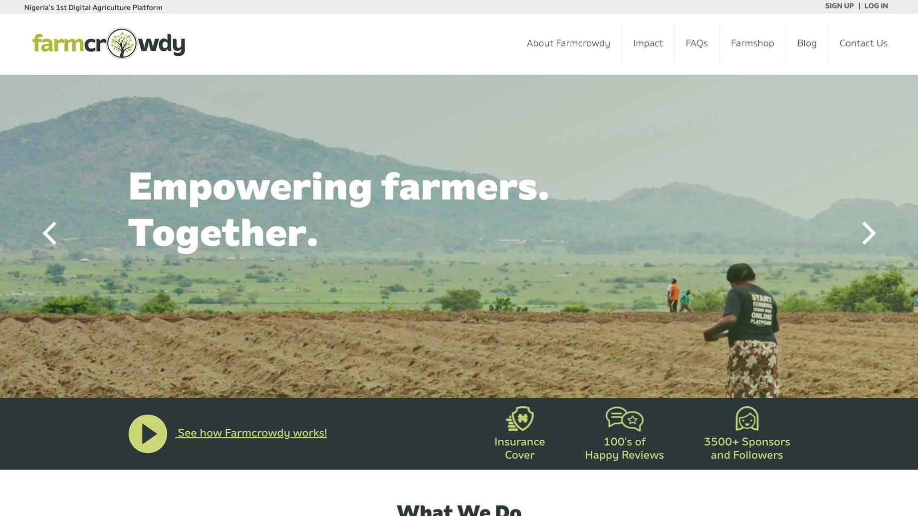
Archived redesigned Farmcrowdy homepage
Redesigned site

02 / Open source / Cultural design systems

When the icon set has six clouds and no danfo.

Creator & Designer · 2024 — Present

Thirty released SVG icons and 54 African country maps, built as an MIT-licensed 24-pixel system for real product interfaces.

30
30 released SVG icons
54
54 African country maps
Read the case study →
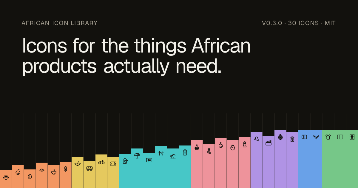
African Icon Library V2 official release art showing the current SVG visual language
Line icon of a danfo minibus, drawn side-on with its windows, wheels and roof rack in a single consistent stroke weight.
Danfo bus
Line icon of a talking drum, showing the hourglass body and the tension cords running along its length.
Talking drum

03 / AI-assisted design / build tools

Branch: what should a design tool know before it draws?

Product designer and builder · 2026 - present

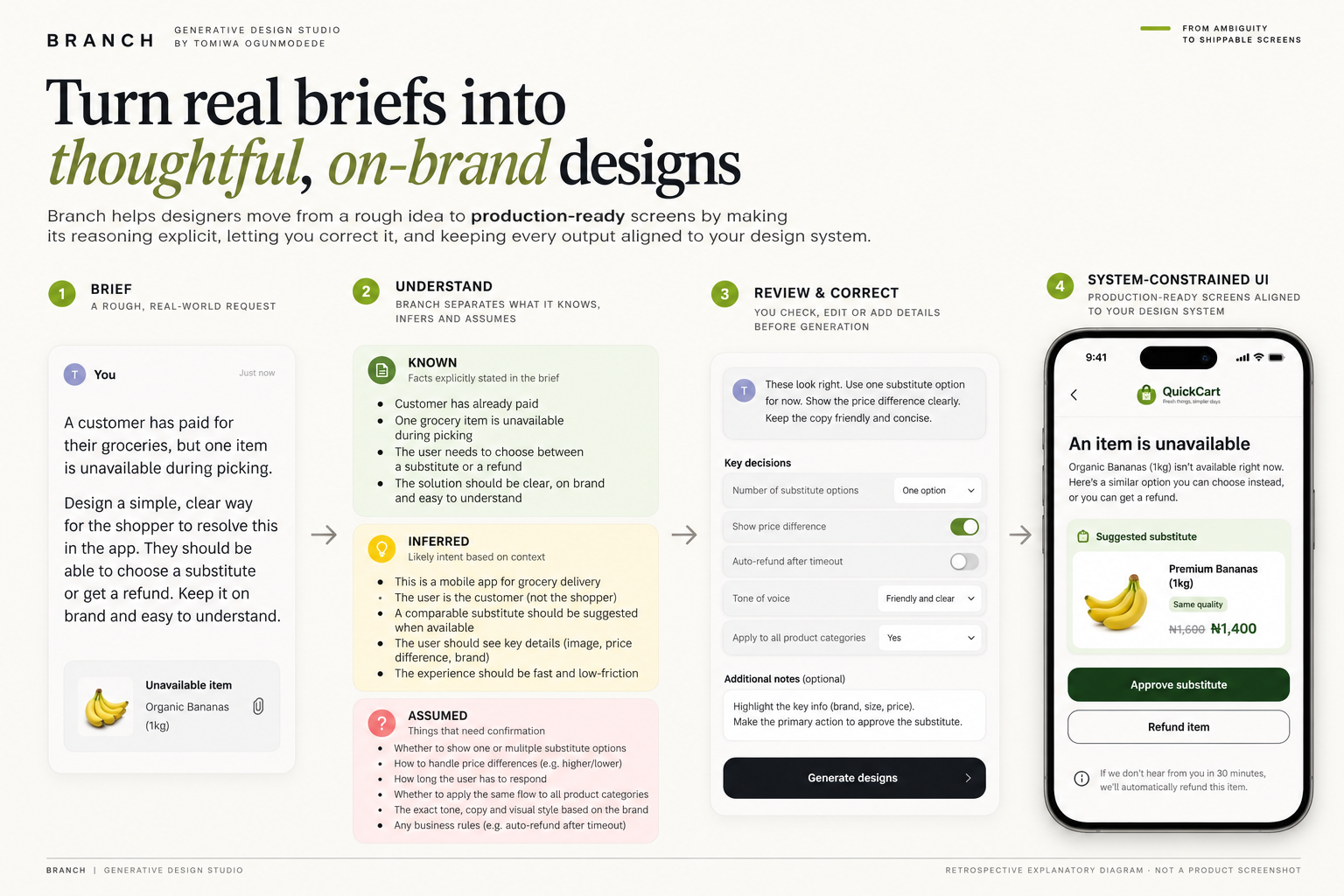
A generative design companion that exposes what a brief says, what the model infers and what it assumes before drawing an on-system first-pass flow.

Read the case study →
Retrospective illustrative diagram: a Branch brief is classified as known, inferred or assumed before correction and example interface generation; not a live screenshot.
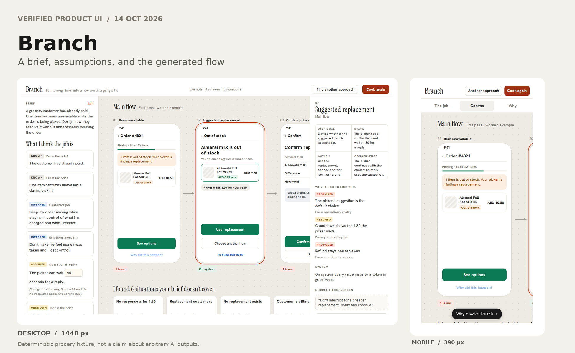
Actual Branch example main flow at desktop and mobile widths, with known and inferred user requirements visible
Live public grocery example after Cook first pass, captured at 1440px and 390px by Playwright. Real deterministic fixture screens, not imaginary mobile mockups or evidence of third-party adoption.

04 / Design engineering / tooling

Figma Bridge: why is moving a layout still so much work?

Product designer and builder · 2026 - present

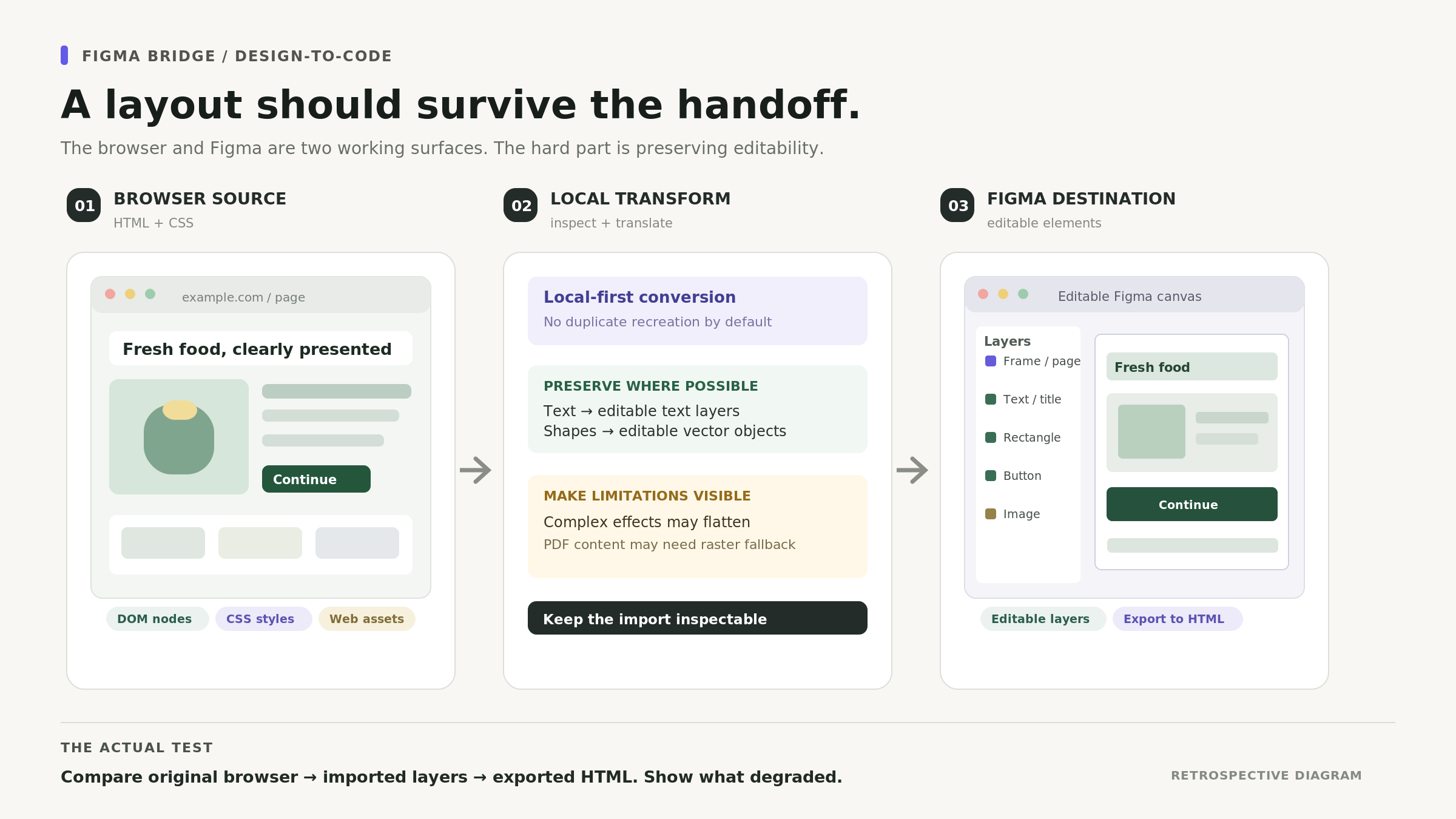
A local-first conversion tool that moves browser designs into editable Figma layers and exports supported work back to HTML, with explicit fallback cases.

Read the case study →
Figma Bridge retrospective diagram: HTML and CSS pass through a local conversion step into editable Figma layers, with limitations and raster fallbacks identified.
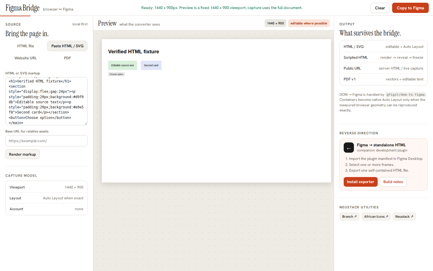
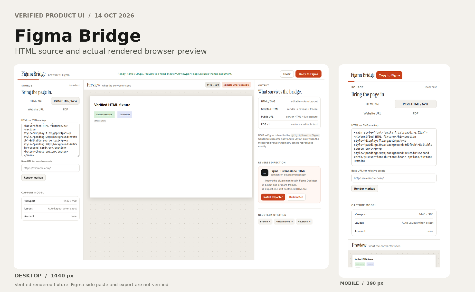
Real Figma Bridge production application with HTML source and corresponding rendered preview
Actual browser acceptance fixture, 14 Oct 2026. The source and preview are genuine. Figma clipboard paste and native editable layers remain outside this capture.
Figma Bridge source and preview captured in production at desktop and mobile widths
Real HTML fixture and preview at 1440px and 390px, 14 October 2026. No claim of confirmed editability after pasting into Figma, or round-trip export.

05 / Brand identity / Food & delivery

Hungry Lion

Brand identity design — Neustack Design Studio · 2026

A food brand rebuilt across mascot, packaging, delivery and digital ordering, with rules for formats from a street-facing bike to a phone screen.

Read the case study →
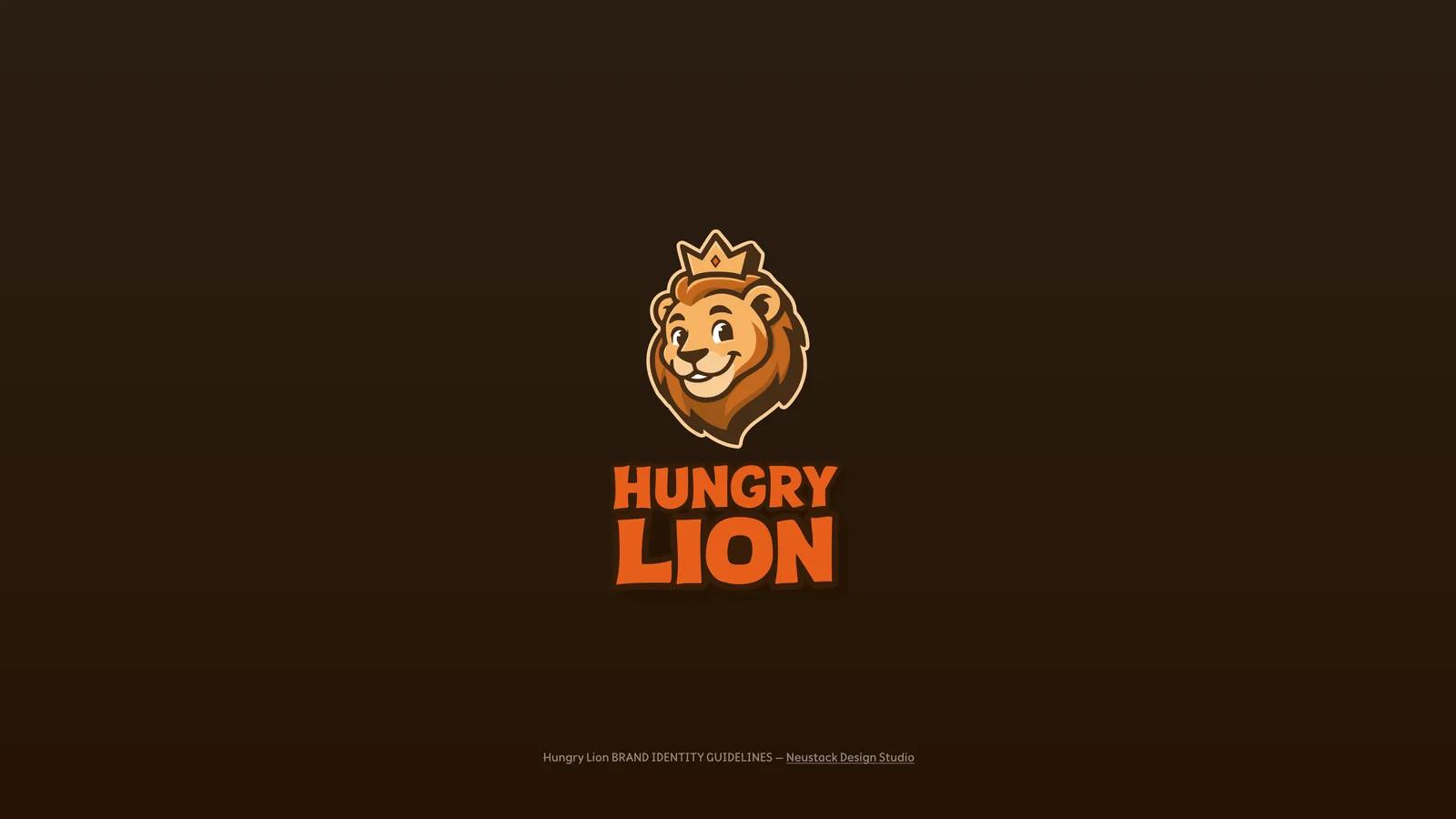
The Hungry Lion mascot — a crowned lion head — above the Hungry Lion wordmark in orange on dark brown.
The rebuilt Hungry Lion mark: a crowned mascot and a heavy display wordmark.
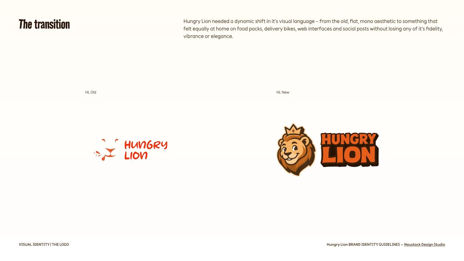
Side-by-side comparison of the old flat Hungry Lion logo and the redrawn mascot and wordmark.
The transition: the old flat, mono mark beside the redrawn identity. Reproduced from the delivered brand book.
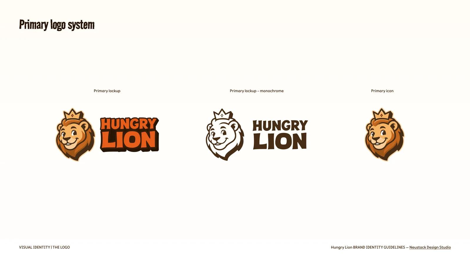
Primary Hungry Lion logo system: full-colour lockup, monochrome lockup and standalone mascot icon.
The primary lockup, its monochrome counterpart and the standalone icon.

06 / Brand identity / Vocational education

Kalvia

Brand identity design · 2026

A visual identity for skilled-work training, with a scalable seal, trade-coded colour system and campaign applications.

Read the case study →
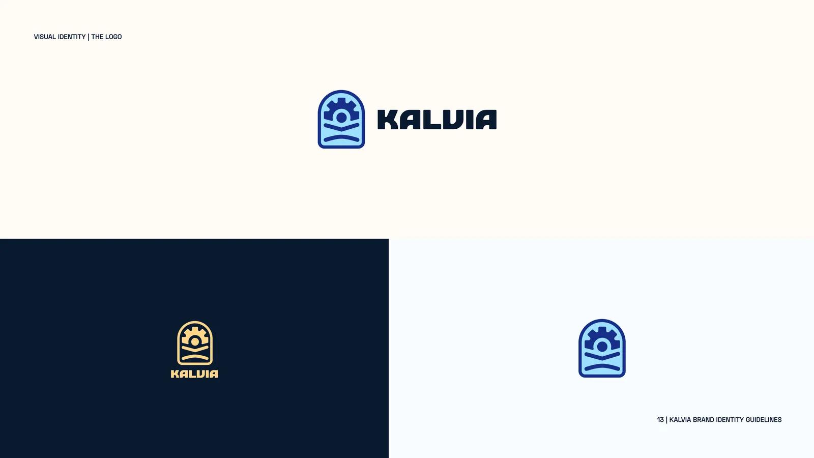
The Kalvia mark and wordmark shown in Lagos Blue on cream and in gold on dark navy.
The Kalvia mark across its primary grounds.
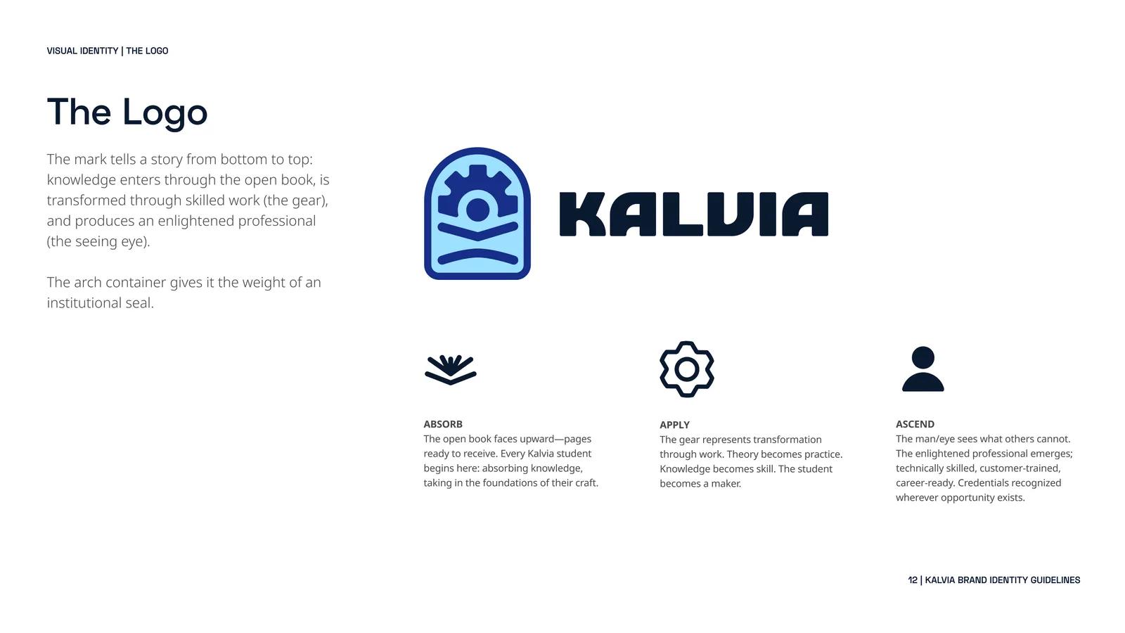
The Kalvia logo explained: open book, gear and figure with eye, inside an arch container.
Absorb, apply, ascend — the mark read from bottom to top, held in a seal-like arch.
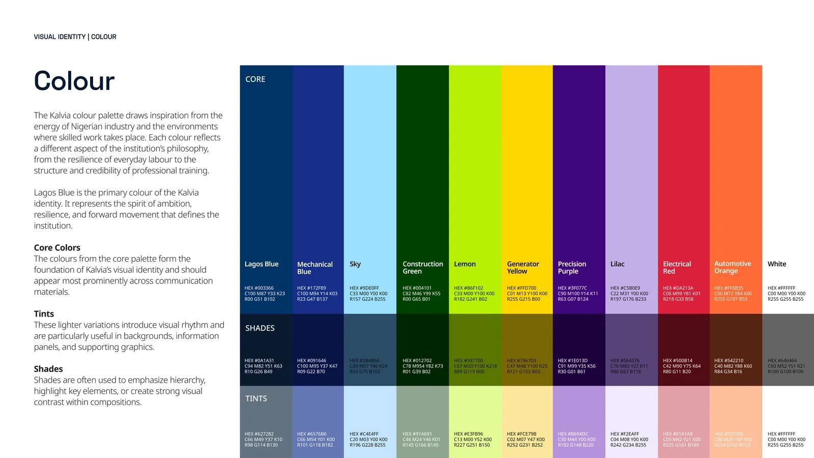
The Kalvia colour system: core trade-coded colours with tints and shades and their hex values.
The palette, coded to the trades — with tints and shades defined for each core colour.

07 / Brand identity / Beauty & personal care

URU

Brand identity design

A clean-beauty identity built across packaging, photography, social creative and a complete visual guideline system.

Read the case study →
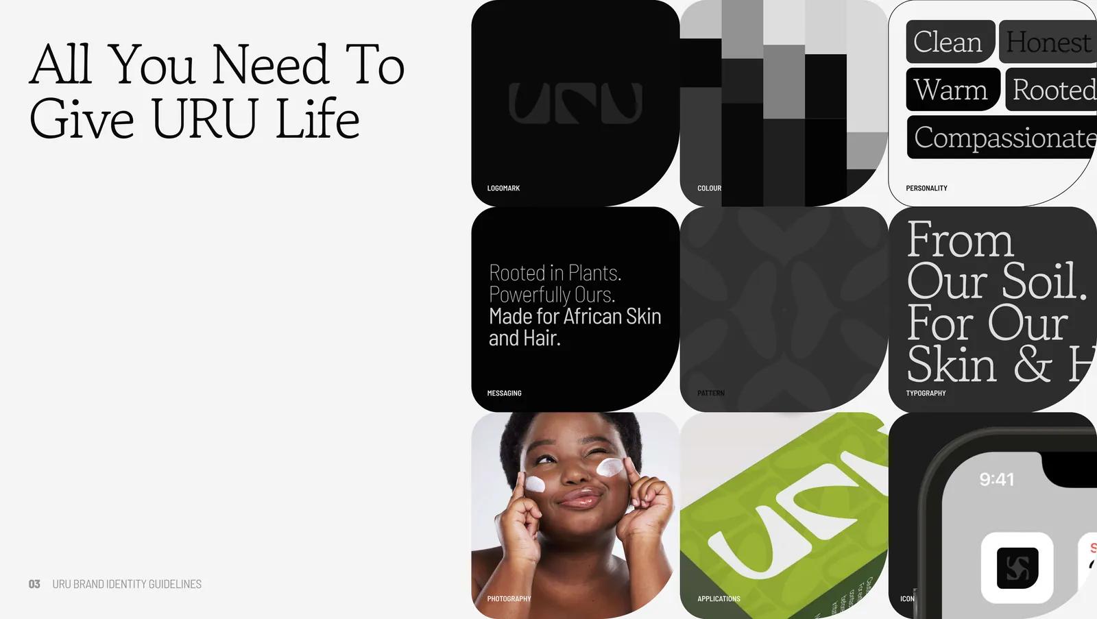
URU brand overview: logomark, icon, packaging, colour swatches and portrait photography on one board.
The URU system at a glance — mark, icon, pattern, colour, photography and livery.
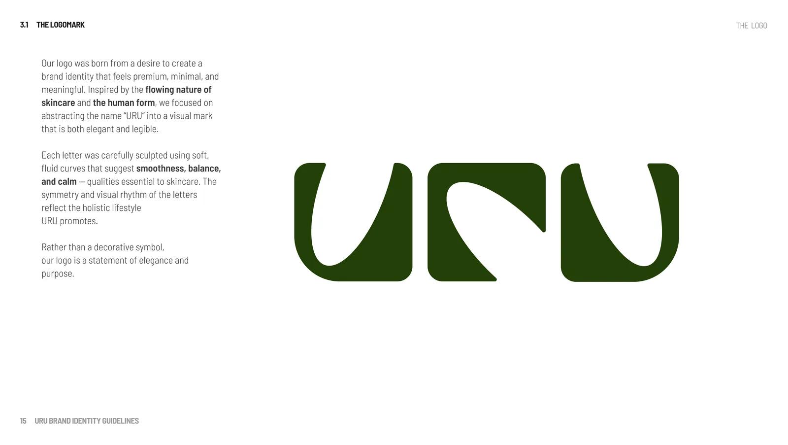
The URU logomark: three sculpted letterforms in deep green with soft, fluid curves.
The logomark — letterforms shaped from curves that carry the calm of the ritual.
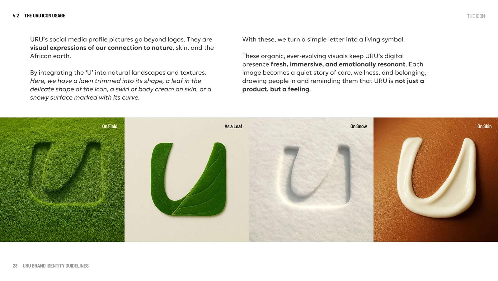
The URU U icon rendered as mown grass, a leaf, a swirl of cream on skin and an impression in snow.
The living icon: one letter, rendered in field, leaf, cream and snow.

08 / Identity / Packaging / Campaign graphics

A visual practice that travelled across formats

Visual design and art direction · 2017–2020

Identity systems, packaging and campaign artwork across food, education, advertising and commercial design.

Read the case study →
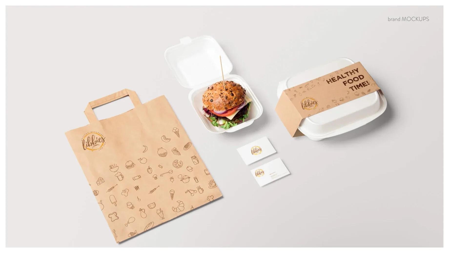
Libbies identity applied to a takeaway bag and meal packs
Libbies packaging system
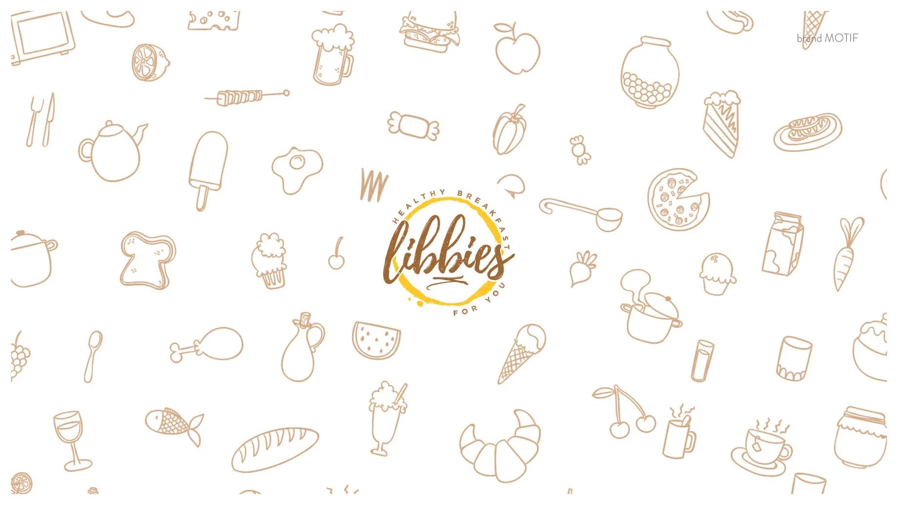
Libbies line-drawn ingredient pattern
Identity pattern
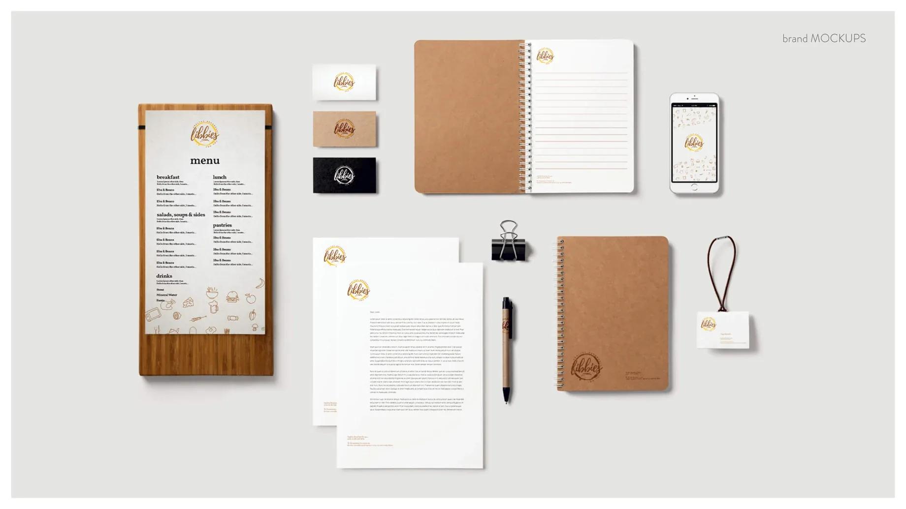
Libbies restaurant stationery mockups
Printed brand system

09 / Brand identity / Strategy advisory

Stratfortis

Brand identity and visual design

A geometric mark and supporting line motif carried across identity lockups, communications and social templates for a strategy advisory brand.

Read the case study →
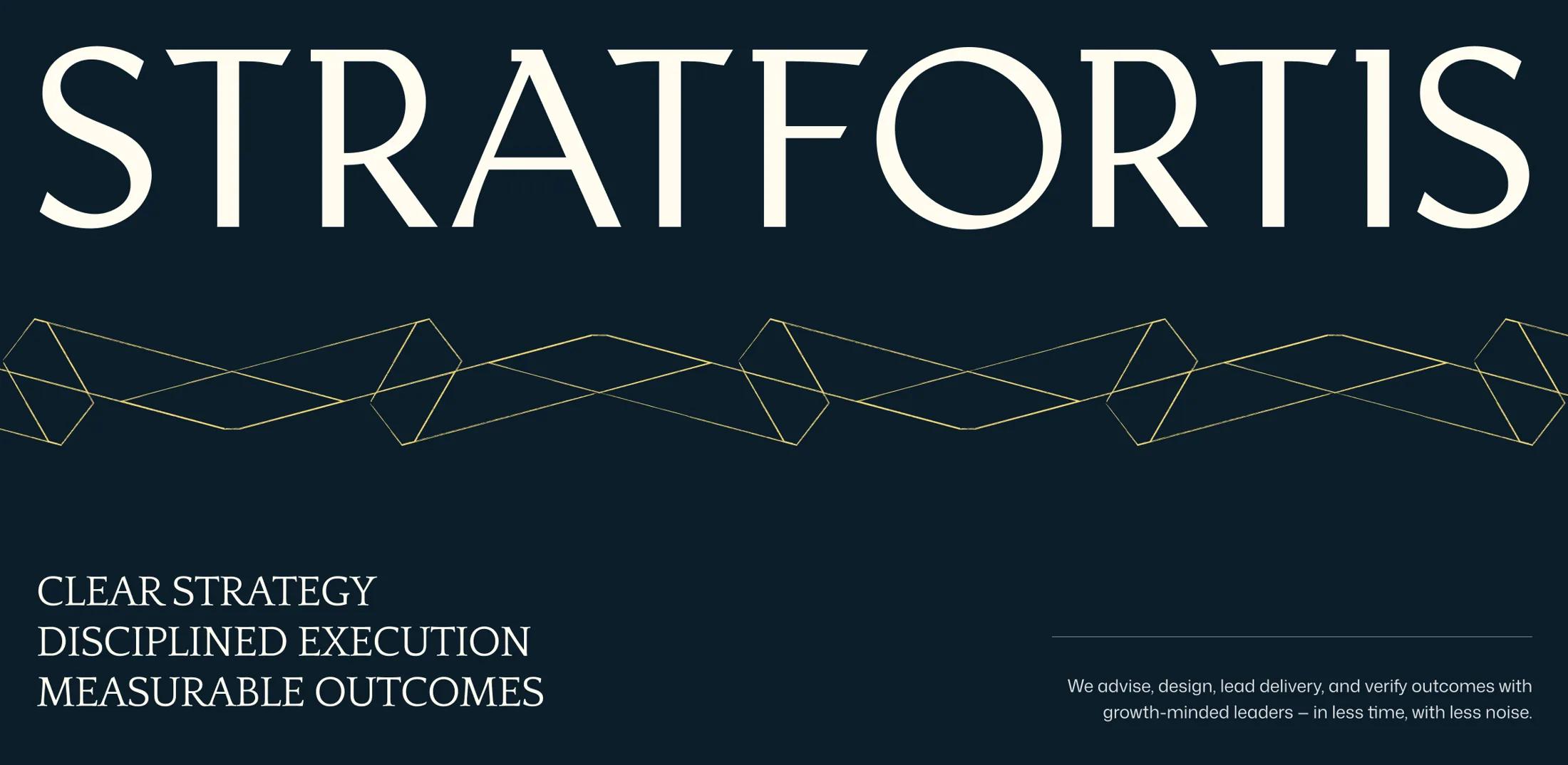
Stratfortis identity board in dark navy with geometric visual pattern
Stratfortis visual system, archival project files.
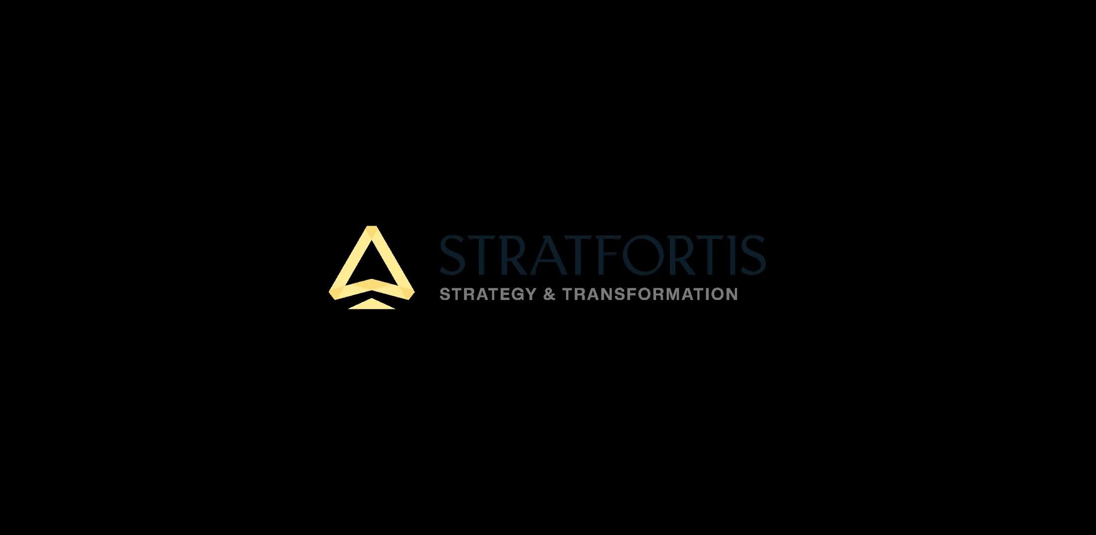
Stratfortis logo and tagline on a cream brand board
Core brand lockup and tagline.
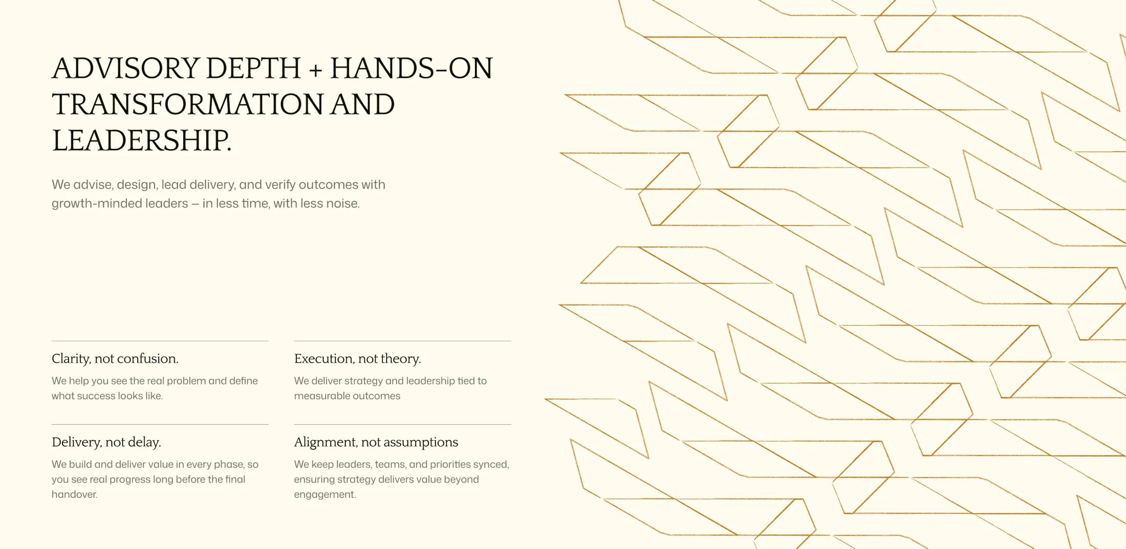
Stratfortis identity and advisory presentation composition on a light background
Light presentation variant.

More work

Product decisions, systems and the complete project archive.