Farmcrowdy — helping first-time users trust farm sponsorship
Farmcrowdy asked people to put money into farms through a mobile product in a market where users already had good reasons to distrust financial promises. As the first design hire, I redesigned the sponsorship flow and worked across product, brand and growth. Conversion moved from 18% to 60% as tracked sponsorship revenue grew from $1.86M to $9.14M.
Context
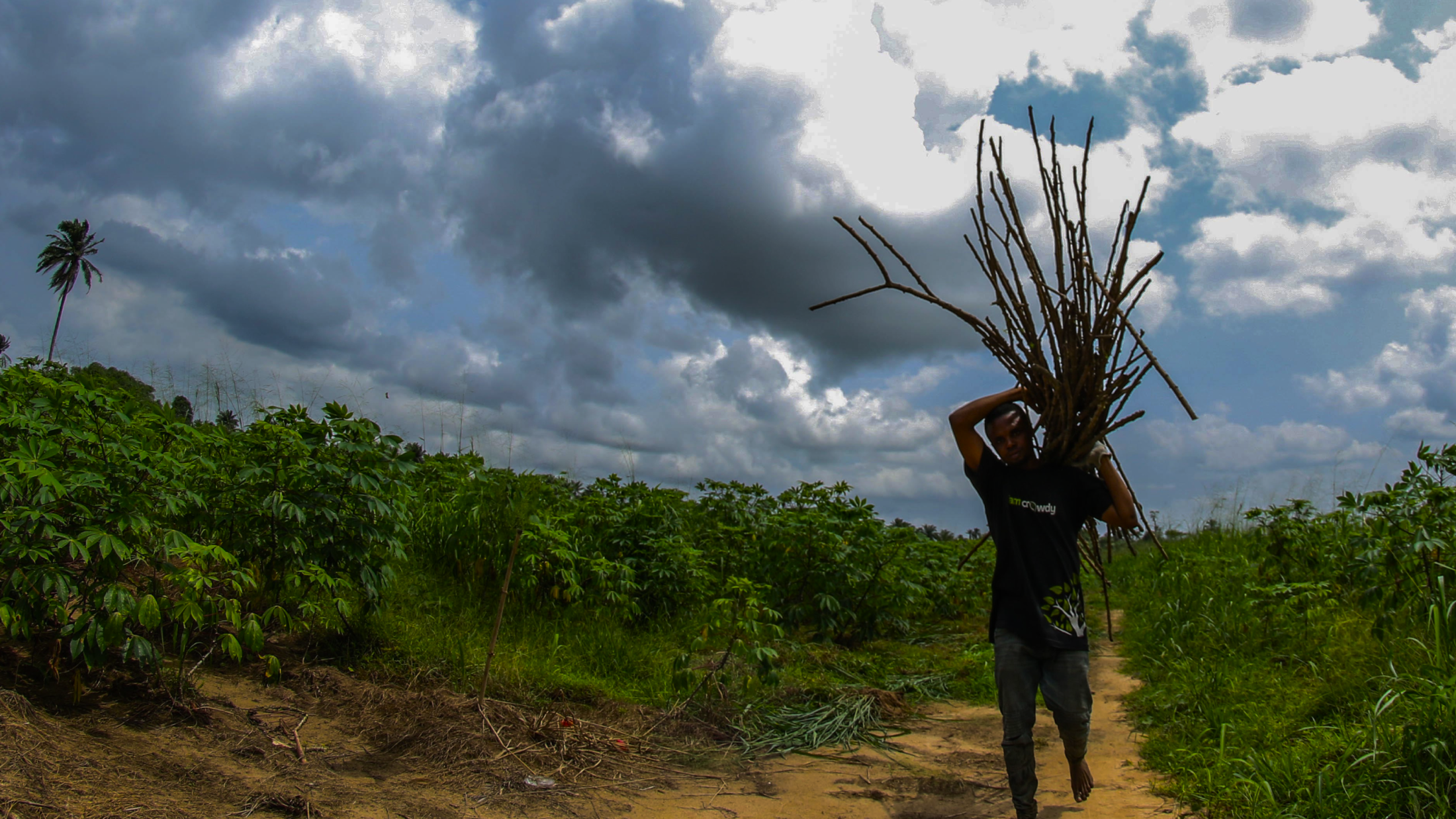
Farmcrowdy launched in 2016 as Nigeria’s first digital agriculture crowdfunding platform, connecting urban sponsors with smallholder farmers across livestock and crop value chains. I joined in April 2017 as the founding designer, when there was no product team and no design system. Over four years the role grew through four titles as the company expanded into a multi-brand ecosystem: Farmcrowdy, Farmcrowdy Foods, Farmcrowdy Aggregator, HAPI Insurance, Agricsquare and FarmGate Africa.
Founding the product layer
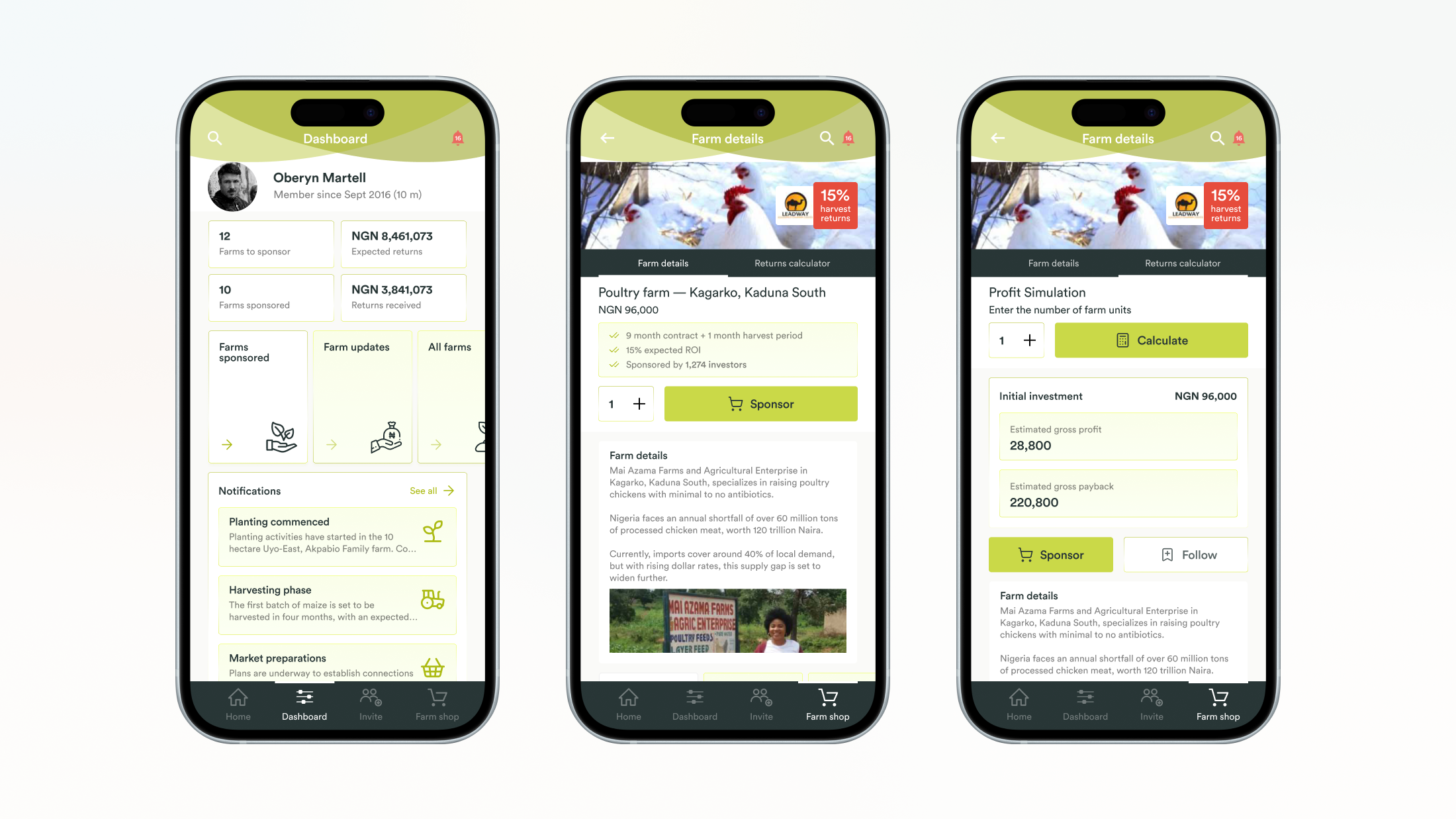
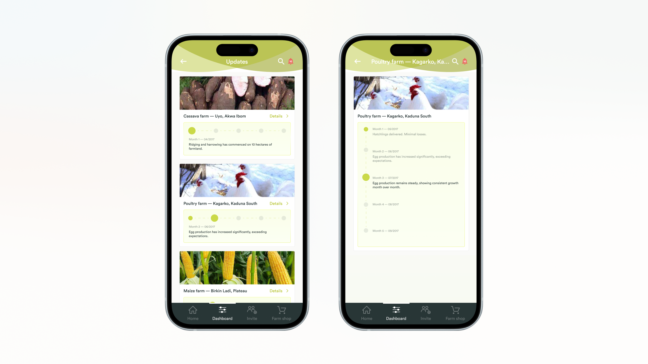
The first task was a platform both sponsors and farmers could trust: that money was safe, farm cycles would be tracked and returns would be paid. I designed the original sponsor platform, including investment flows, farm-tracking dashboards, disbursement states and the trust signals that made an untested agricultural investment product feel credible to first-time sponsors. The app won Best AgriTech Solution at the 2018 AppsAfrica Innovation Awards.
Building brand and growth systems
As the platform scaled, I built and owned Farmcrowdy's brand and marketing infrastructure — the visual system, content strategy, and campaign execution across web, social, press and events. By 2019 the Farmcrowdy blog ranked on the first page of Google for competitive agriculture keywords. The email list reached 166,119 subscribers with a 19.75% average open rate. Farmcrowdy accumulated 1,000+ media mentions and 16,800 quality backlinks across Nigerian and international platforms. The company attended and led 50+ public events in 2019 across agricultural, fintech, and development sectors. (Source: Annual Report 2019)
Agricsquare and community infrastructure
I led the product and content direction for Agricsquare — Farmcrowdy's content and community platform designed to rank for agriculture search terms and drive organic reach across the ecosystem. Agricsquare grew to 25,000+ members and became the largest online agricultural community in Nigeria. In 2019, dedicated Community Coordinator and Content Developer roles were created to run the platform full-time.
Program Development Unit
In 2020, the company formally created the Program Development Unit — responsible for product development, identification of donor-funded programmes, and new product and project incubation (Annual Report 2019). I led this unit, working across product definition, partnership design, and programme structure for Farmcrowdy Foods, Grainpoint, and HAPI Insurance.
Scale at end of 2019
By the end of 2019, Farmcrowdy was operating across 16+ states with 25,000+ farmers in platform context, 45,000+ customers acquired, and $10.6M in company-level sponsorships. Tracked sponsorship revenue grew from $1.86M to $9.14M. (Source: Annual Report 2019)
Recognition
United Nations Global Disruptive Innovation Award — UNIDO ITPO Italy, May 2019. British Awards for African Development — Africa's Innovative Business of the Year 2019. London Stock Exchange — Companies to Inspire Africa 2019. Nigeria Stock Exchange — Next Bulls Award 2019. FT/IFC Transformational Business Awards 2019 finalist.
Outcome
$10.6M in company-level sponsorships (tracked sponsorship revenue grew from $1.86M to $9.14M), 45,000+ customers acquired, 25,000+ farmers in platform context across 16+ states, plus 1,000+ media mentions, 166,119 email subscribers, and 16,800 quality backlinks built through in-house growth systems.