Hungry Lion
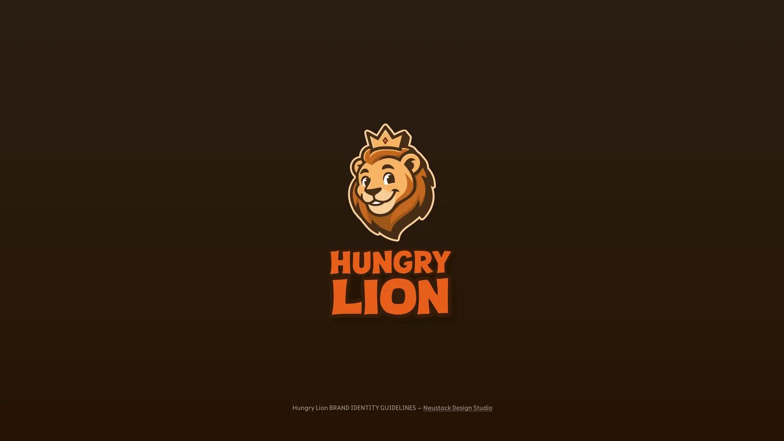
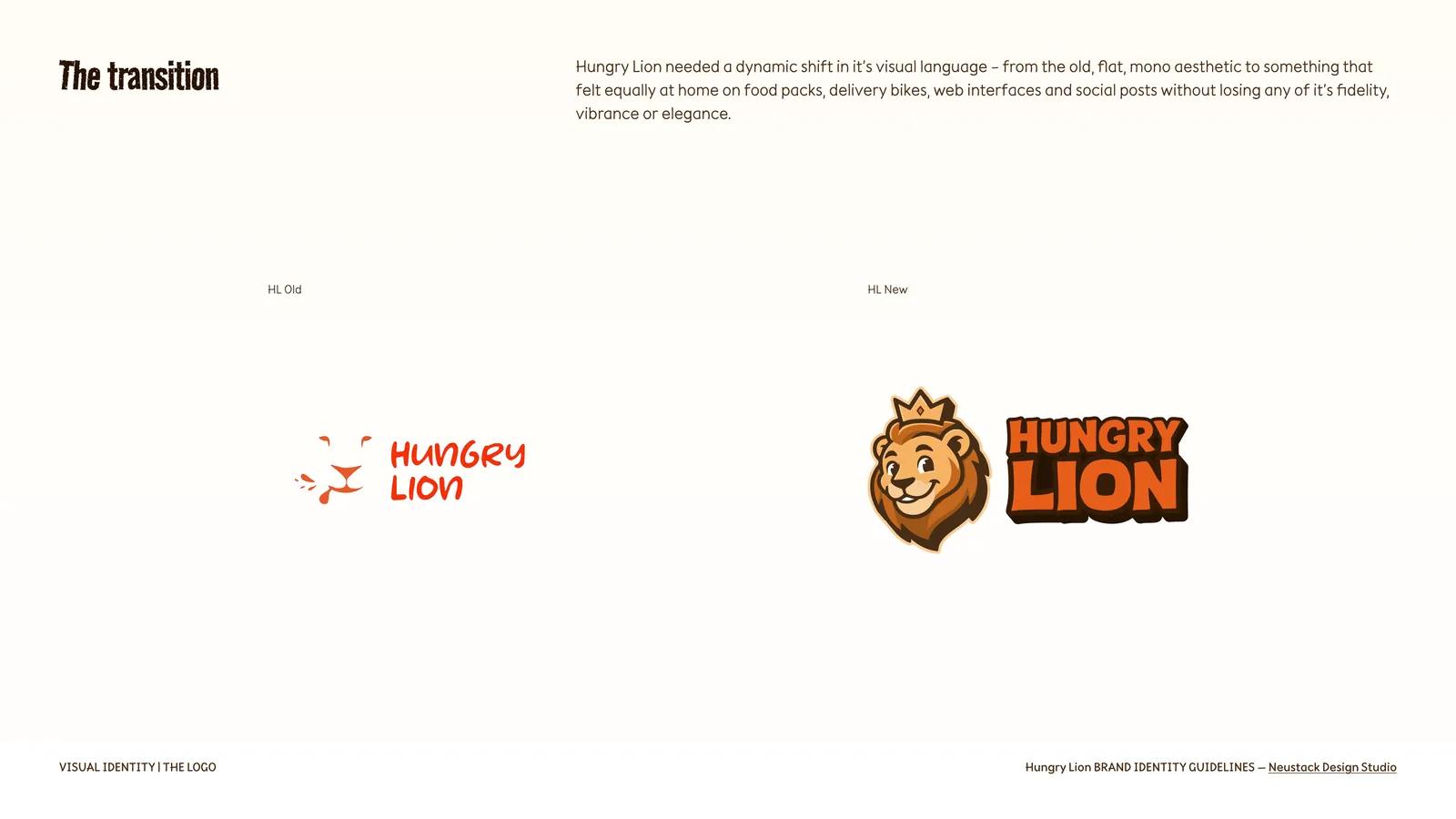
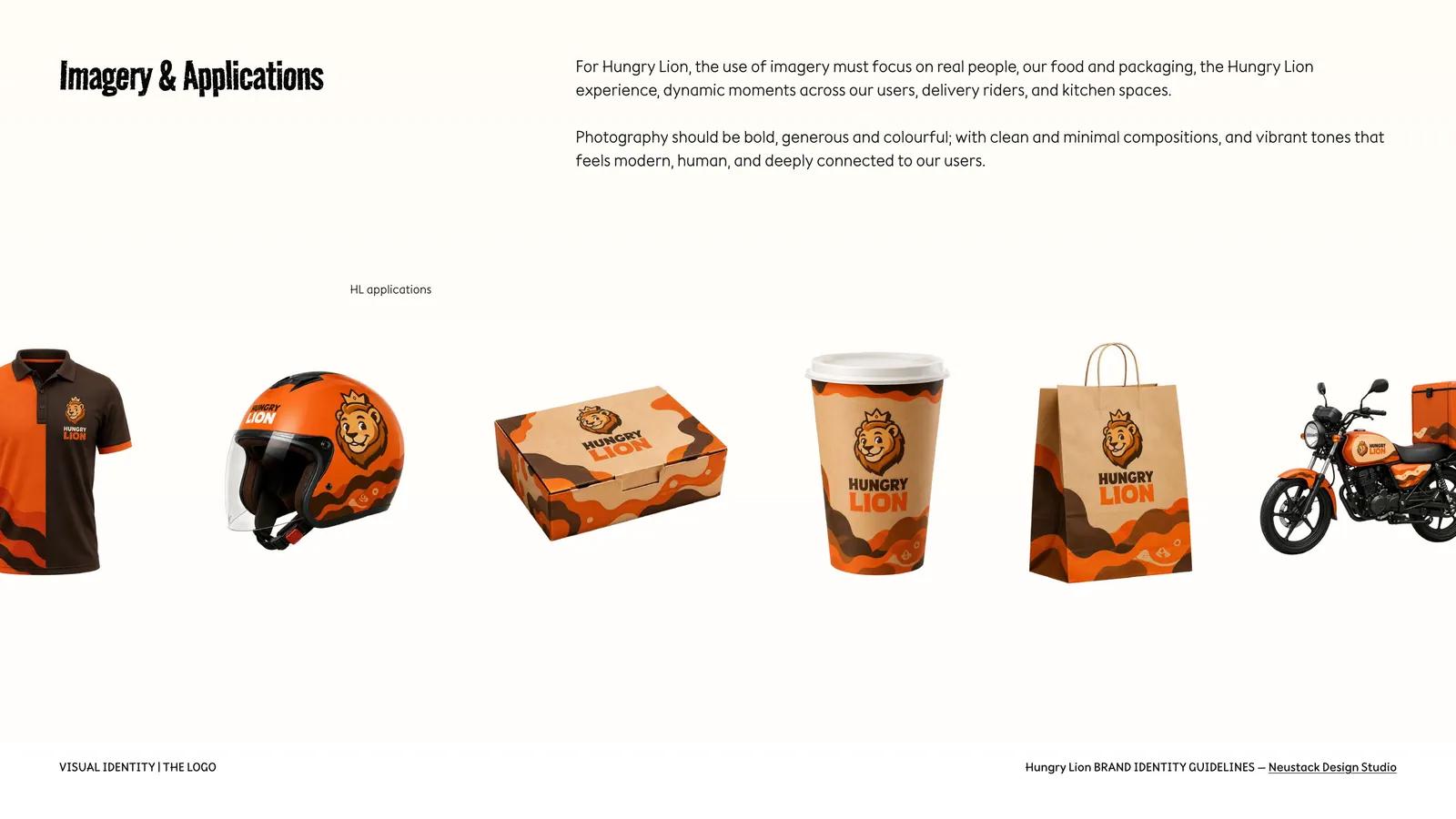
Hungry Lion sells bold, generous meals at speed, and its old mark was flat and monochrome. The rebrand had to hold on a food pack, a delivery bike, a web interface and a social post — surfaces that agree on nothing.
The problem
The old mark worked as a logo and stopped there. A delivery-first food brand does not get to choose where it is seen: the same identity has to hold on a printed food pack, on the panel of a moving bike, inside an ordering interface, and cropped into a circular social avatar — each with different production limits, viewing distances and colour behaviour.
The brief asked for a dynamic shift in visual language without losing fidelity, vibrance or elegance — at every one of those sizes. One drawing cannot do that; a set of them, with rules about which goes where, can.
My role
Brand identity design through Neustack Design Studio: the logo system, colour, typography, graphic language, imagery direction and the application set, delivered as the Hungry Lion brand identity guidelines. Hungry Lion is the delivery brand of Lion Hospitality Partners, where I lead product and technology — so the identity had to survive contact with the operating stack described in the Lion Hospitality case study, carrying the same visual direction into working service interfaces.
The solution
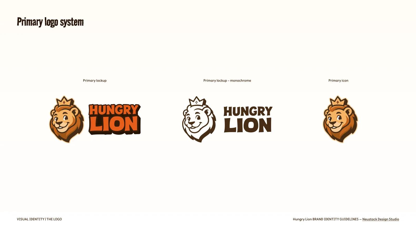
The mascot was redrawn with depth and expression, then wrapped in a lockup system rather than a single logo. A primary lockup and monochrome variant carry most surfaces; vertical, horizontal and alternate lockups exist so the mark can meet a tall pack face, a wide bike panel or a square avatar without being squeezed into one; the icon stands alone where the wordmark would be illegible.
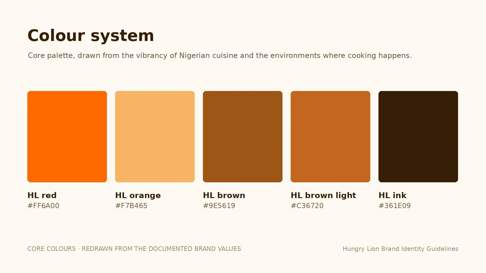
Colour is drawn from the vibrancy of Nigerian cuisine and the environments where cooking happens, structured as core colours with tints for backgrounds and information panels and shades for hierarchy and contrast — so a designer laying out a menu board is picking from a defined role, not a mood.
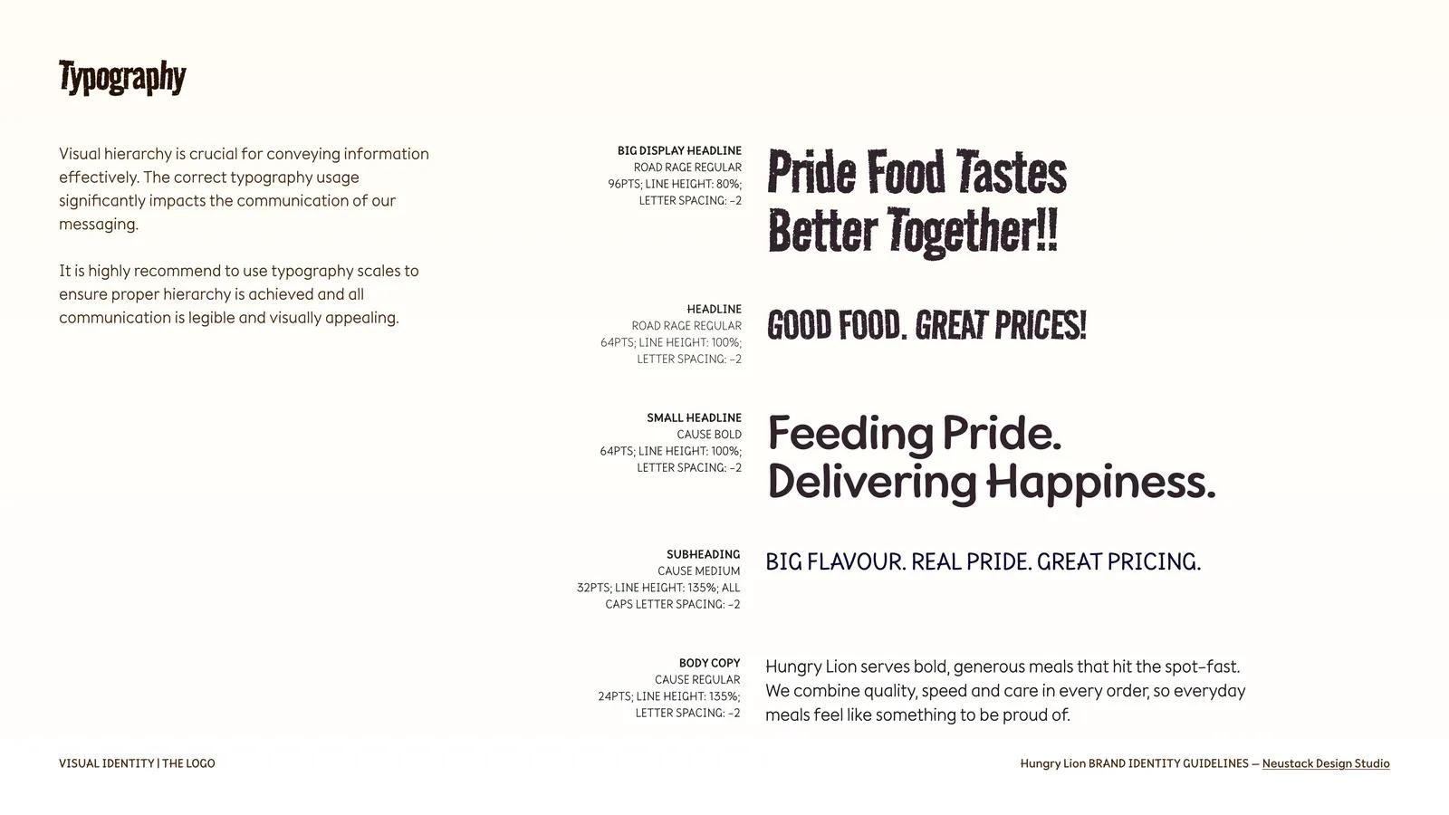
Type is two families with a clear division of labour: Road Rage for display — “Pride Food Tastes Better Together!!” at 96pt, 80% line height, minus-two tracking — and Cause for headlines, subheads and body. Every level is specified as a scale rather than shown as an example, so a poster set by someone outside the studio still lands in the same voice.
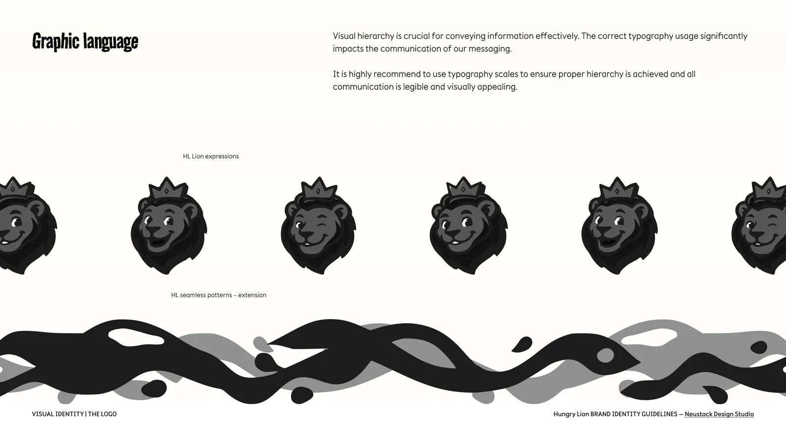
Then the graphic language: an icon set, brand shapes, seamless patterns, and a run of lion expressions. On a paper bag, a rider’s jacket or a meal box the logo is rarely the hero, so those surfaces need something else to be made of — and the pattern and the mascot’s moods are what fill them.
Impact
Packaging, rider kit and digital surfaces can now be produced without coming back to the studio for each decision — the lockups, colour roles, type scale and pattern set answer most of them in advance.
The identity was also applied inside our restaurants' operating platform, including the branded Fulfilment Console used in dispatch testing. Visual rules connect service software with the packaging and delivery experience.