URU
URU is a plant-based beauty brand made for African skin and hair. I designed the wordmark, living icon, colour and photography system, then carried it through social applications and packaging specifications.
The problem
The brand’s own positioning names the gap: for every African woman who has felt invisible in the beauty aisle. Mainstream clean beauty signals purity through a visual language — bare white space, cool neutrals, a narrow cast of skin in the photography — that reads as absence rather than care, and that quietly excludes the customer URU is formulated for.
So the identity had to hold two things at once: premium and unmistakably African. And it had to survive the least glamorous constraint in beauty — a small pack face that still has to carry an INCI list, usage instructions, weights, certifications and two markets’ regulatory details.
My role
Brand identity design across the full system: logomark, standalone icon, pattern, colour library and pairing rules, typography, photography direction, and the brand livery — social assets, stationery and the product packaging artwork.
The solution
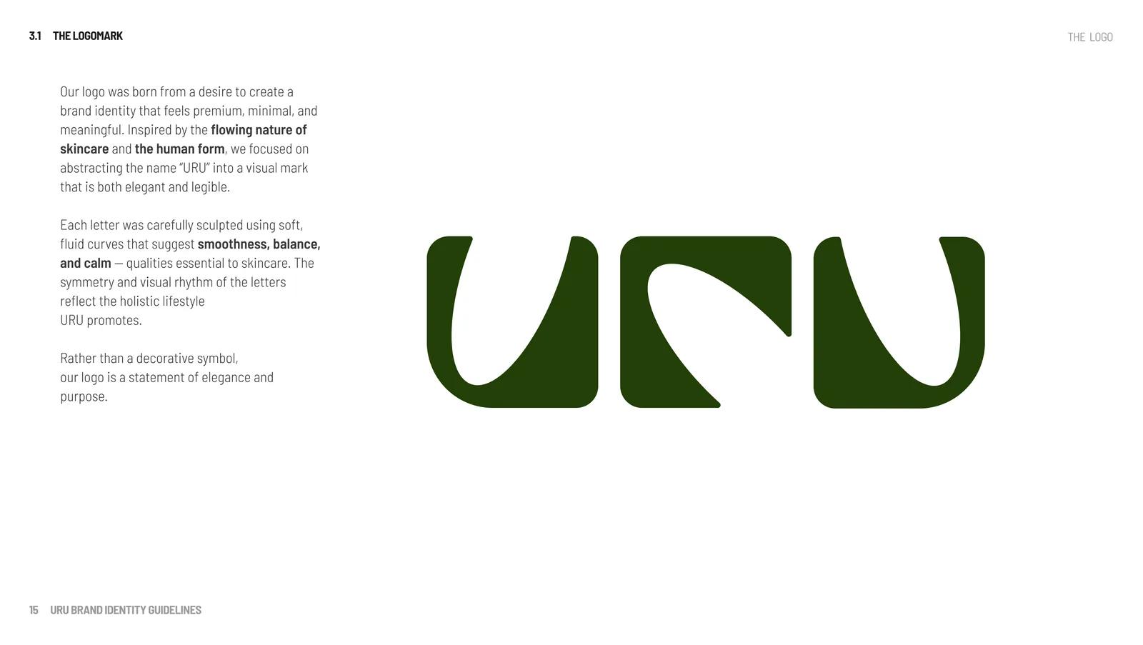
The brand book describes URU as the nurturing older sister — warm, grounded, never flashy — and the wordmark is drawn to match. “URU” is abstracted into soft, fluid curves with a symmetry that reads as a ritual rather than a laboratory, and the whole identity rests on the letterforms instead of a decorative symbol. Premium without reaching for gold foil.
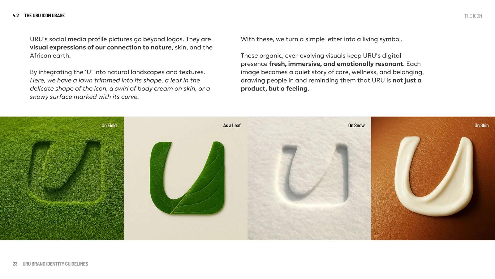
The single U becomes a living icon: mown into a lawn, shaped from a leaf, swirled in cream on skin and pressed into snow. Each variation keeps the same letterform while giving the brand a different texture and story.
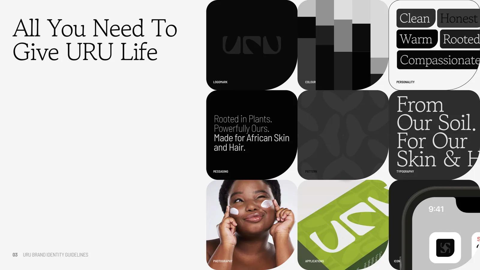
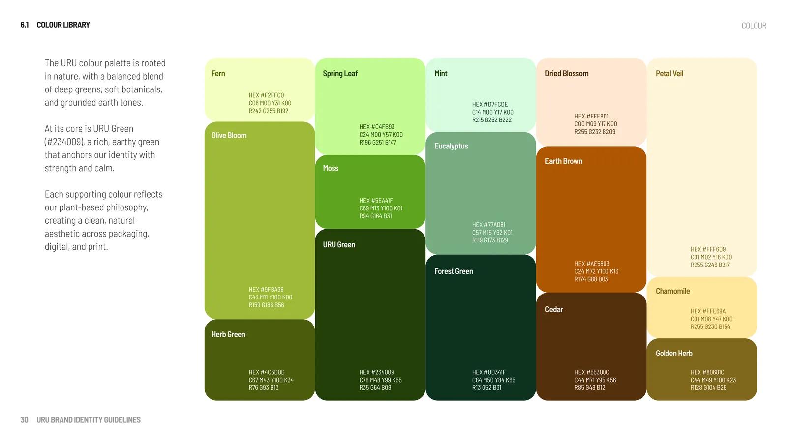
Colour is a library rooted in URU Green #234009, with botanicals and earth tones around it — and, more usefully, a set of fixed pairings. Each colour is stacked against its own tint and shade, and the wrong pairings are documented as explicitly as the right ones, so contrast and readability survive contact with a busy social calendar.
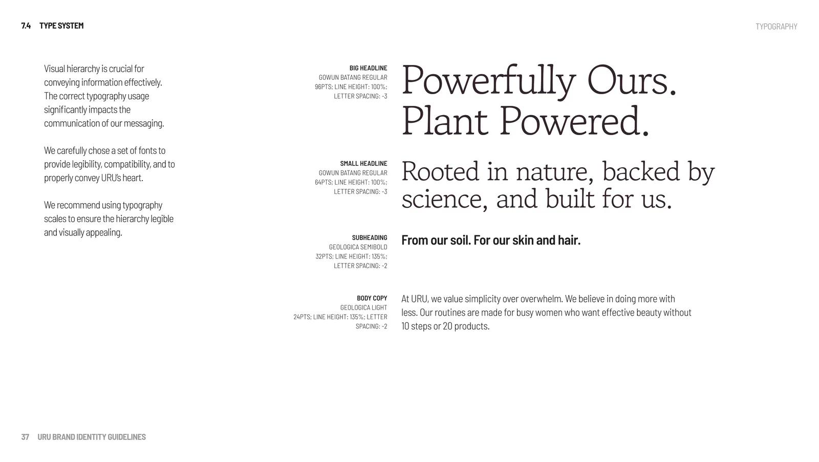
Type sets a serif — Gowun Batang — against condensed and geometric sans companions. The serif gives the brand its composure at display sizes; the sans carries the density of ingredient panels and educational content without the pack turning into a leaflet.
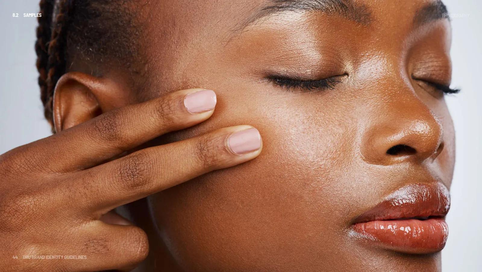
Photography direction is written as a set of prohibitions as much as preferences: real African skin and hair, warm tones, natural texture and community scenes; avoid Eurocentric beauty tropes; avoid excessive editing, enhancing colour and vibrance only. In a category built on retouching, that restraint is the brand position.
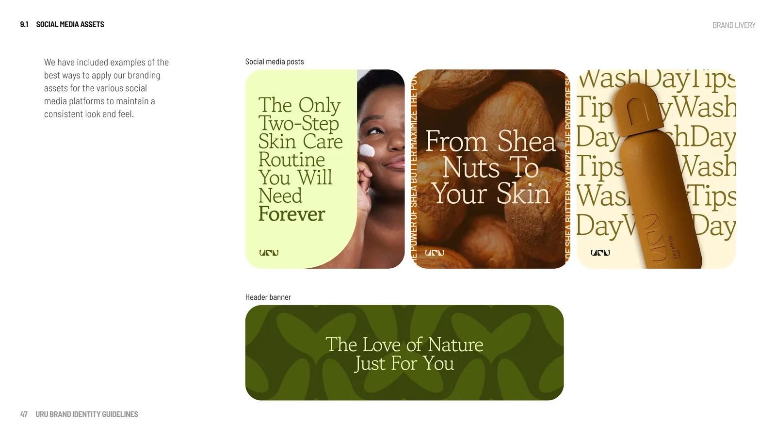
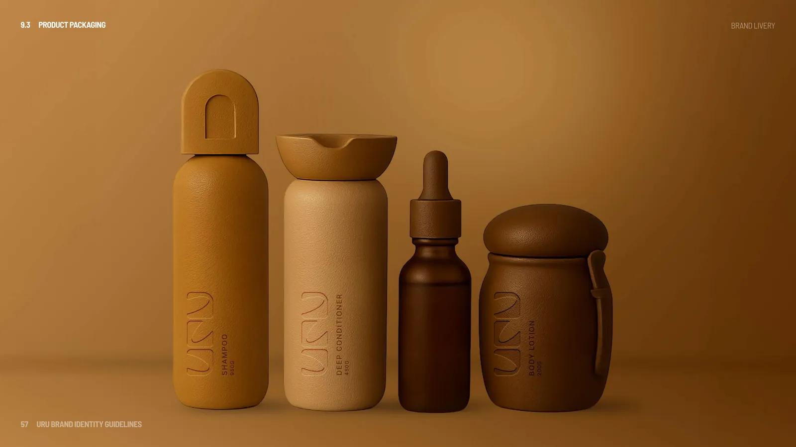
Social assets, stories and highlight covers are built from the pattern, which is derived from the logo and hides a heart sprouting from a stem inside it. The packaging is where the system stops being a document: the artwork is specified to production.
- Debossed logo at a stated depth, with bottle and jar dimensions and fill weights.
- Full INCI ingredient panels, usage instructions and vegan, cruelty-free and recyclable marks.
- Manufacturer and responsible-person details for both the Nigerian and UK markets.
Impact
The identity survives the full range it has to live in — a 24px favicon at one end, a 400g conditioner jar with an INCI panel at the other — because the pairings, minimum sizes and pack specifications were settled in the document rather than left to whoever lays out the next SKU.
The photography rules and living U icon carry “Beauty that knows us” across social creative, packaging and digital touchpoints.