The years ahead are open.
Y Club began as an ambitious longevity-led membership proposition. I took the founders' early blueprint and developed a more compelling way to express what they were building: a brand about continuity, curiosity, belonging and the years still ahead.
A compelling venture was already taking shape.
The founders' early October 2026 deck described a private longevity-led membership for affluent adults aged 40+ across India, the Gulf and South-East Asia. Its central idea was ambitious: city sanctuaries for everyday life, retreats for deeper resets, and a community that connects the experiences.
Avishek was identified as the founding project lead and AFINUE co-founder, with Elizabeth leading alliances and partnerships. They had mapped locations, membership tiers, a retention flywheel, a technology vision and funding assumptions. That was the foundation I began with.
My opportunity was to turn those ingredients into a world people could understand, desire and recognise before its first sanctuary existed.
What does a membership for the years ahead actually feel like?
I began by separating the business model from its emotional promise. A club for people already accomplished in life could lead with elite facilities, medical science or exclusivity. But those alone would make the proposition easy to confuse with a clinic, a resort or a traditional members' club.
The founders' retention loop suggested the more interesting answer. A visit creates insight. Insight leads to a new ritual. The next visit becomes more meaningful through familiarity, progress and relationships. The brand needed to make that continuity visible.
That gave me the creative north star: 'The years ahead are open.' The idea celebrates the life members have already built while inviting them to remain curious about what comes next.
From luxury service to a new idea of longevity.
I studied how exceptional service brands like Wheely, Blacklane, Esqyre and Jesko Jets use photography, restraint and movement to make trust feel tangible. I also examined longevity and social-wellness brands, including Surrenne and Remedy Place, where science and hospitality coexist.
The visual references sharpened the brief further: the sculptural editorial character of Broveld and Brönie, the precision of longevity reporting, atmospheric nature photography and the emotional value of beautifully made objects.
I chose a direction that could sit comfortably in an intimate private club, on an assessment report, inside a wearable and on a future-facing investor presentation. The same promise had to survive every change of medium.
One continuous line became the identity.
The first explorations considered a more traditional serif-informed Y. As the proposition became clearer, I moved towards a proprietary symbol with an actual narrative: a continuous line that forms an open infinity.
The closed loop holds experience already accumulated. The open arms point towards possibilities yet to be lived. The strands cross like a helix, bringing scientific precision into the same gesture as an elegant letterform.
I tested the symbol as a large architectural mark and at small interface sizes, with two optical cuts to retain the crossing and loop. Its graphic logic gives the identity a recognisable asset beyond typography.
Warmth in the voice. Precision in the details.
I built the visual language around the same contrast. Lamrata brings editorial warmth and maturity to statements, names and prominent numbers; Geist and Geist Mono keep bookings, clinical information and operational details legible.
Obsidian gives the brand privacy and depth. Evergreen carries the living, continuous quality of the proposition. Bone introduces tactility; Titanium connects the mark to engineered objects and a quieter vision of the future. Pulse is reserved for small, purposeful moments of emphasis.
Motion follows the line's own behaviour: two strands draw, cross and continue. The brand can feel alive without slowing down tasks that members came to complete.
Belong: the first object makes membership real.
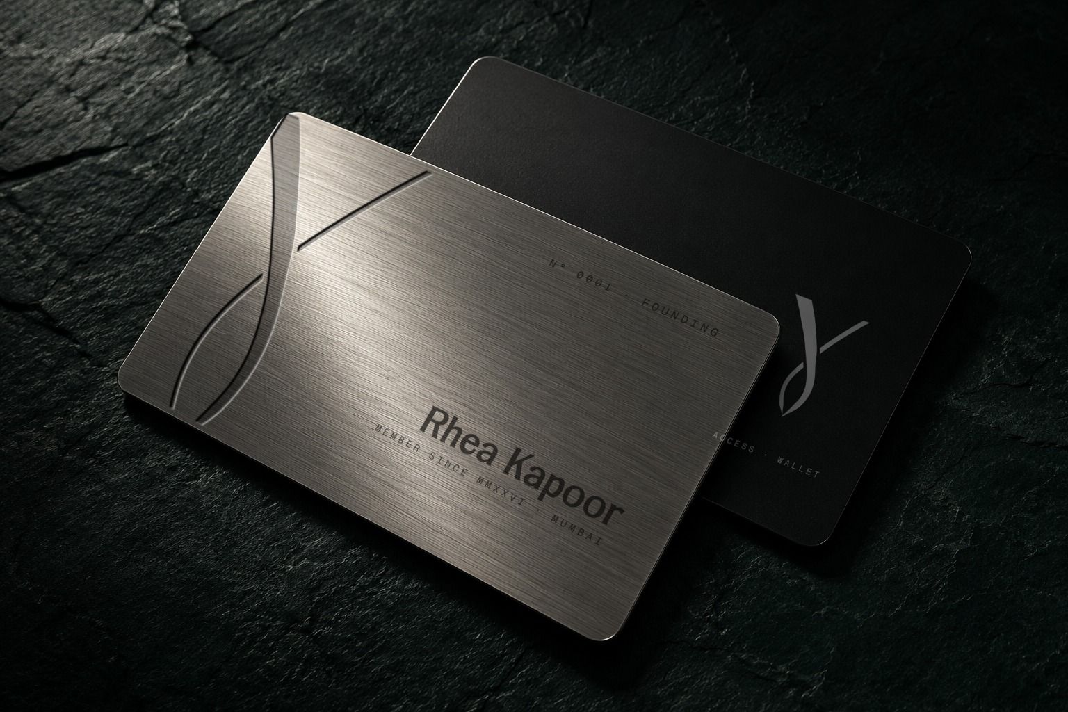
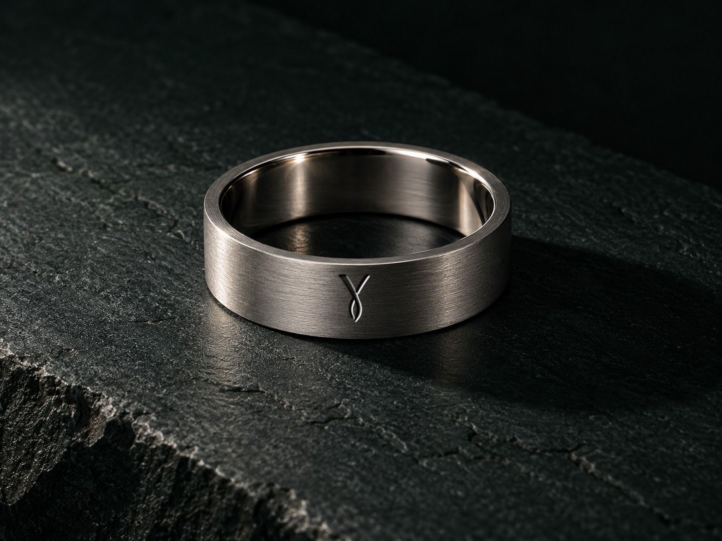
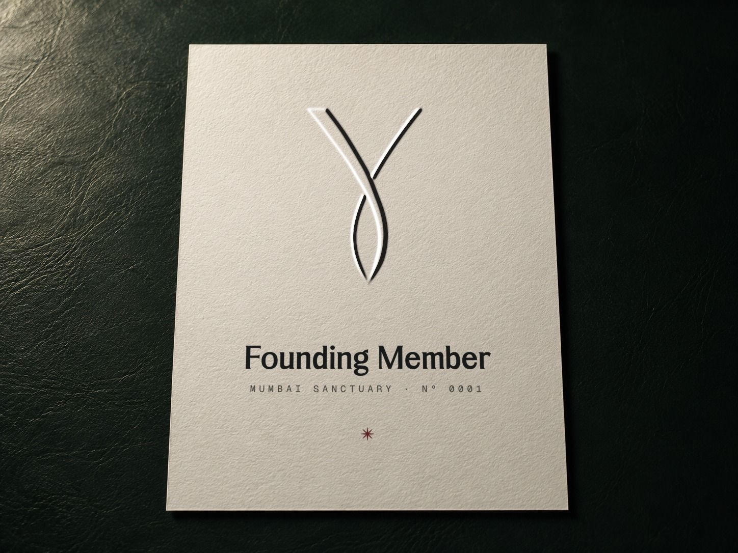
The membership card is the first physical proof of belonging. I treated it as a lasting object, using titanium, edge-cropped symbolism and a deliberate absence of unnecessary surface data. The companion ring and founding certificate extend the same idea into access and recognition.
Arrive: the building should speak before anyone does.
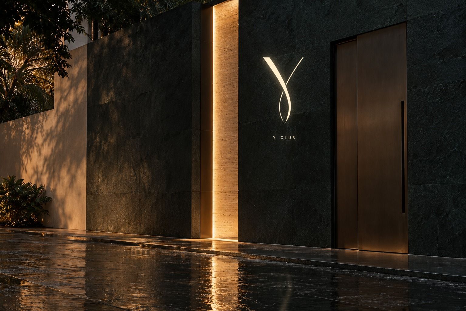
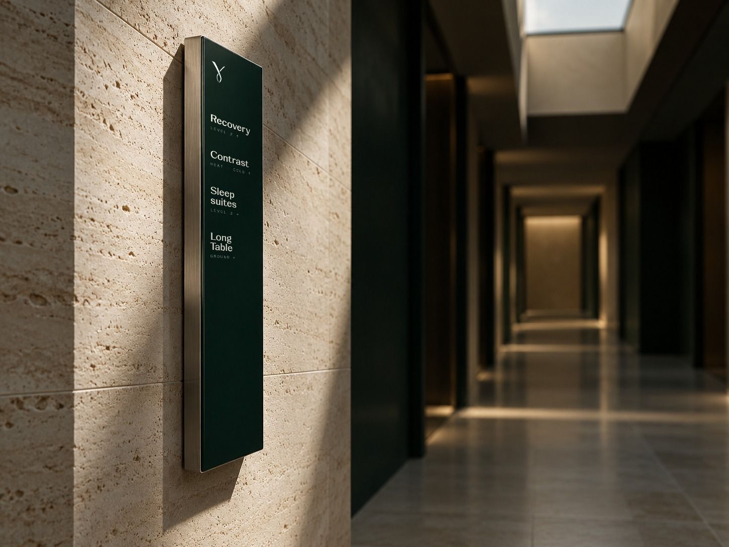
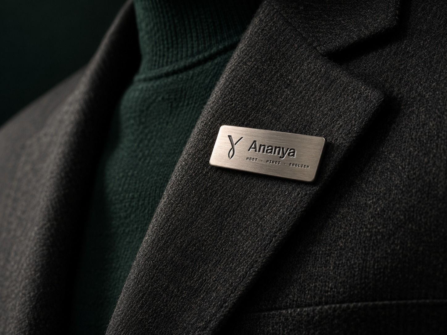
I translated the mark into a light slot cut through stone at the sanctuary entrance. Wayfinding combines editorial destination names with precise navigational information, while a host badge begins the relationship with a person's first name.
Measure: make progress understandable.
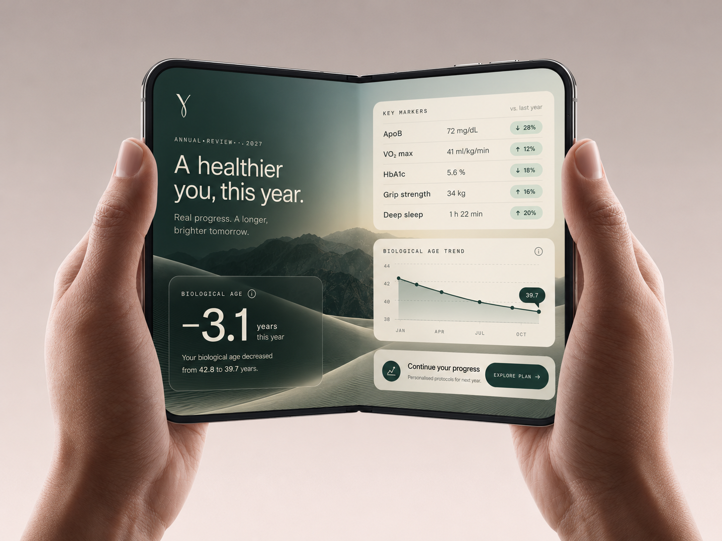
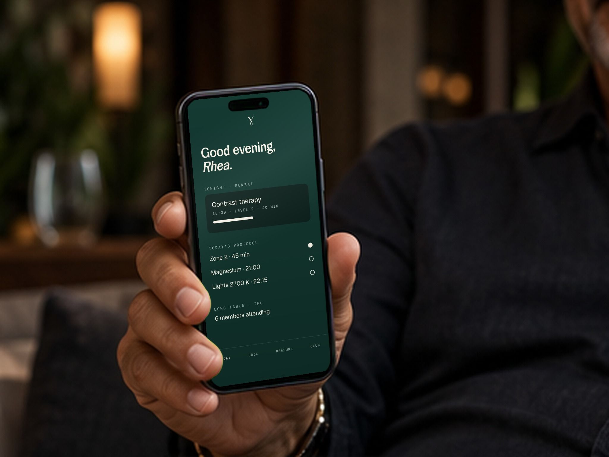
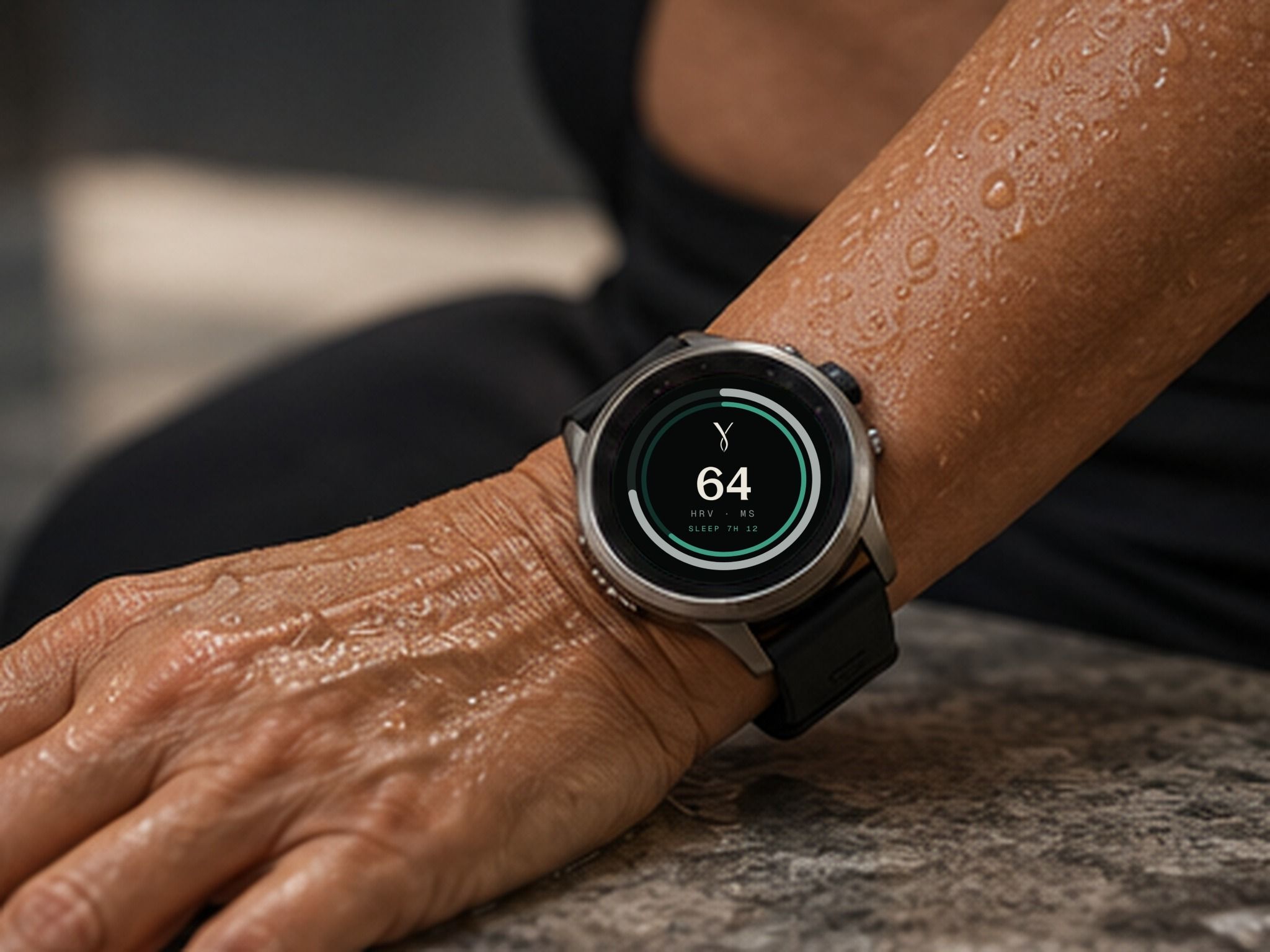
Longevity becomes credible when members can understand what is changing. I explored an annual review that gives one important measure priority, then discloses supporting biomarkers. The app and wearable translate the same information into shorter everyday interactions.
These are illustrative interface and reporting concepts, not clinical claims or evidence of an operating programme.
Restore: the ritual continues outside the club.
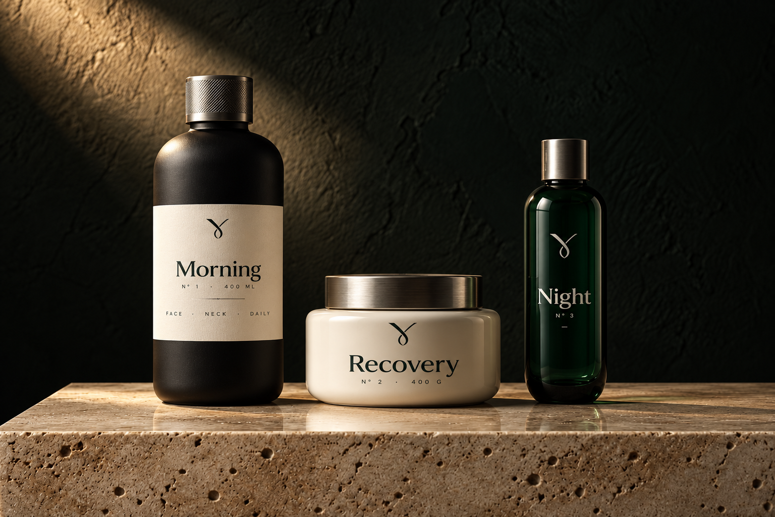
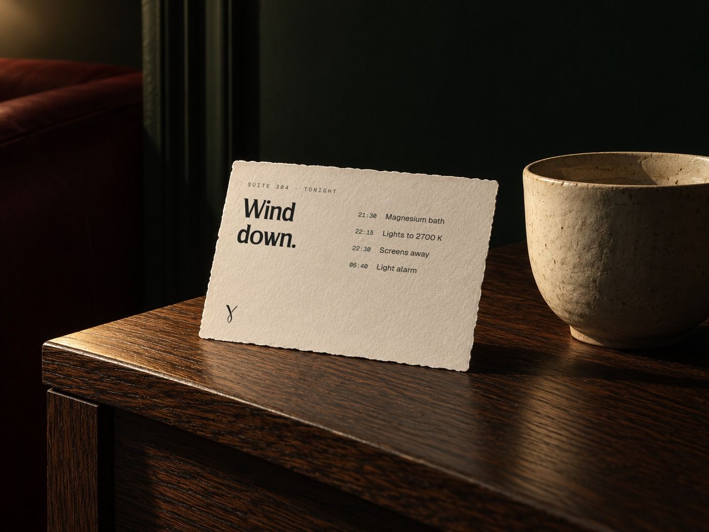
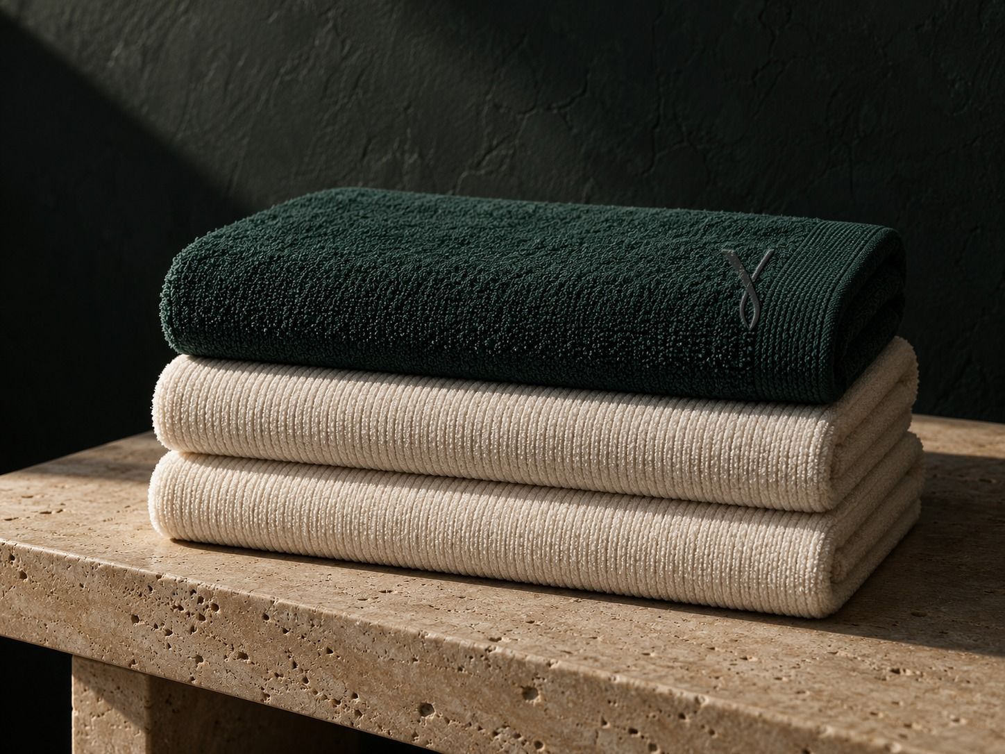
The apothecary range turns a daily routine into a recognisable system through three numbered treatments: Morning, Recovery and Night. Protocol cards place the member's schedule first; linen carries the identity through material and finish rather than oversized branding.
Travel: anticipation is part of the experience.
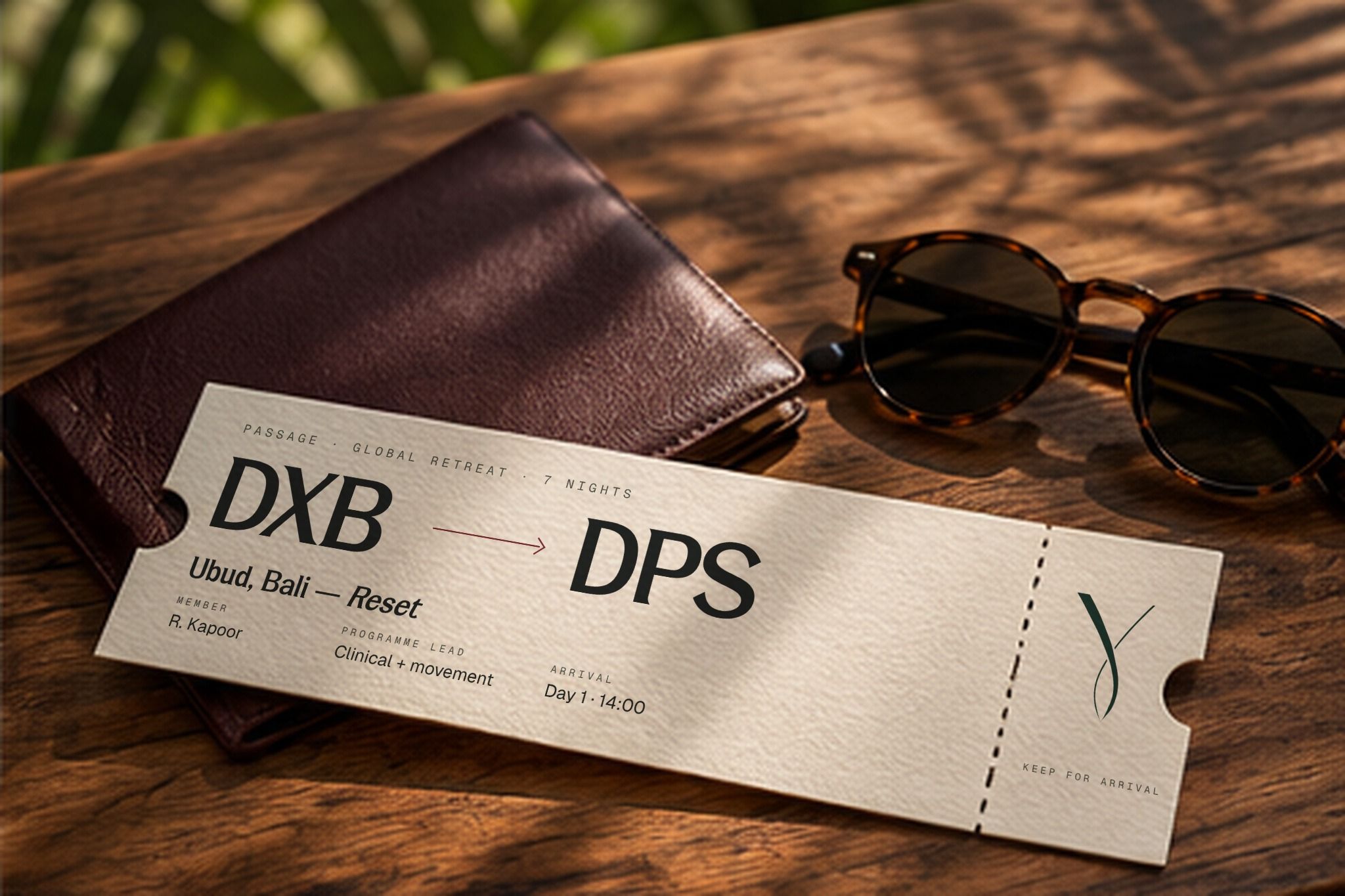
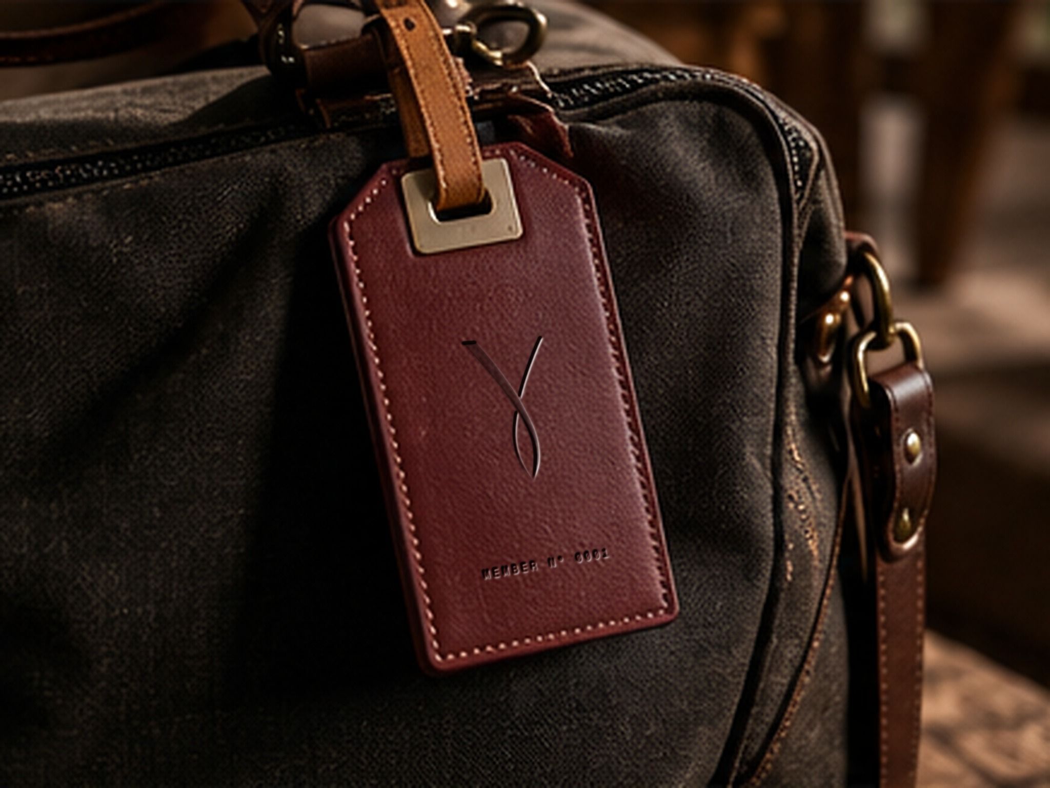
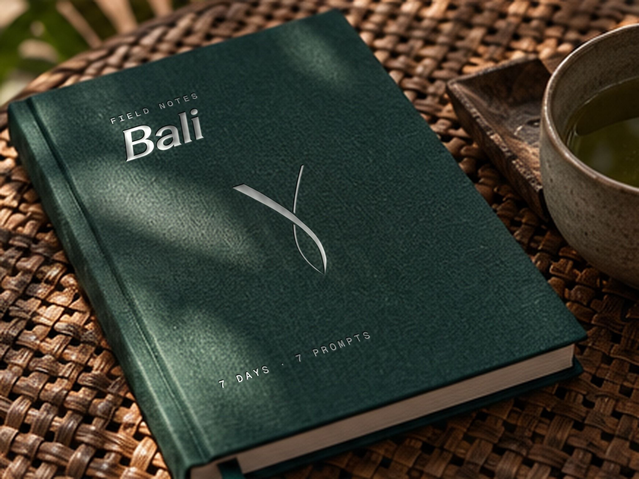
The retreat passage uses familiar travel conventions as a keepsake; the luggage tag protects personal information; the field journal creates space for reflection during the programme. Each object gives continuity to an experience that extends beyond the booking.
Gather: design for the relationship that brings people back.
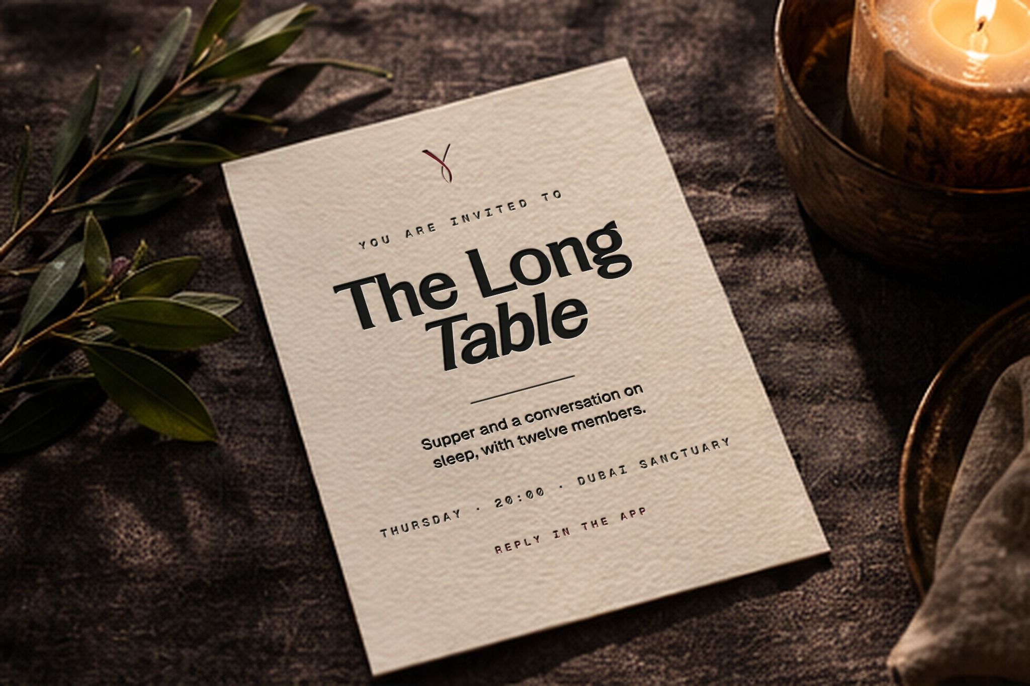
The founders had already made community a third pillar of the proposition. I gave it a recurring physical expression through The Long Table: a simple invitation to a shared ritual. Facilities may introduce the membership, but the relationships give members a reason to return.
The investor story needed the same clarity.
The original pitch carried substantial work: the nine-location vision, target membership, city-and-retreat rollout, commercial model, capital requirements, technology architecture and the people bringing it together. Its opportunity was to make the argument unfold at the reader's pace.
I reorganised the narrative from the shifts creating demand, to the gap in existing options, to the integrated membership and the three experiences that bring it to life. Only after that foundation does the presentation move into revenue, network scale, cash projections, the team and the investment ask.
The detailed evidence moves into a separate appendix. This protects the main argument while preserving the underlying model, assumptions and diligence material. Financial figures remain the founders' management projections, not achieved results.
A brand system designed for a business still being built.
Y Club remains the founders' working name. The work establishes a creative direction, a repeatable identity system, a member-experience vocabulary and a clearer way to tell the investment story. It gives the founders a tangible brand world to respond to and build from.
My contribution spans brand interpretation and positioning, visual identity exploration, art direction, digital and physical application concepts, and narrative restructuring of the investor presentation.