Making the answer reusable.
Design-system work at Learning Equality was not about producing components; it was about reducing the number of product decisions each new Kolibri feature had to reinvent — under constraints most design systems never meet.
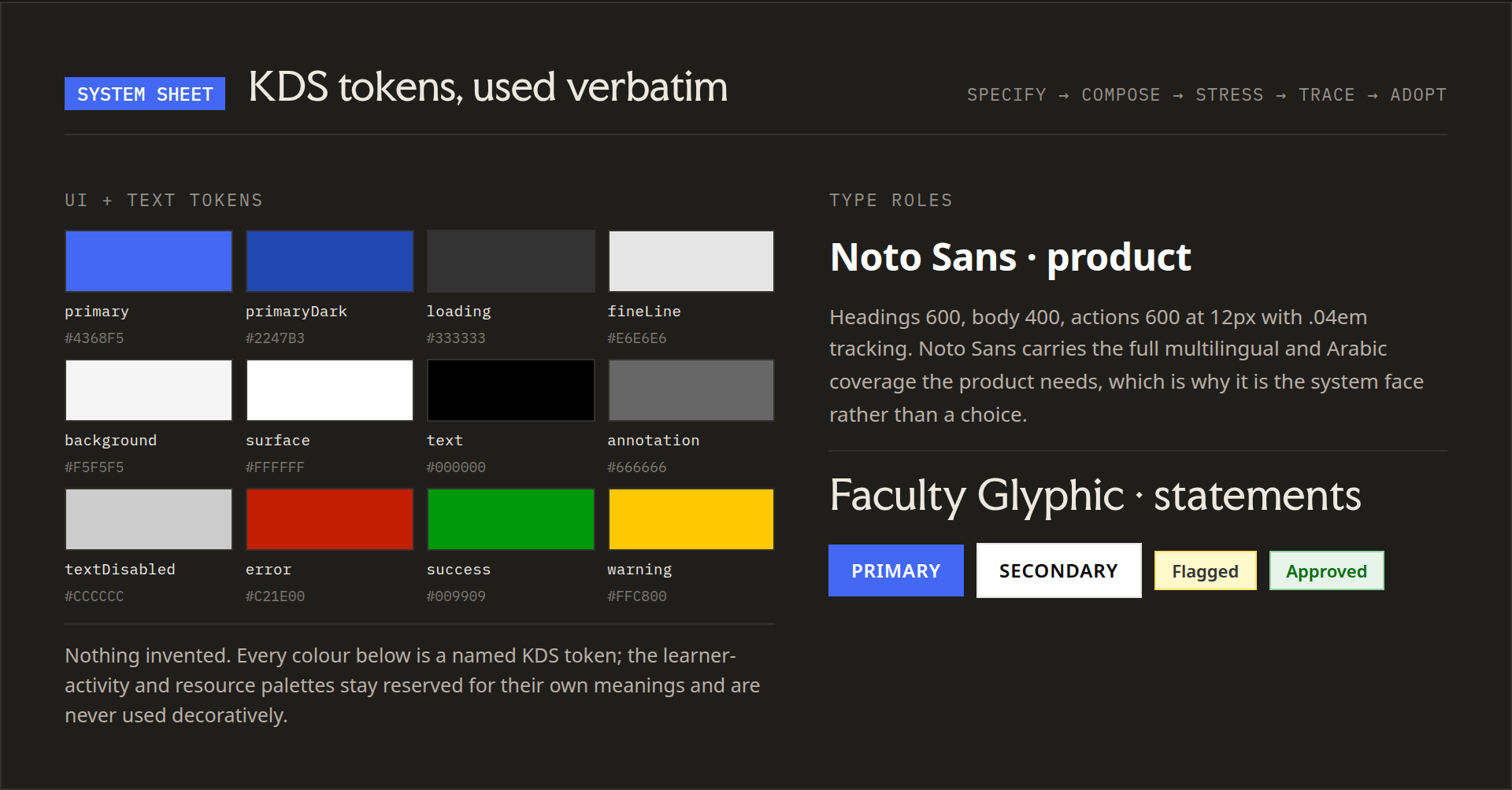
Contributor to the open-source Kolibri Design System (500+ components); listed in Kolibri AUTHORS.md. I also designed a new 100+ component design system for learningequality.org and led the public website redesign with in-house engineering.
The constraint set
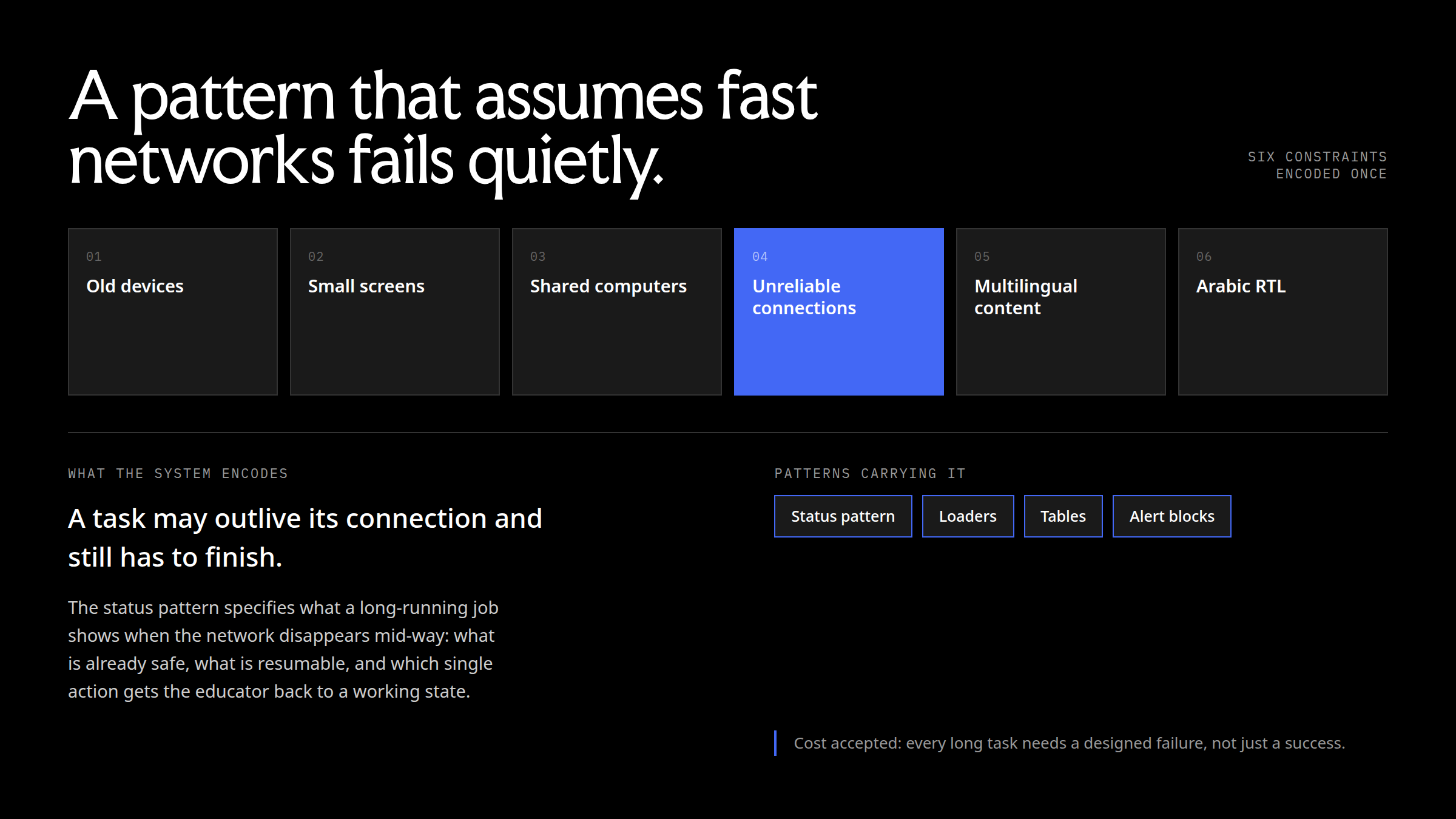
Kolibri runs in learning environments with old devices, small screens, shared computers, unreliable connections, multilingual content and Arabic RTL interfaces. A pattern that assumes fast networks or modern hardware fails quietly in exactly the places the product exists to serve. The design system had to encode those constraints so individual features did not have to rediscover them.
What follows is the system as a set of settled decisions: type, the card, direction, status and loaders, tables, the atoms built on top, and what all of that removed from feature work.
Type as named roles, not sizes
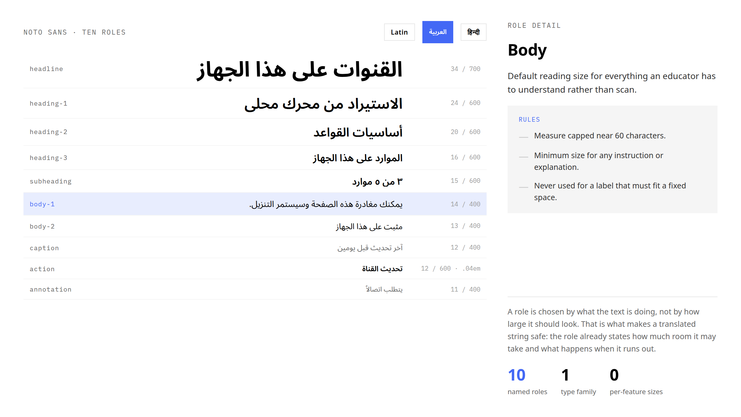
Noto Sans is the system face because of script coverage, not preference: the same ten roles have to carry Latin, Arabic and Devanagari. A role is chosen by what the text is doing — headline, heading, subheading, body, caption, action label, annotation — not by how large it should look. That is what makes a translated string safe: the role already states how much room it may take and what happens when it runs out.
The rules travel with the role. A headline is used once per screen and truncates to two lines, never one. An action label sizes to its content, so no button in the system is fixed-width, and stays at two words in English so translations hold one line. Annotation is the floor for contrast at its size and is never the sole carrier of a requirement. Ten named roles, one family, zero per-feature sizes.
The side panel, composed rather than designed
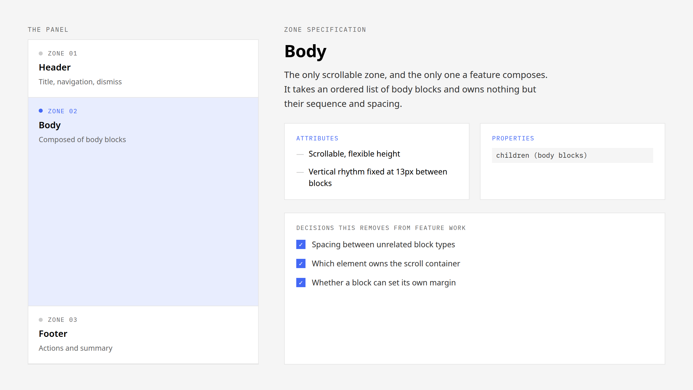
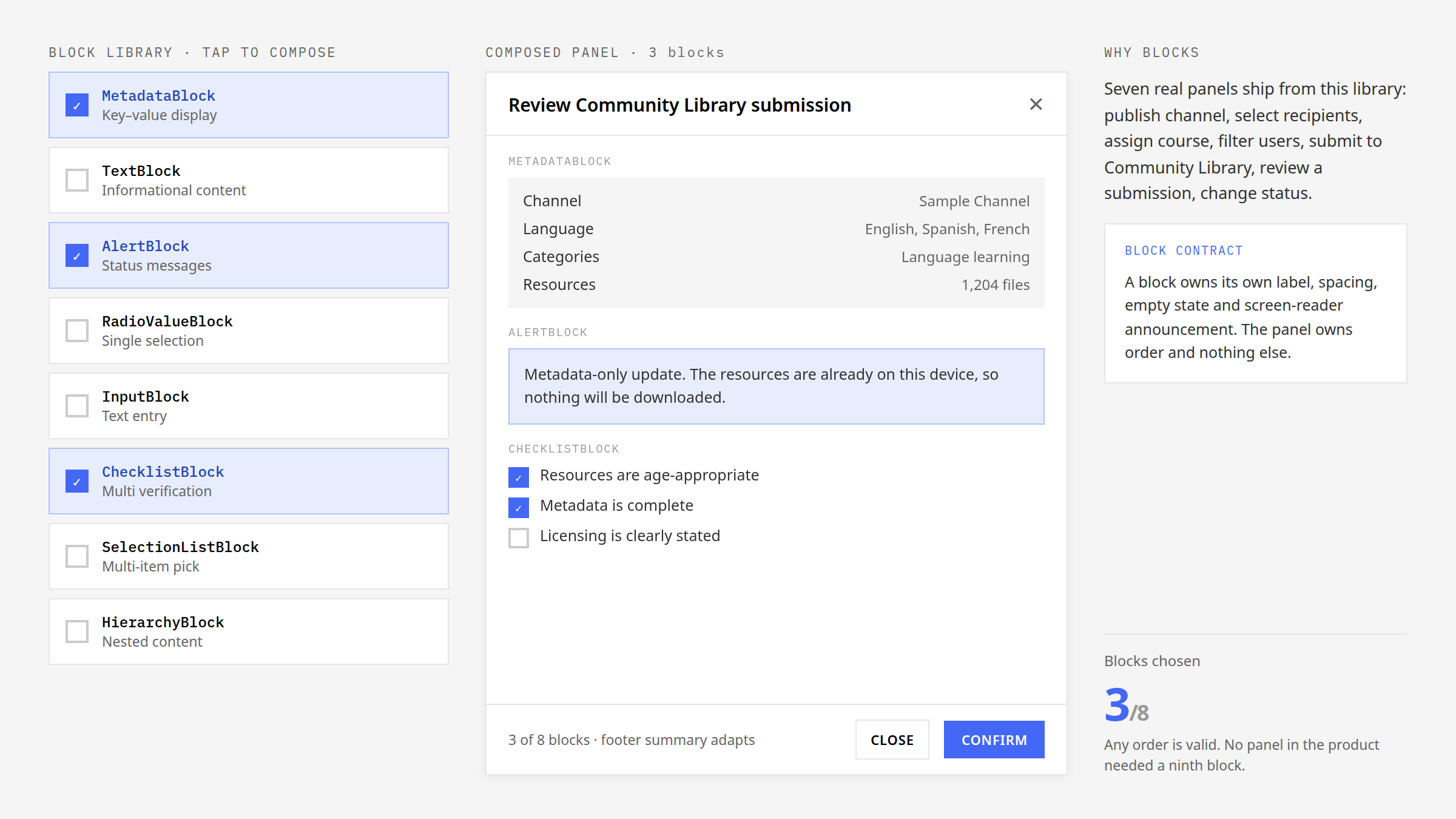
Seven real panels ship from one library — publish a channel, select recipients, assign a course, filter users, submit to the Community Library, review a submission, change status — so the panel is the clearest case of the system replacing decisions rather than adding components. Its architecture is three zones: a header that owns the title, navigation and dismiss; a body that is the only scrollable region; and a footer that owns the actions and the summary.
A feature composes a panel from eight body blocks rather than designing one. That is what settles the questions a feature would otherwise answer differently each time: the spacing between unrelated block types, which element owns the scroll container, and whether a block may set its own margin. Below 600px the panel becomes a full-screen sheet with stacked footer actions, and direction mirrors as a property of the pattern.
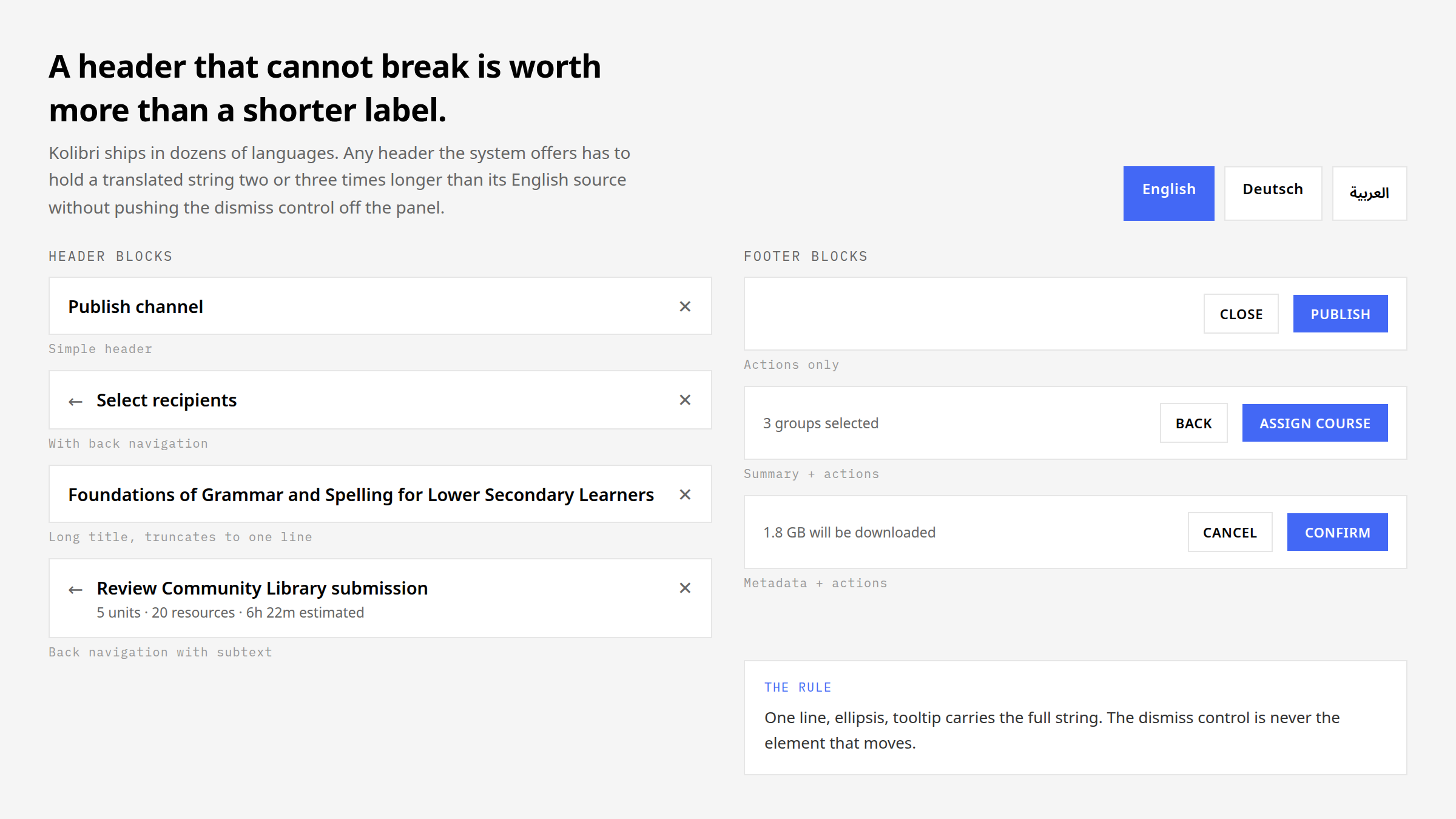
The header and footer are stress-tested against real strings rather than English placeholders: Kolibri ships in dozens of languages, and a header has to hold a translated string two or three times longer than its source without pushing the dismiss control off the panel. One line, ellipsis, the full string in a tooltip, and the dismiss control never the element that moves.
One card, five states, one content structure
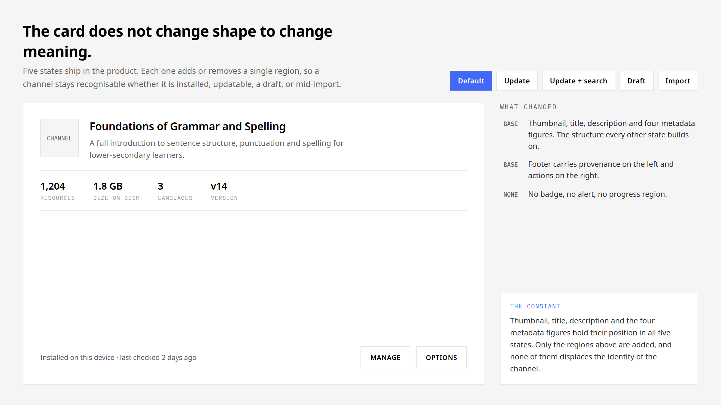
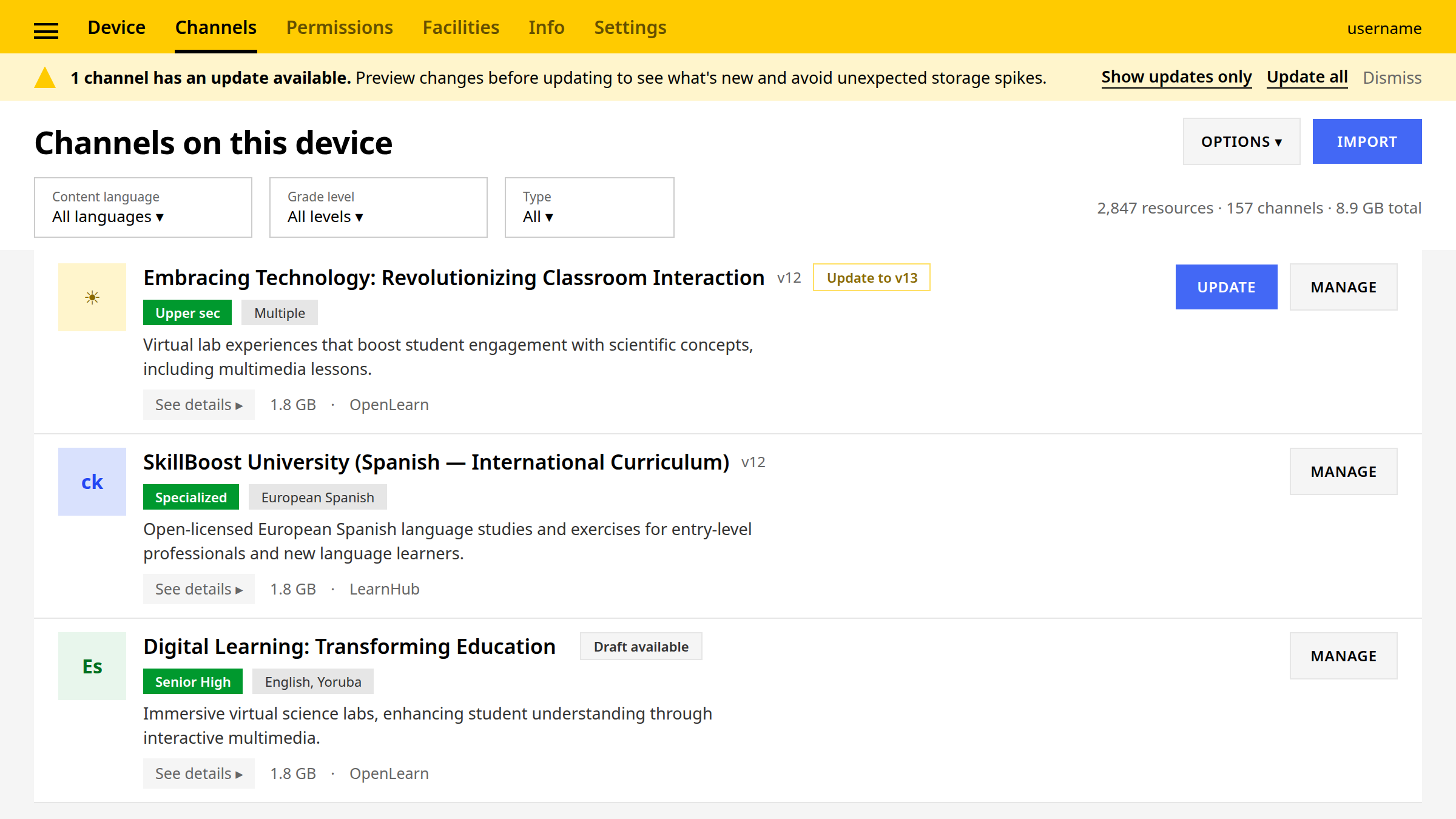
The card does not change shape to change meaning. Five states ship in the product — default, update, update with search, draft, import — and each one adds or removes a single region: a version badge, an alert naming exactly what will be downloaded, a search-context bar, a progress region reporting finished groups rather than a percentage. Thumbnail, title, description and the four metadata figures hold their position in all five, so a channel stays recognisable whether it is installed, updatable, a draft or mid-import.
The card got smaller over time by removing regions rather than by shrinking type. A draft shows its version as an em dash because an empty cell would read as a bug; an importing card keeps its place in the list because import never moves a channel to a separate screen.
What mirrors, and what must not
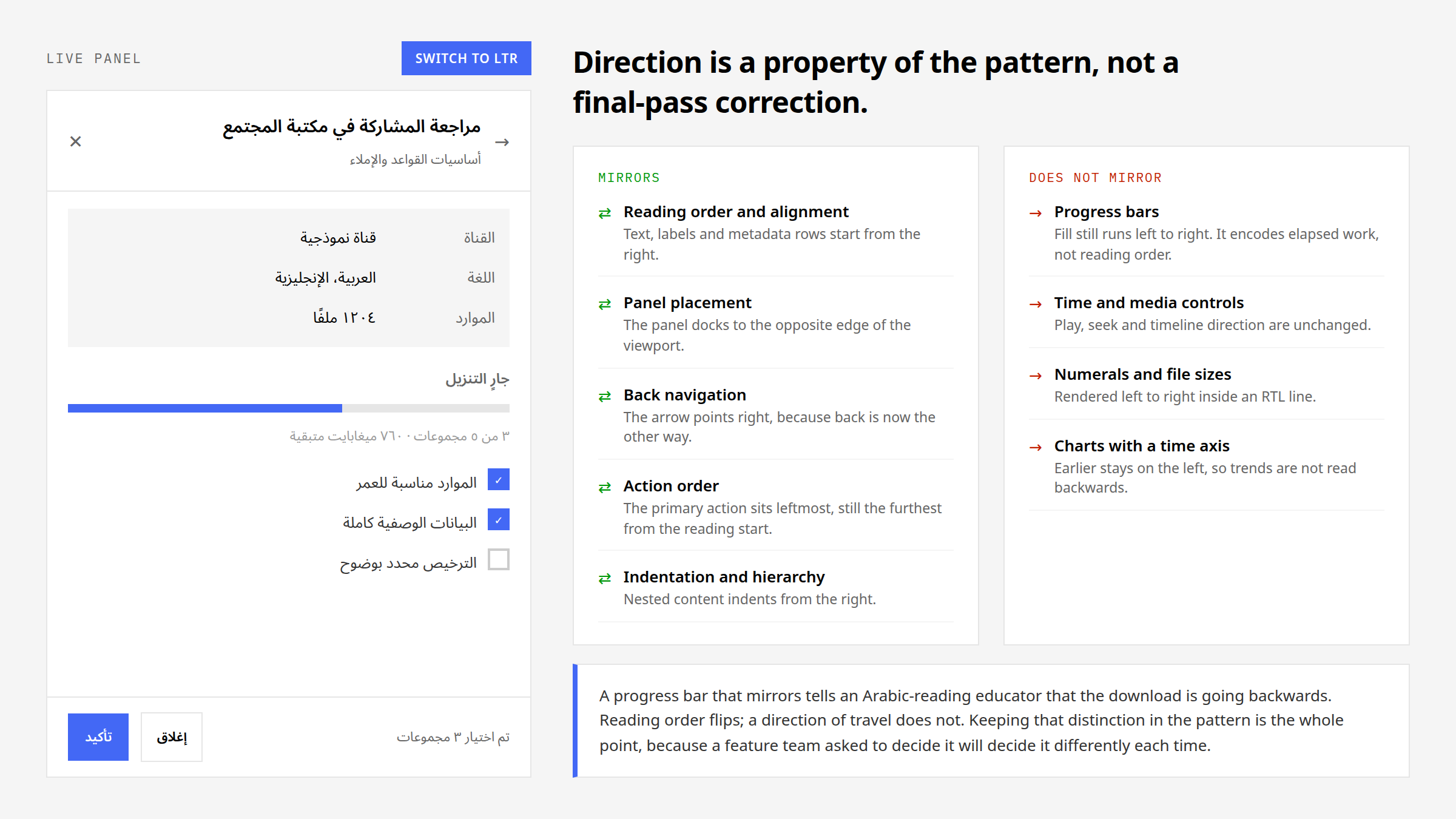
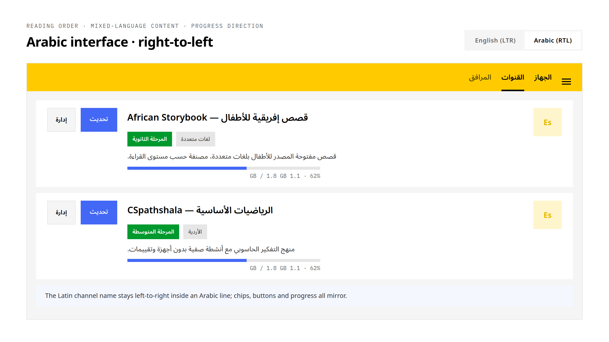
Direction is a property of the pattern, not a final-pass correction. Reading order, alignment, panel placement, back navigation, action order and indentation all mirror for Arabic. Progress bars, time and media controls, numerals, file sizes and charts with a time axis do not, because they encode a direction of travel rather than a reading order.
A progress bar that mirrors tells an Arabic-reading educator that the download is going backwards. Keeping that distinction inside the pattern is the whole point: a feature team asked to decide it will decide it differently each time.
Status, loaders and confirmations
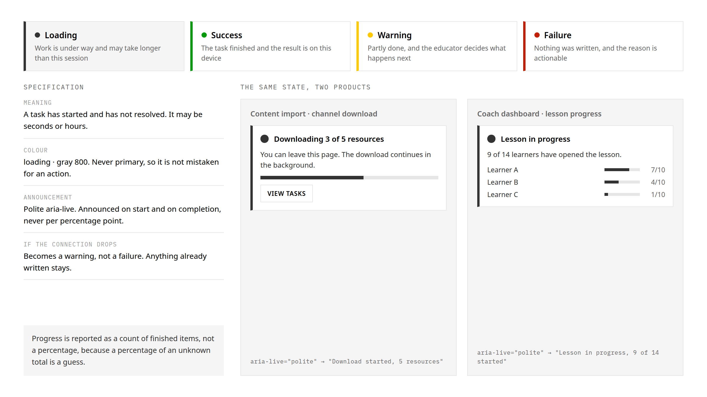
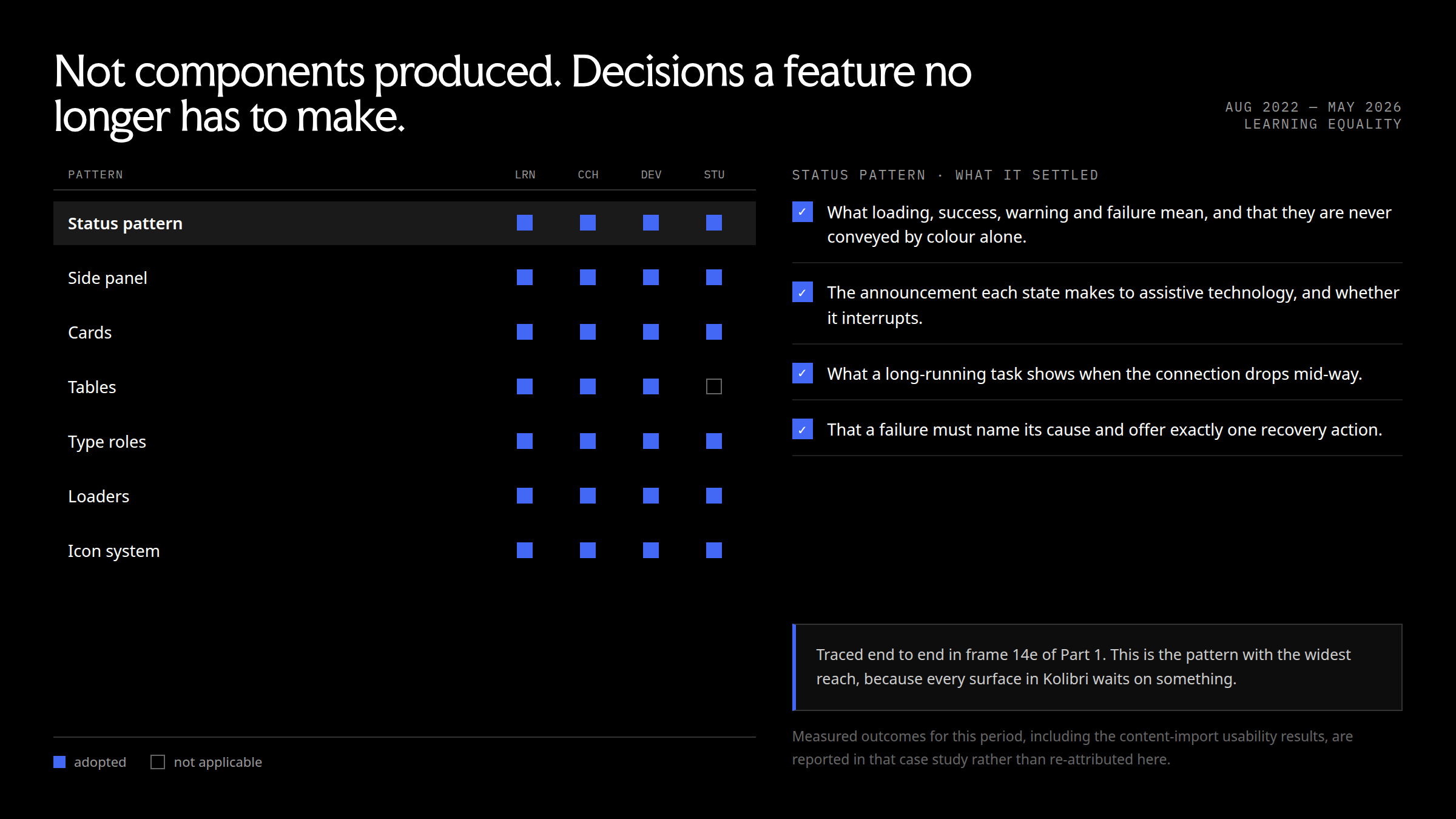
The status pattern has the widest reach in the system, because every surface in Kolibri waits on something. It settles what loading, success, warning and failure mean and that they are never conveyed by colour alone; what each state announces to assistive technology and whether it interrupts; what a long-running task shows when the connection drops mid-way; and that a failure must name its cause and offer exactly one recovery action.
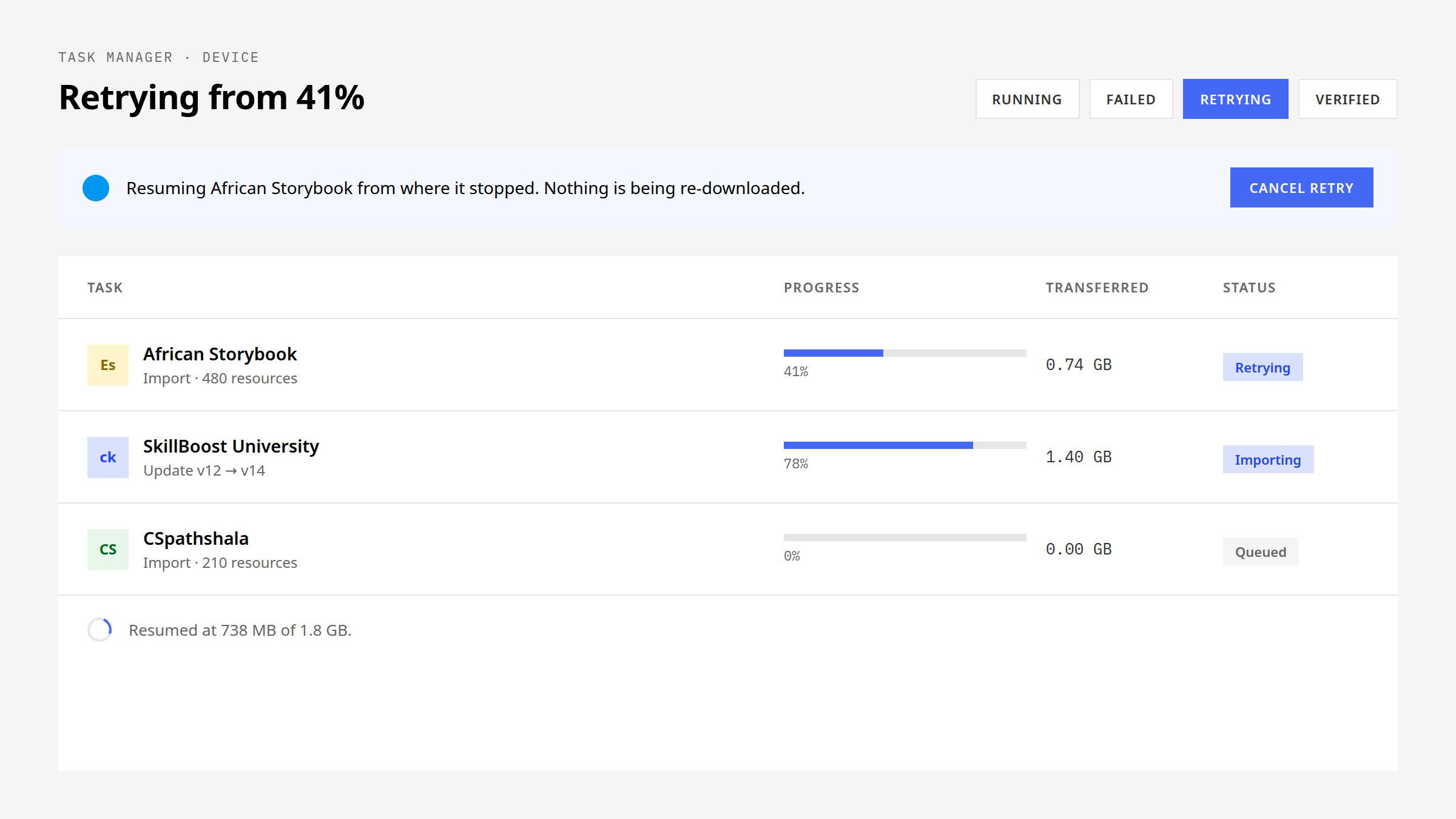
Loaders follow from the hardware. Progress is reported as a count of finished items when the total is known, never as a fabricated percentage, and nothing in the system depends on animation to be legible, because a spinner on old hardware can drop to two frames a second. Confirmations follow the same discipline: built as a set, so the irreversible actions read as one pattern rather than four dialogs.
Tables at two densities
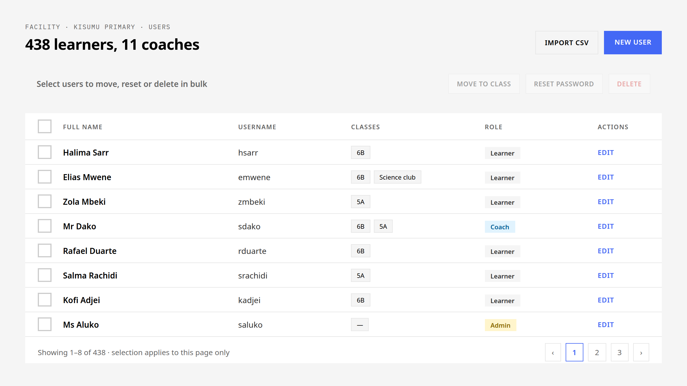
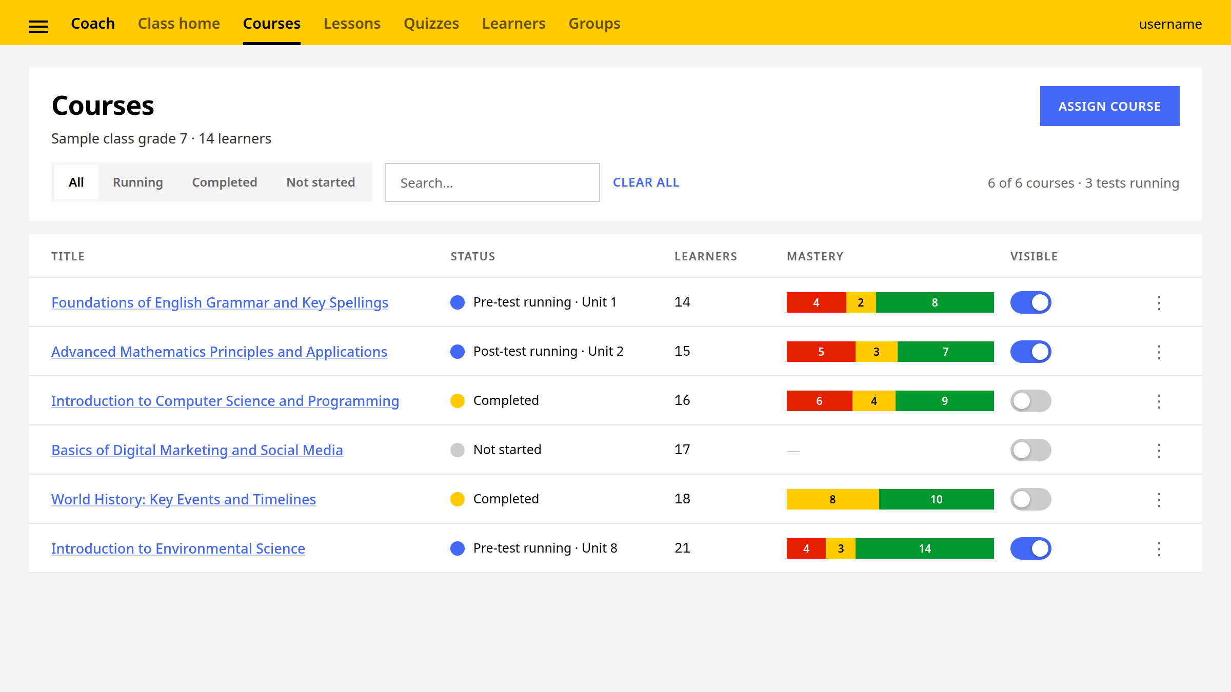
The table pattern settles column behaviour when a translated header is twice its English width, what an empty cell means and that it is never left blank, and which columns survive at the narrowest supported width. The user table in device management and the courses table in the coach dashboard are the same pattern at two densities.
Atoms built on the system
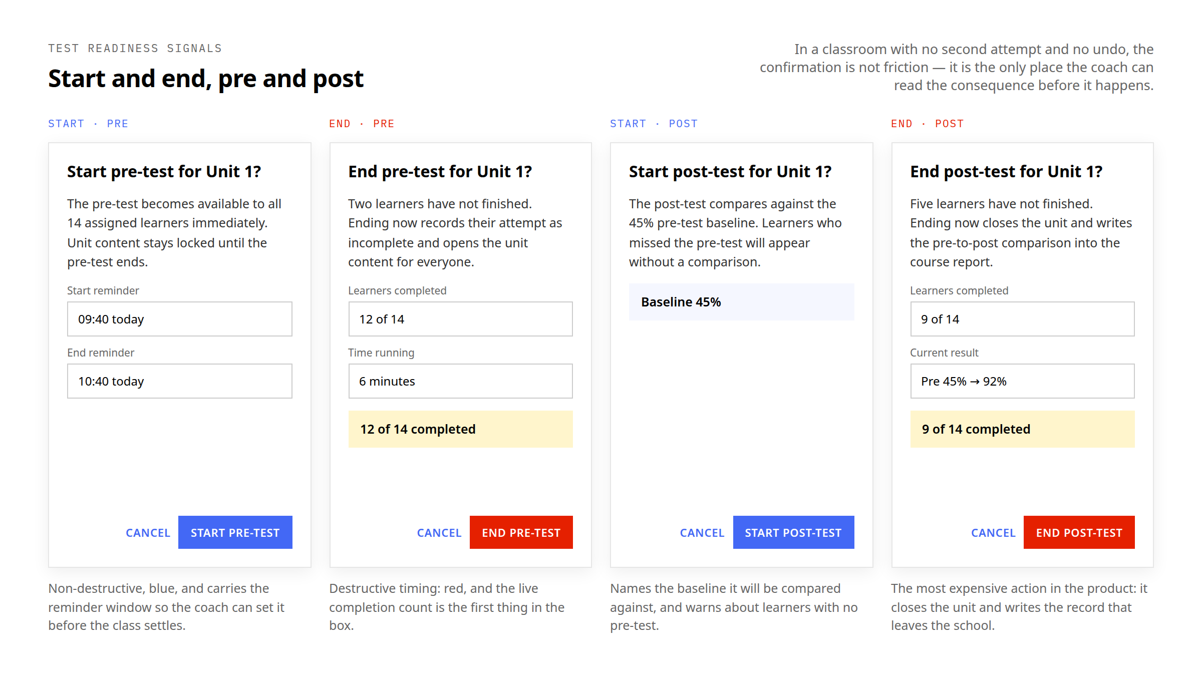
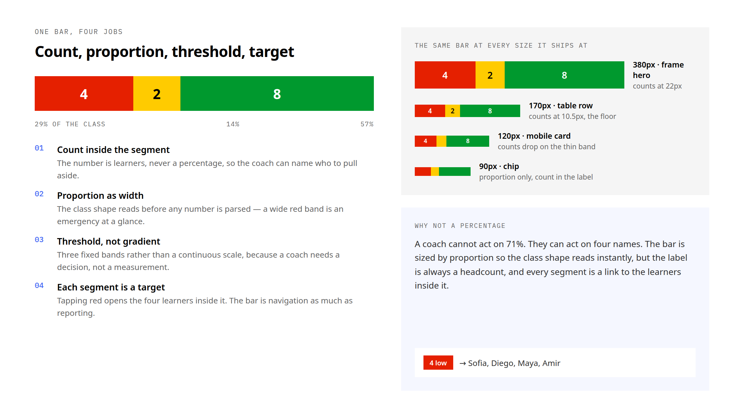
A product surface extends the system with atoms, not with exceptions. The coach dashboard added five on top of the tokens — the tri-colour mastery bar, the risk pill, the active-unit and active-test chips, and the test-readiness confirmation — and the mastery triad is the only place three colours sit together in the system. The bar is specified down to the width at which it becomes a chip without losing its headcount.
What the system removed from feature work
Not components produced: decisions a feature no longer has to make. Each pattern settled something once, on behalf of every feature that came after it.
- Side panel. A three-zone architecture so no feature decides where a dismiss control lives; eight body blocks covering every panel shipped; a full-screen sheet below 600px with stacked footer actions; direction mirrored as a property of the pattern. Seven distinct panels ship from one library.
- Cards. Five states sharing one content structure, which region each adds, and how a card behaves inside a filtered list.
- Tables and loaders. Translated headers, empty cells, surviving columns; progress as a count of finished items, and nothing that depends on animation to be legible.
- Icon system. Which icons mirror in RTL and which encode a direction of travel and therefore do not; learning-activity and resource-category colours reserved and never decorative, which is why the rest of the system uses so little colour.
Status and boundary
Designed during my Learning Equality tenure, Aug 2022 to May 2026, as shared infrastructure for the Kolibri product family. The measured outcomes attached to this period — the usability-testing results for content import — are reported in that case study, not re-attributed to the design system. Every channel, learner and count inside these frames is representative data drawn for the frame.
Two design systems, two kinds of ownership
Kolibri's existing open-source design system had 500+ components. I extended and maintained patterns within it through feature specifications, accessibility work, reviews and design QA. Those 500 components are the scope of a shared library, not a personal creation count.
I separately designed the 100+ component system for learningequality.org, including page architecture, responsive layouts and reusable public-site patterns, with the in-house developers implementing the site. Design reviews and guidance to external contributors made the decisions reusable beyond my own feature work.