Stratfortis
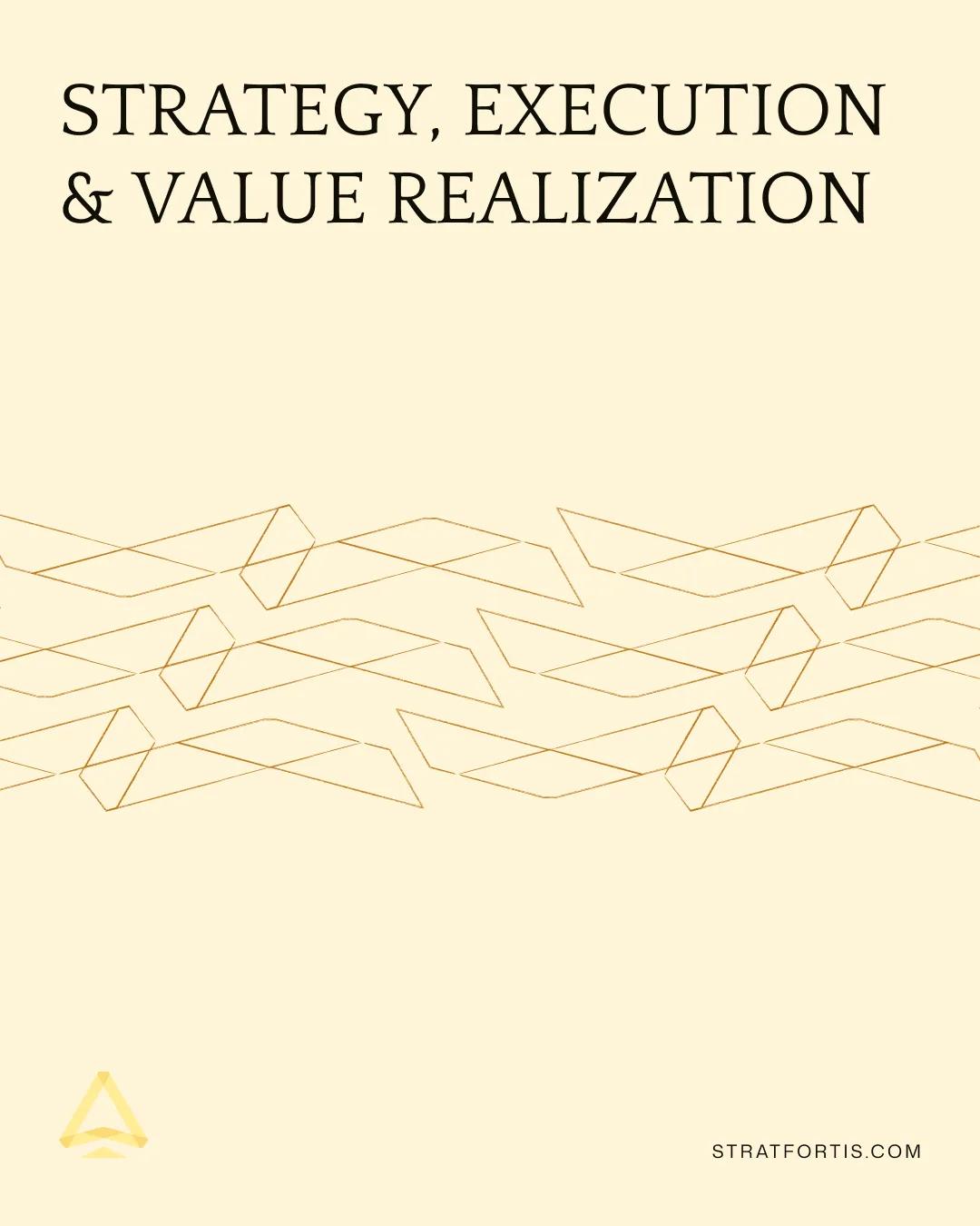
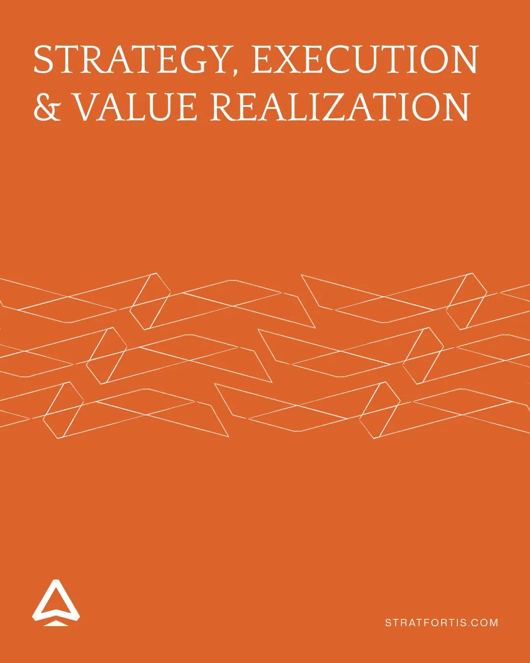
Stratfortis needed a distinctive visual system for formal advisory work and everyday communications. I designed a geometric mark, a line-work pattern and a set of typographic and colour treatments that carry from presentation material into social creative.
The visual brief
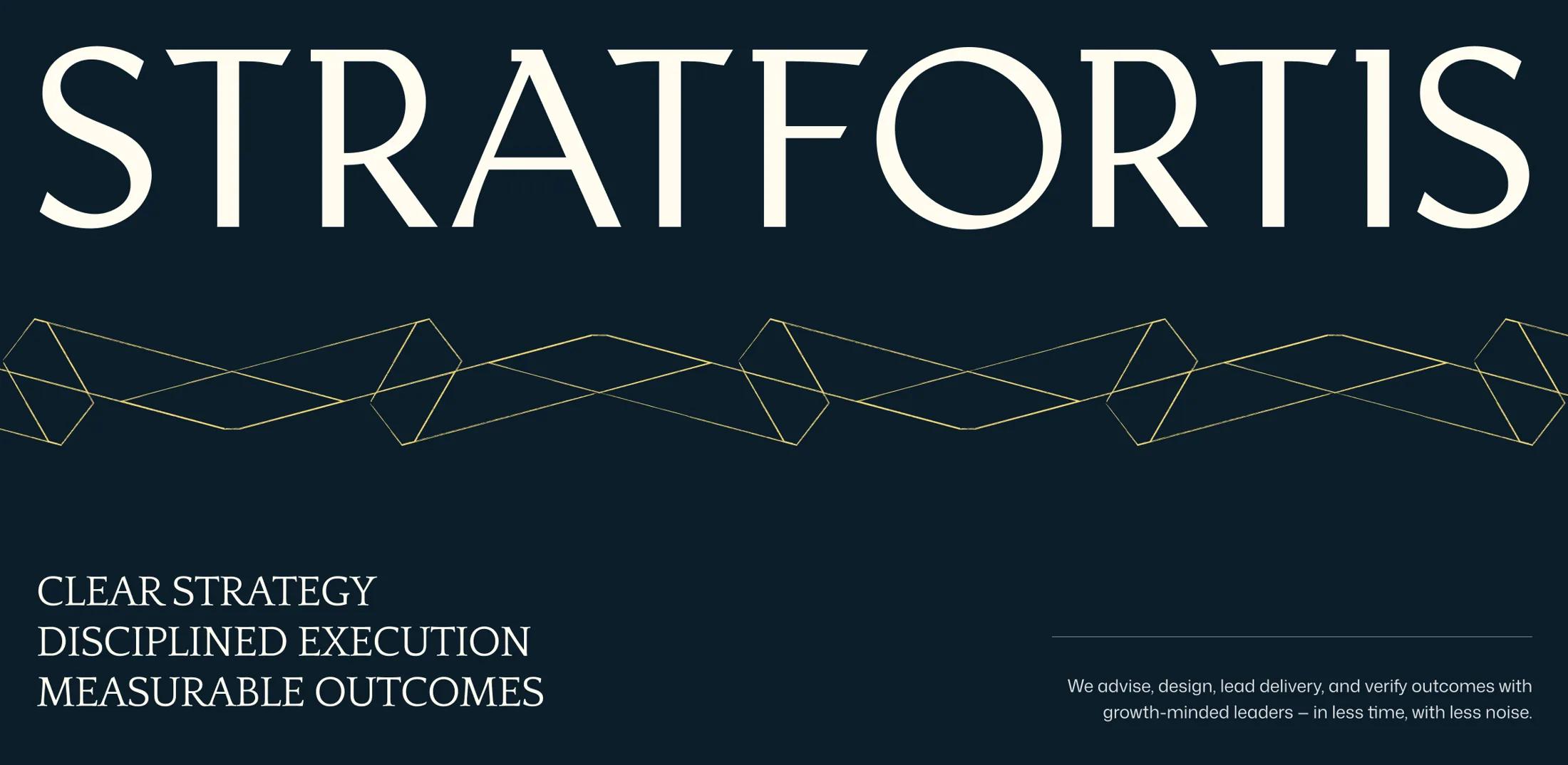
Stratfortis works across strategy, execution and advisory. I built the identity around the firm's own promise: clear strategy, disciplined execution and measurable outcomes. The logo, line motif and colour system give that message a recognizable form.
I developed the mark and graphic treatments, then applied the system to presentations, stationery and social content. The geometric motif carries across sizes and colourways while the typography keeps the message legible.
The mark and supporting geometry
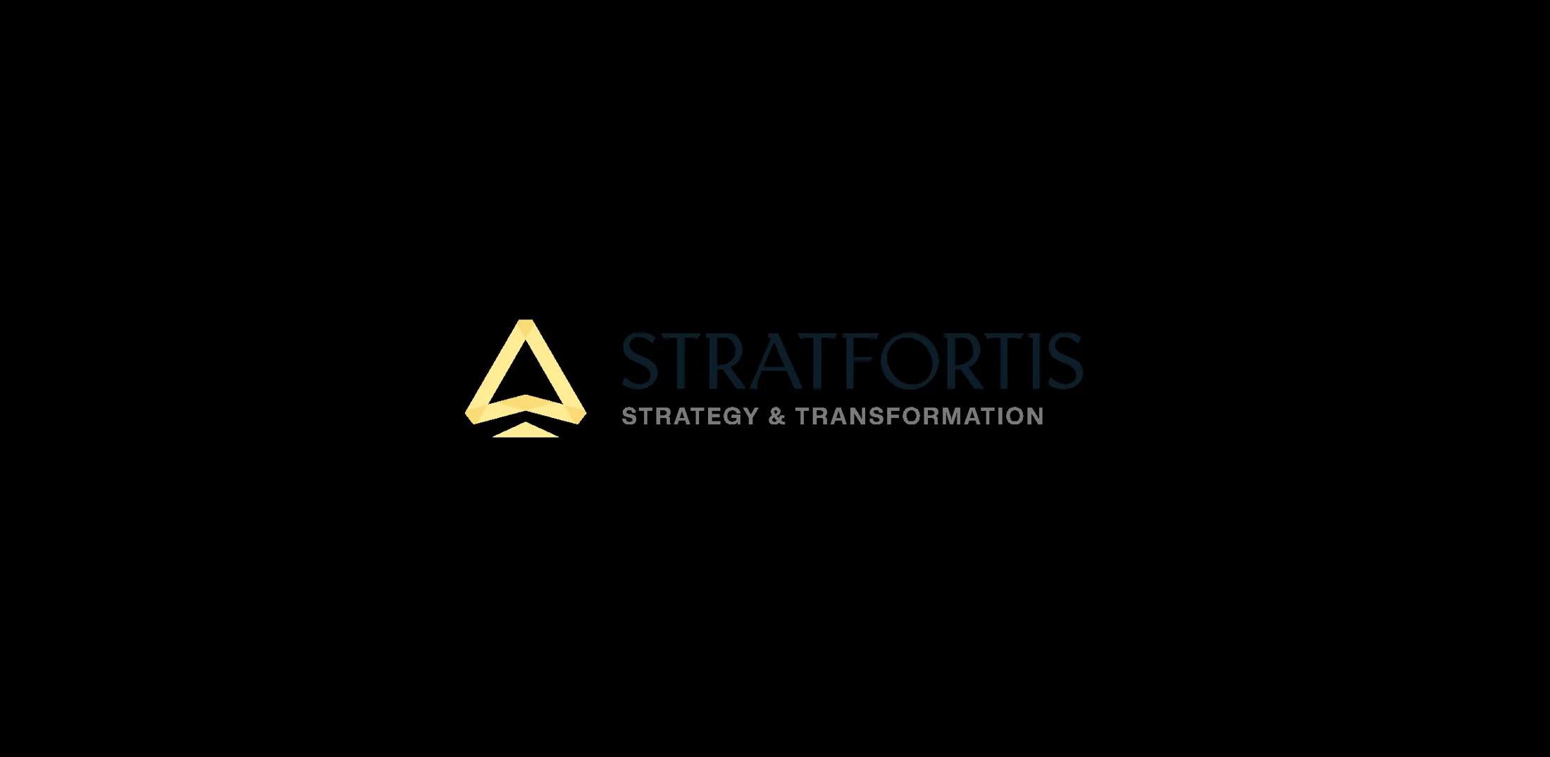
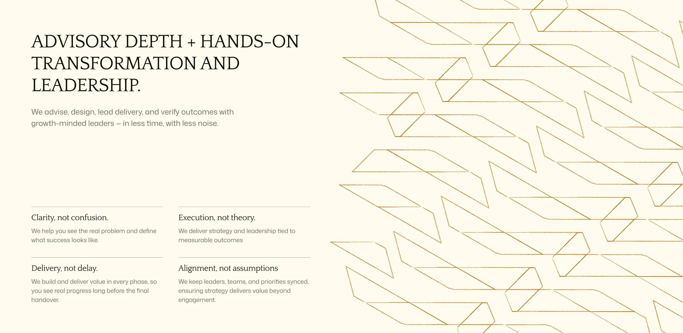
A small triangular emblem carries the identity. The repeated angular line-work enlarges the same visual idea into an adaptable background treatment, giving long-form slides and short social graphics a common visual signature.
Navy, cream and brighter accent colours let layouts move between restrained corporate materials and bolder social treatments without inventing an unrelated identity for each channel.
Applying the direction to communications
The social layouts use concise headlines, generous margins and one deliberately prominent visual element. The layout family keeps the brand mark and the angular pattern constant while varying colour and content hierarchy.
The portrait templates switch between editorial quotations, numeric statements and typography-led campaign posts. The brand stays recognisable while the emphasis changes.