Kalvia
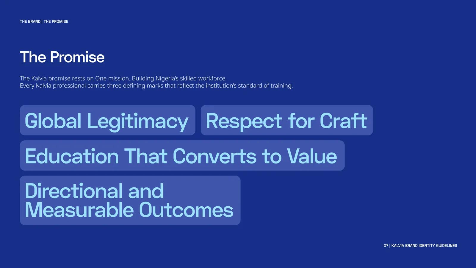
Kalvia is building an institutional identity for vocational training in Nigeria. I designed its seal, a trade-coded colour system and the guidelines that connect programme identities, typography, photography and campaign creative.
The problem
The brief states the diagnosis plainly: the gap is not intelligence or ambition, it is institutional infrastructure. Vocational training has been positioned as a second choice, so trades carry social stigma, rigour varies between providers, and graduates finish with credentials that mean little outside their immediate market.
A new institution claiming international standards therefore has a design problem before it has a marketing one. It has to look like an institution — the visual register of accreditation and permanence — while still speaking to a nineteen-year-old choosing between a trade and a university queue. Most training providers in this space look like short courses, and short courses do not confer credibility.
My role
Brand identity design across both halves of the system: the verbal identity — positioning and tone of voice — and the visual identity — the mark and its size rules, the colour architecture, the typographic system, imagery direction and the first application set. Delivered as the Kalvia brand identity guidelines.
The solution
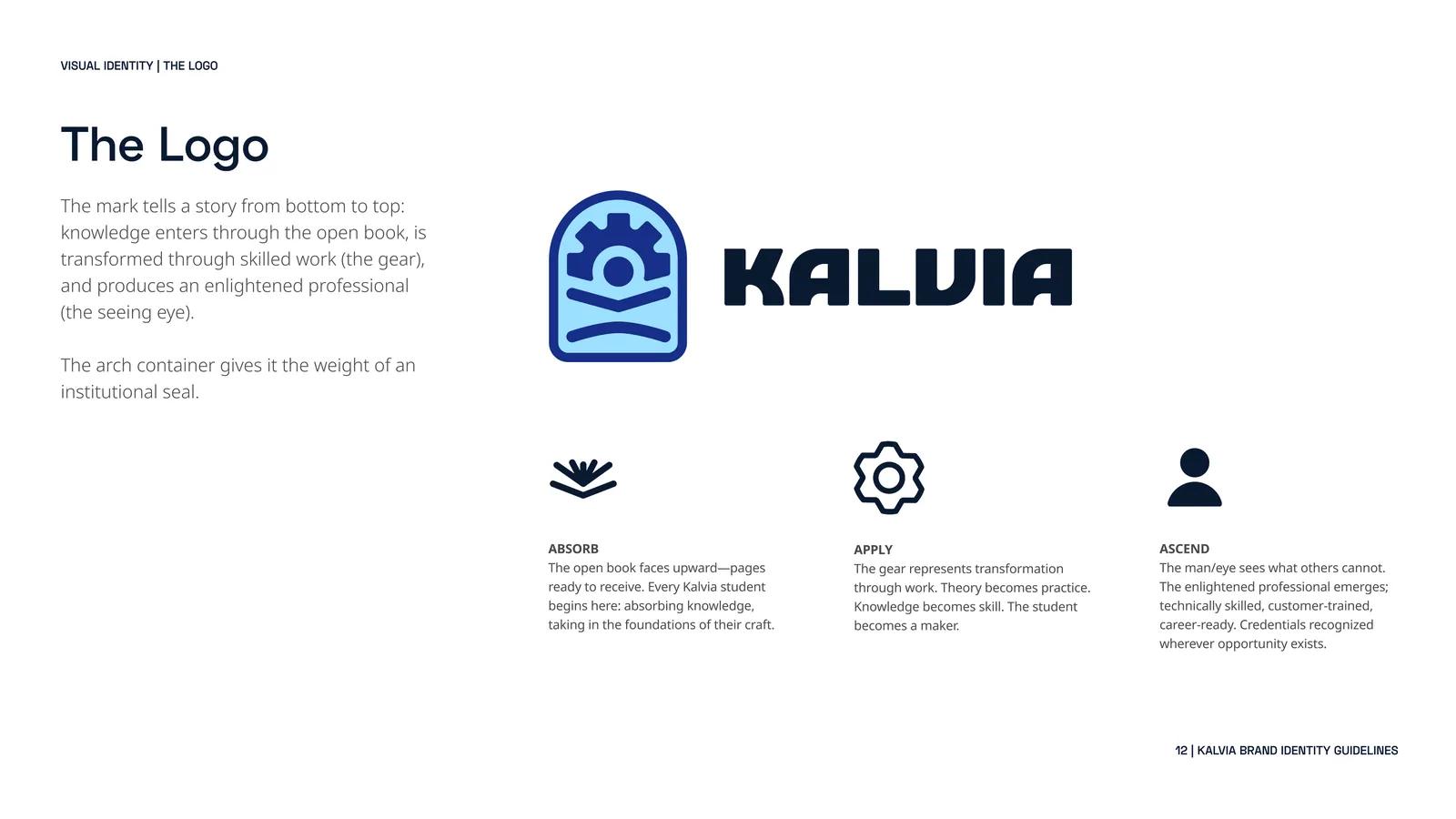
The mark reads bottom to top as the student’s journey, and each element is assigned a stage:
- Absorb — the open book faces upward, pages ready to receive. Every student begins by taking in the foundations of a craft.
- Apply — the gear is transformation through work. Theory becomes practice; the student becomes a maker.
- Ascend — the figure and eye see what others cannot: the trained professional, technically skilled and career-ready.
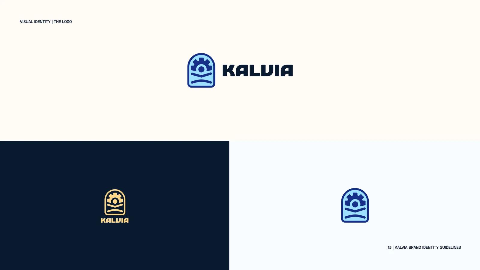
The arch around it is the deliberate part. It borrows the geometry of a seal — the shape universities, chambers and licensing bodies use — which is exactly the register a trade school is usually denied.
Because a seal collapses into mush at small sizes, the system specifies minimum sizes rather than hoping: never below 0.25 inches in print, 100 pixels at 1x or 200 pixels at 2x, with drawn small, medium and large states so each character stays definable.
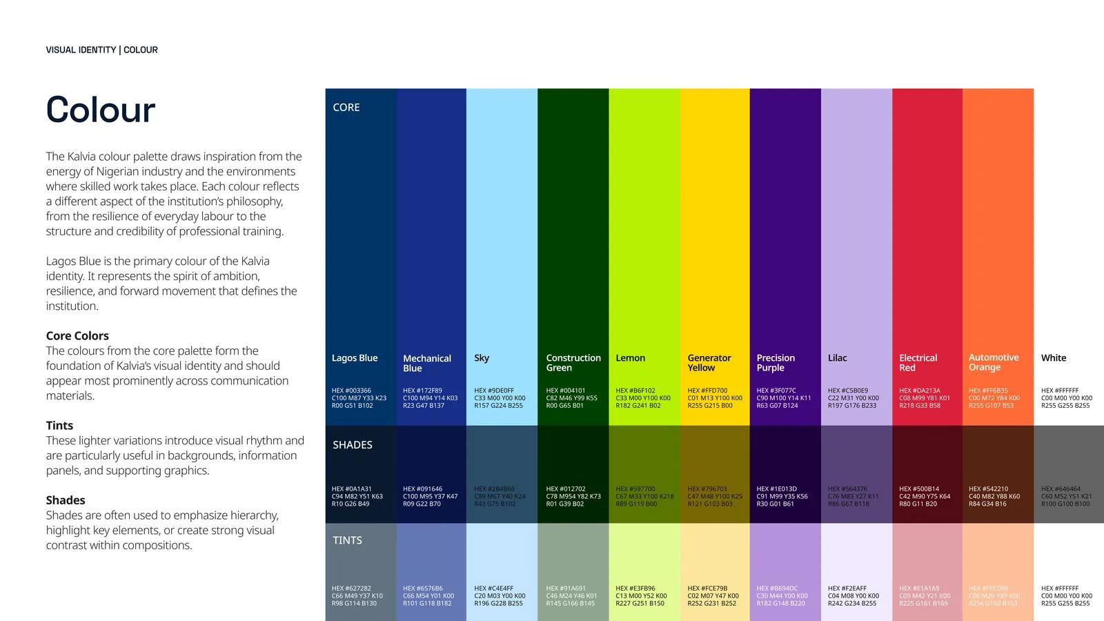
Lagos Blue #003366 anchors the identity. Around it the palette is coded to the trades themselves — Mechanical Blue, Construction Green, Generator Yellow, Precision Purple, Electrical Red, Automotive Orange — so each discipline gets its own colour inside one institutional system. Adding a programme means picking a colour, not reopening the brand.
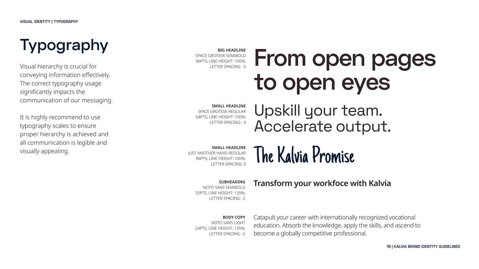
Space Grotesk sets the primary voice and Noto Sans handles dense copy. The third face is the interesting choice: Just Another Hand, a handwritten accent used sparingly, so an institution addressing a nineteen-year-old does not read as a licensing authority.
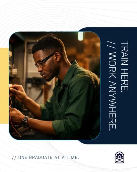
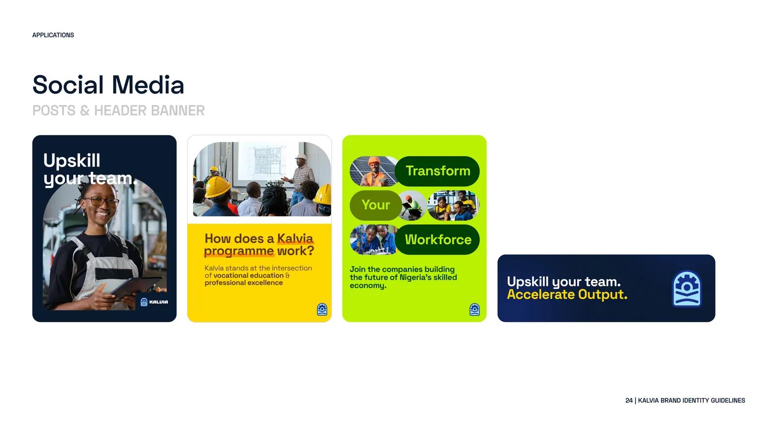
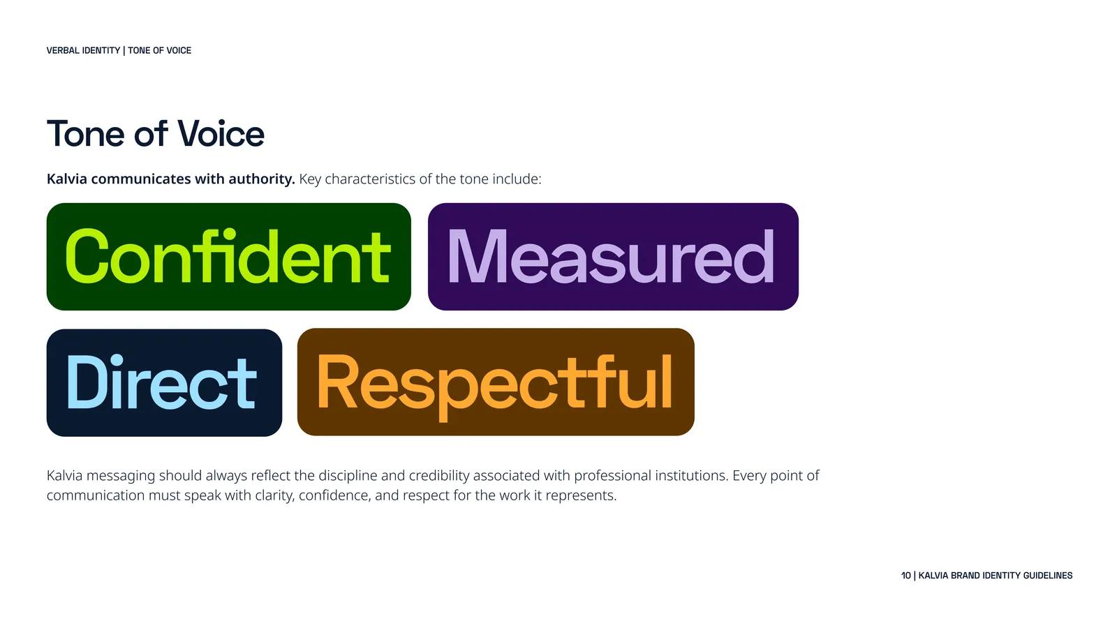
The verbal identity is short and enforceable: confident, direct, respectful, measured. Imagery direction is equally specific — real people, dynamic work moments and contemporary Nigerian spaces, in clean compositions with vibrant tones. It rules out the two stock defaults: staged smiling students, and grimy documentary shots that reinforce the stigma the institution exists to dismantle.

Impact
Kalvia now has a defined mark, minimum-size rules, a colour for each training discipline, a typography hierarchy and visual direction for its first campaign treatments. New programmes fit into the same system.
The identity guidelines cover positioning, visual standards, social applications and the materials needed to introduce the institution.
Campaign applications
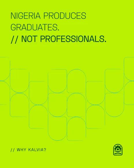
The first campaign series uses the same institutional blue, arch mark and graphic fragments at social scale. Portrait photography and type can lead separately without losing the parent identity.