What happens when one successful product wants to become a category?
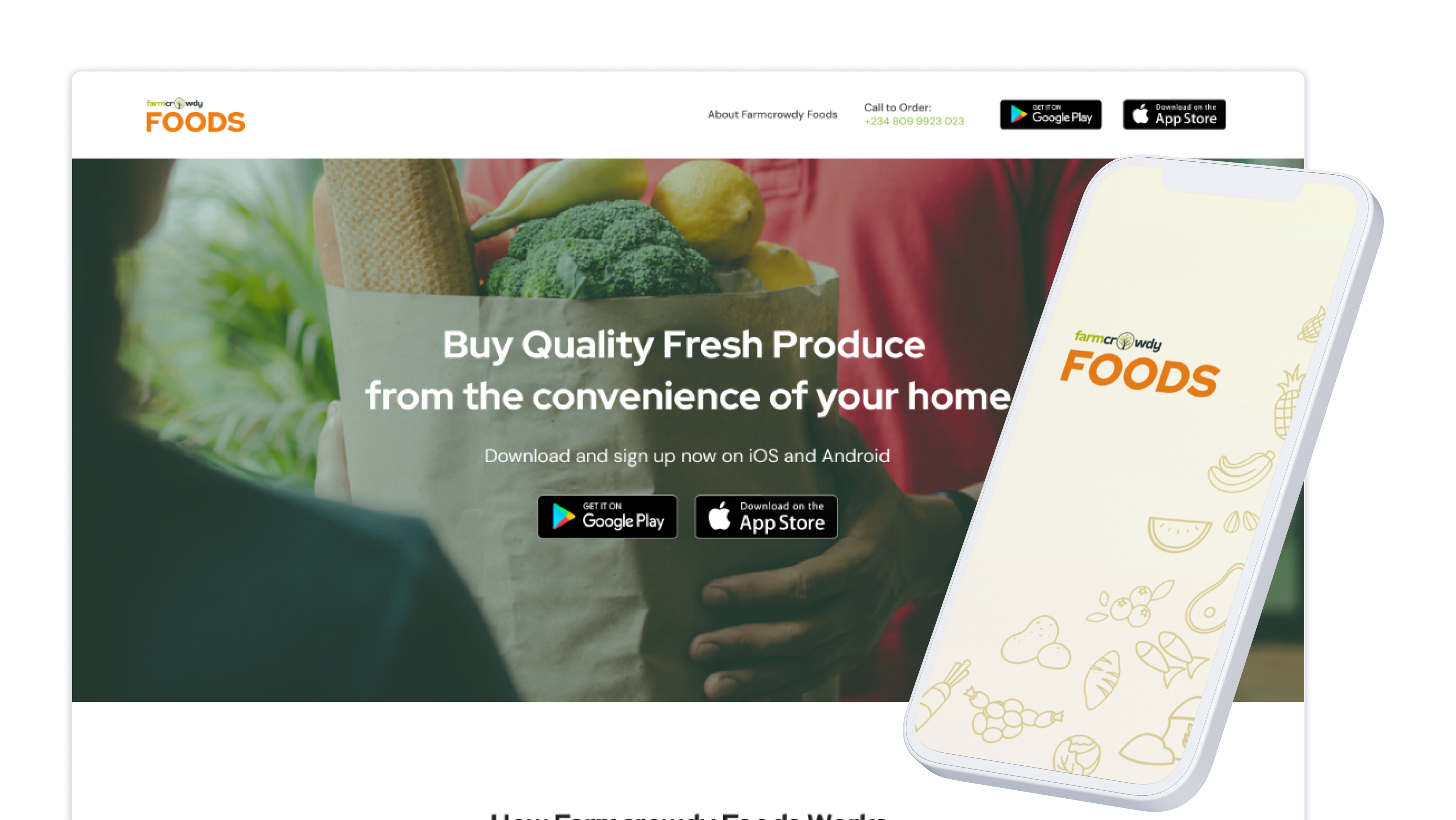
I led the brand identity and supervised the first app and website as Crowdyvest became a standalone platform for impact-driven investment opportunities. The work introduced a new company while preserving confidence that existing Farmcrowdy sponsorships, history and support remained intact.
Farmcrowdy had already shown that people would fund agricultural projects through a digital platform. Crowdyvest was created to take that behaviour into a standalone product and eventually open it to opportunities beyond farming.
I led the Crowdyvest brand identity and supervised product design for its first app and website. The work covered the logo and visual system, product direction, launch materials and the operating collateral the new company needed to appear coherent from its first public touchpoint.
The difficult part was continuity. Existing Farmcrowdy sponsors already had accounts, active sponsorship cycles and money tied to future returns. Crowdyvest needed to look like a new company while making those users feel that nothing important had been lost.
Why Crowdyvest had to exist
Farm sponsorship had outgrown the boundaries of the Farmcrowdy product.
The company wanted one platform where members could discover and sponsor opportunities across several sectors, with Farmcrowdy becoming one portfolio company within a wider investment model. This meant moving the sponsorship relationship into a new product while preserving the trust Farmcrowdy had earned.
For an existing sponsor, the corporate structure was secondary. Their real questions were immediate:
- Are my active sponsorships still here?
- Can I see what I invested and when the cycle ends?
- What return should I expect?
- Who do I contact when something is unclear?
- Can I trust new opportunities outside agriculture?
The brand and product had to answer those questions together.
Building a distinct identity while carrying inherited trust
Crowdyvest needed to feel broader than Farmcrowdy while retaining enough continuity for existing sponsors to recognise the relationship.
I developed a circular mark built from repeated directional forms, supported by a palette of deep teal, green, mint and lime. The mark could work as a complete logo, a large background shape or a set of smaller graphic fragments. That flexibility mattered because the identity had to move between a financial product, company documents, staff materials and physical launch environments.
The system was applied across:
- business cards and staff ID cards
- letterheads and envelopes
- notebooks and stickers
- shirts
- pull-up and trifold banners
- event backdrops and picture walls
- app and website interfaces
This breadth was deliberate. A financial product loses credibility quickly when the app, legal documents, staff credentials and physical events look like different companies.
Turning the brand into product rules
The logo was only one part of the identity. The app needed a consistent way to communicate money, time, progress and support.
I set the visual and interaction direction and supervised the first product design across onboarding, account access, sponsorship management and content. The product used the darker teal for primary actions and headings, with the brighter greens reserved for progress, links and returns. Illustrations and category graphics were constructed from the same shapes as the logo so the visual language did not stop at the splash screen.
The product direction was built around four rules.
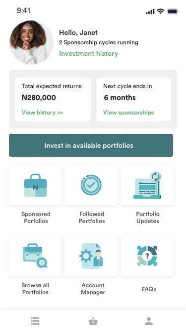
Show the user’s position first. The dashboard opens with the user, their number of active sponsorship cycles, total expected returns and the time remaining on the next cycle. That is more useful than leading with promotional opportunities: a returning sponsor needs to know where their money stands before being asked to invest again.
Separate commitment from interest. “Sponsored portfolios” and “followed portfolios” are different states. One contains money already committed; the other is a watchlist. Keeping them separate reduces the chance that a user mistakes interest for an active investment, and gives the product a clearer route back to opportunities they may fund later.
Make ongoing updates part of the product. A sponsorship does not end at payment — users need updates while the underlying project runs. “Portfolio updates” was therefore placed alongside investment history and active sponsorships rather than hidden in a generic notification centre. The decision treated reporting as part of the financial relationship.
Keep human support visible. The dashboard included direct access to an account manager and FAQs. Crowdyvest was asking people to put money into projects they could not directly inspect; a named support route gave users somewhere to go when the interface alone could not resolve a question.
Designing the first account experience
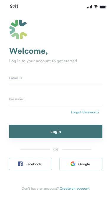
The account flow used familiar patterns: email and password, social sign-in, account creation and password recovery.
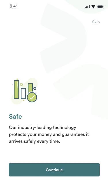
The onboarding sequence also addressed safety before the user reached the investment catalogue. This was a reasonable order for a new financial brand. The product was asking people to carry trust from Farmcrowdy into a company with a new name, broader scope and unfamiliar opportunities.
The surviving screens show a clean, sparse interface with one dominant action per page. That restraint helped the new brand feel more controlled and reduced the visual noise around high-consequence actions such as registration and login.
Expanding from farms to portfolios
The language of the product shifted from individual farms to portfolios.
That change allowed the same structure to support agriculture and other impact sectors without rebuilding the core experience for every new opportunity. Users could browse available portfolios, follow those they were considering, sponsor one and return later for updates.
The product architecture visible in the early screens included:
- account creation and login
- onboarding and security reassurance
- active sponsorship cycles
- investment history and expected returns
- portfolio discovery
- sponsored and followed portfolios
- project updates
- account-manager support and FAQs
- editorial and educational content
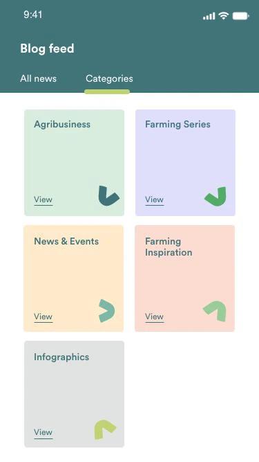
The content area still carried a strong agriculture bias in the early design, with categories such as Agribusiness and Farming Series. That makes sense for a product inheriting Farmcrowdy’s audience and content library. It also shows the next design task clearly: the information architecture would need to expand as Crowdyvest added sectors.
Designing the website and launch system
The website had a different job from the app.
The app served registered members managing sponsorships. The website had to explain the new company, establish legitimacy, describe the portfolio model and move new or migrating users into an account.
I supervised the website design so it used the same hierarchy, colour system, typography and graphic fragments as the app. The broader rollout carried that system into company documents, staff identity and event materials.
The sequence of the surviving files shows the work moving from identity and launch collateral in mid-2019 into a fuller product system through 2020. Crowdyvest was being built as a company people could encounter online, in person and through formal documents without the identity changing at each step.
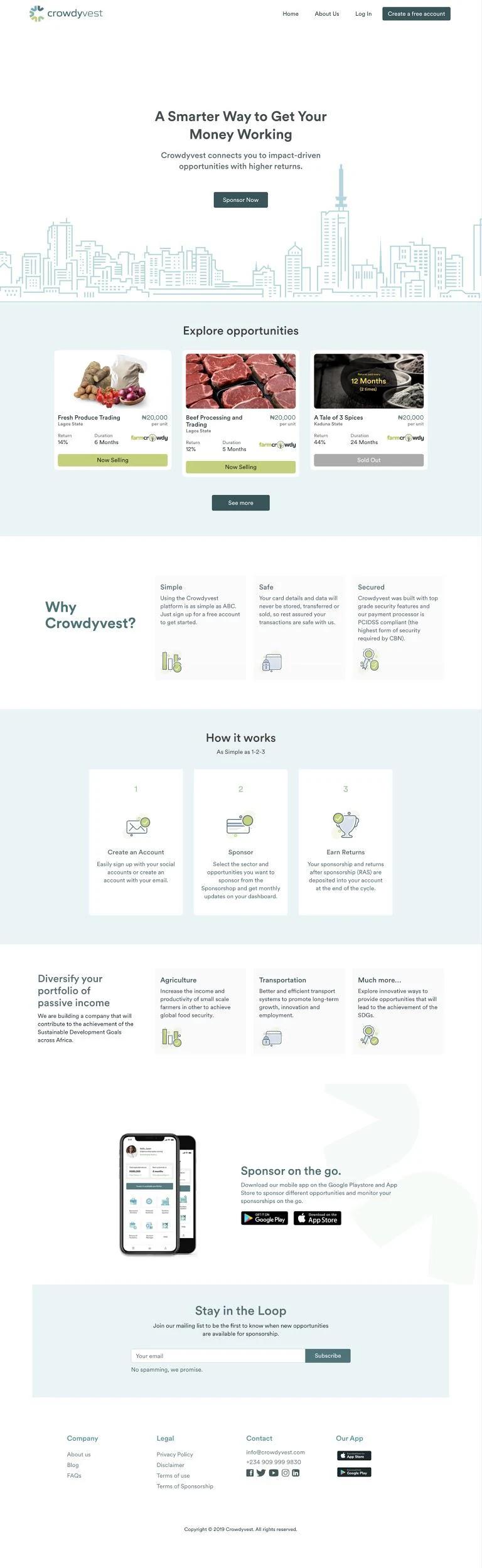
Scroll the frame to see the full page.
Launching while money was already in motion
Crowdyvest entered beta in 2019. Existing Farmcrowdy users were asked to consent to the transfer of their sponsorship data, then access their previous history and active commitments inside Crowdyvest.
That made the transition more than a visual rebrand. It involved:
- a new company and product identity
- account and data continuity
- active sponsorship states
- legal consent
- communication across Farmcrowdy and Crowdyvest
- support for users who did not understand the change
The product work had to respect all six at once. A polished new interface would have meant little if a sponsor logged in and could not find an existing investment.
Scope of this case study
This case study covers the brand identity and first product work completed in 2019–2020: the standalone identity, portfolio structure and continuity of existing sponsorships into the new platform. The scope ends with that launch period.
What this work proves
Crowdyvest sits at the intersection of brand, product and organisational change.
I helped move an existing financial relationship into a new product structure, then gave the platform enough range to support opportunities beyond agriculture.
The senior decision was to treat continuity as the core design problem. The logo, app, website, account history, portfolio states, support routes and launch materials all had to tell the same story: this is a new platform, and the commitments you already made are still accounted for.
The difficult part of changing the brand
Crowdyvest was taking a sponsorship relationship built around farms into a wider investment product. A new identity made sense, but people with an existing investment still needed recognisable ownership, balances and continuity. That forced the account model and launch communication to be designed together.
My role covered visual identity and product design direction across the website and app. The archived designs show the decisions behind that system. Customer migration completion and retention would be the right outcomes to measure; I have not turned the existence of migration screens into a fictitious success rate.