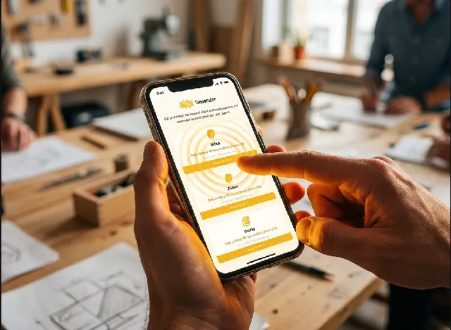
Back to work
AI / Learning / 2021 — 2022

Jarvis

Turning classroom data into teacher decisions.

AI-assisted teacher dashboard for RIIID Labs, turning learning diagnostics into actionable classroom decisions for US K-12 educators.

Teachers were teaching and configuring software built for someone else.

The research started with ten interviews. The most common answer to "what do you do before your first class?" was some version of the same thing: check three or four different tabs, copy names into a document, and try to remember which students had flagged issues last week.

That was not a workflow. That was a workaround — the kind that builds up when software is built for administrators who want reporting rather than teachers who need to teach.

The data was all there. The problem was that none of it pointed anywhere. Existing LMS dashboards treated teachers as data entry clerks. The product opportunity was not more data. It was a dashboard a teacher would actually want to open in the morning.

Design brief

Reduce interpretation work, expose the next useful action, and keep the teacher in teaching mode while the system does the bookkeeping.

CompanyRIIID Labs
RoleProduct Design Consultant
Period2021 — 2022
FocusAI learning, teacher workflow, dashboard design
8teacher interviews
2administrator interviews
10Maze test participants

The product had to answer more than one kind of urgency.

Teachers needed a fast class-level read, but they also needed to know which students to reach first, where assignments were stalled, and whether setup would block them before the lesson started.

What the surface had to do

Translate class health, student urgency, and administrative friction into one understandable sequence.

Class signal

A fast answer to how the class is doing without turning the morning into chart interpretation.

Student attention

A way to spot students trending in the wrong direction before they slipped further behind.

Assignment state

A coherent picture of work across grading, submitted, and not-yet-due states.

Roster setup

An onboarding flow that did not require an IT ticket before a teacher could start.

The dashboard became the proof artifact.

We reconstructed the screen from published material and workflow notes so the layout could show the decision surface, not just decorate the page.

Designed evidence panelClass performance snapshot

Reconstructed from published screens and workflow notes. The goal was to show the decision logic, not a live admin skin.

StatusClass is behind on two topics
Next actionOpen student records
Late submissionsMissed assignmentsDeclining accuracy
Reconstructed product logicNeeds Attention
MayaLate submissions
Send message
EliMissed assignment
Flag for grading
NoahDeclining accuracy
Open record

The deliverable was not a persona. It was a journey map from logistics back to teaching.

The research connected what teachers said they were trying to do with what they were actually doing, and where those two things were in conflict.

  1. 01Teach

    Teachers said they were trying to teach, but the tools kept pulling them into logistics.

  2. 02Find the signal

    Dashboards surfaced information that did not lead anywhere. The design work was making information actionable.

  3. 03Decide

    The surface had to answer what changed, who needs help, and what to do next from the same screen.

Every surface had one rule: make the next decision visible.

Assignment management became a board with clear states. Classroom setup became a roster sync with one approval step. The information architecture followed the work teachers were already trying to clear.

Reconstructed product logicAssignment status board

Needs grading

Exit ticketFractions reviewReading check

In progress

Adaptive practiceGroup activity

Not yet due

Unit quizHomework set
Setup flowClever sync
  1. Pull rosters automatically
  2. Surface reconciliation conflicts in plain language
  3. Give teachers a single approval step

We built the dashboard the other way around.

The setup flow held up well. The deeper signal came from usage: teachers consistently opened student records before class averages, so the design emphasis moved toward per-student action.

Takeaway

Surface the next useful decision first. Let the class view summarize, but let the student view lead.

Same model output. Different interface decision.

The model had a specific failure mode we did not anticipate. Jarvis used AI prediction to flag students at risk of falling behind. The model was accurate. But teachers in testing consistently ignored the flags for students they already knew were struggling — not because the prediction was wrong, but because "at risk" told them nothing they did not already know.

The flag had to change from a prediction label to an action prompt. "Maya: at risk" became "Maya: missed three assignments this week — send a message?" The same underlying model output, translated into a decision the teacher could act on immediately without opening another tab.

That was the through-line of the project: not making the AI more accurate, but making the interface surface what to do next.

Model output only matters when the interface makes the next action obvious.

That was the through-line across the page: reduce uncertainty, surface urgency, and keep the teacher moving.