Nature Roots
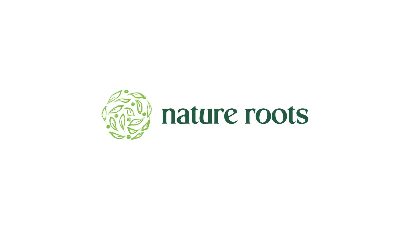
A natural-products brand has to signal “all-natural” in a category where every competitor reaches for the same leaf. Nature Roots needed a mark that felt organic and established at the same time.
The problem
Natural-products branding has two failure modes and most brands pick one. Either a literal leaf is attached to a neutral logotype — a badge that says the category rather than the brand — or the whole mark is drawn so softly that it reads as homemade, which undercuts any claim to consistency or quality.
Nature Roots needed to be organic and established at once: alive enough to mean “natural”, stable enough to look like it had been on a shelf for years.
My role
Wordmark and brand mark design, delivered in the 2025 brand book with the construction rationale for each decision. This study is scoped to that mark work — the document does not extend to a full identity system, and it is not presented as one.
The solution
Three decisions carry the mark, and each answers one half of the tension:
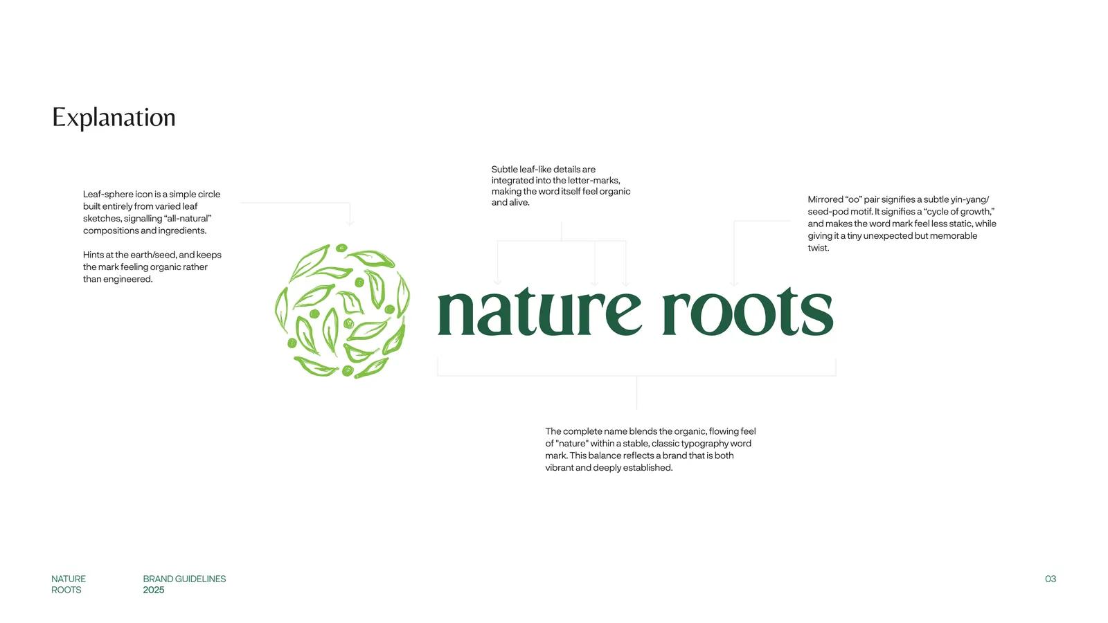
- A sphere built only from leaves. The icon is a circle composed entirely of varied leaf sketches rather than a single specimen. It signals all-natural composition, hints at the earth and the seed, and stays organic instead of engineered — no two leaves repeat, so the mark never resolves into a logo cliché.
- Letterforms that are alive. Subtle leaf-like details are cut into the letters themselves, so the naturalness sits inside the word rather than beside it. The wordmark can stand alone and still carry the category.
- A mirrored “oo”. The paired o’s are mirrored into a seed-pod motif — the book reads it as a cycle of growth. Practically, it puts one small irregularity in an otherwise classical wordmark, which is the detail people notice second and remember first.

Impact
The lockup lands where it needed to: the organic, flowing feel of “nature” inside a stable, classical wordmark — vibrant and long-established at once, with no tagline required to explain it.
The leaf-sphere also works standalone, which gives the brand an avatar and a packaging stamp it did not have to design separately. Scope note: this was mark work, delivered in the 2025 brand book; no full identity system, application set or commercial outcome is claimed.