AWIS 2026
A first-edition continental symposium has no equity to trade on. AWIS needed an identity that reads as credible to research institutions, policymakers, funders and farmers at once — and that keeps working between events, not only for three days in October.

The problem
The Africa-wide AgriGHG Symposium convenes farmers, researchers, innovators, policymakers and development partners around low-emission agriculture. As a first edition it had no visual equity, and its audiences pull in opposite directions: institutions want evidence and restraint, funders want ambition, and the agricultural community wants something that does not feel imported.
The two default looks were both dead ends — donor-speak in earth tones, or generic conference branding that expires the day the event ends. The identity also had to carry a year-round catalyst network and an award, so it needed to be a system rather than an event logo.
My role
Brand and identity system: the wordmark and its construction rules, the colour architecture and usage ratios, the type system, the pattern language, applications across stationery, digital and merchandise, the physical award, and the verbal identity. Delivered as Brand & Identity v1.0, Volume 01, in May 2026 — ahead of the October symposium.
The solution
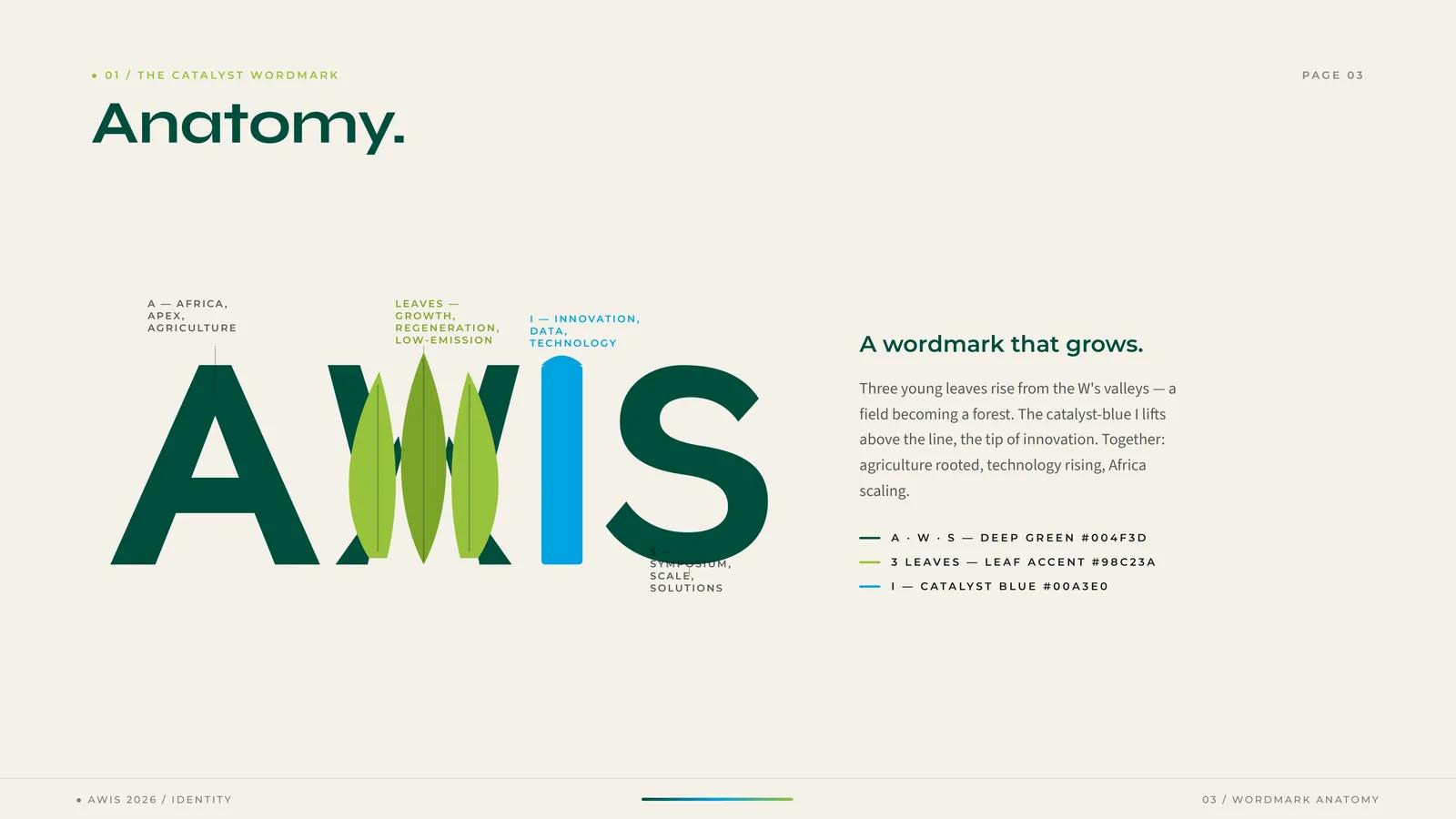
The wordmark carries the argument. Three young leaves rise from the valleys of the W — a field becoming a forest — and the I lifts above the line in catalyst blue as the tip of innovation. Each letter is assigned meaning in the guidelines: A for Africa, apex and agriculture; the leaves for growth, regeneration and low emissions; I for innovation, data and technology; S for symposium, scale and solutions.
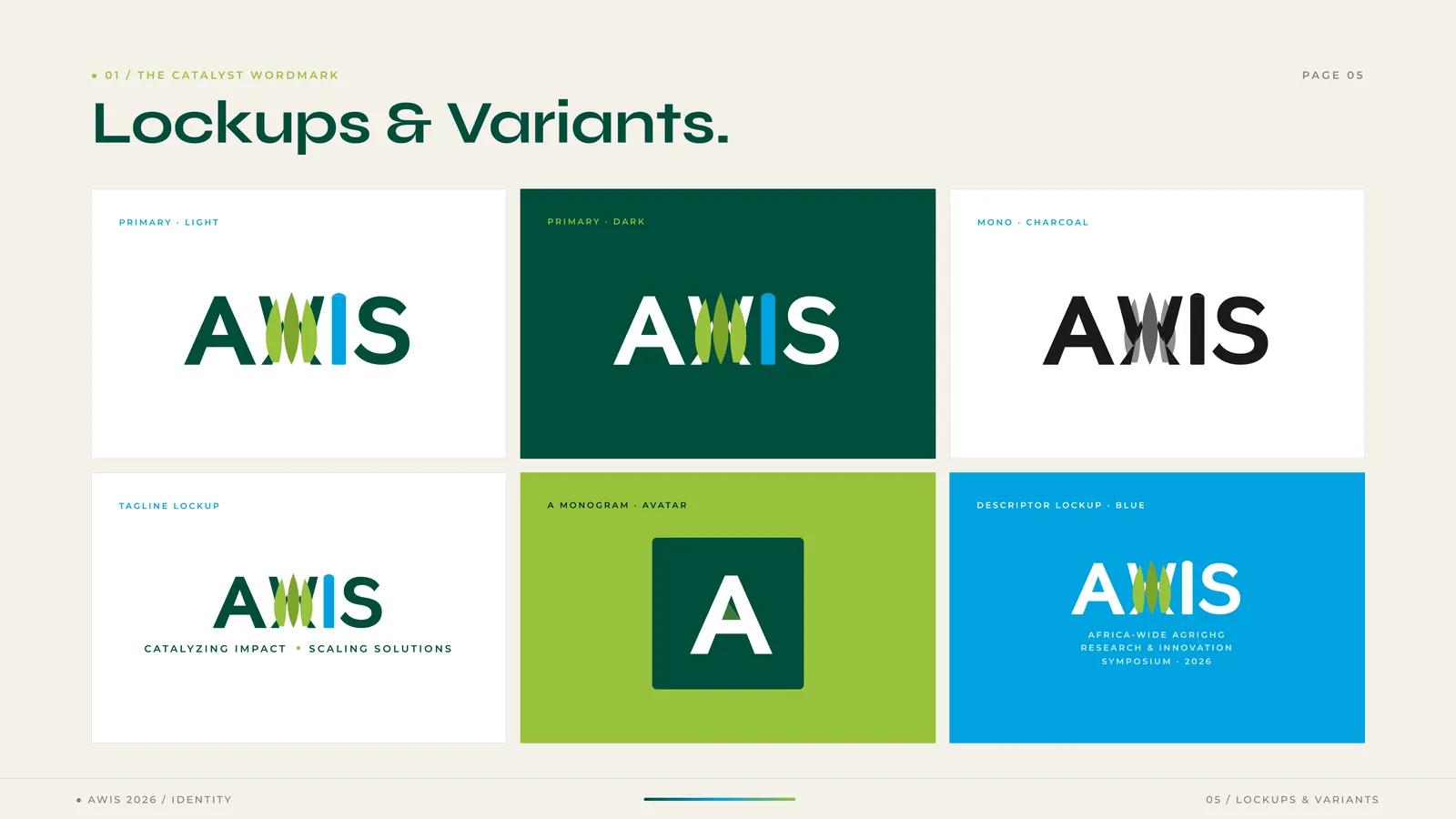
A mark that detailed has to be told how to fail. The system specifies a standard lockup at or above 80px on screen and 25mm in print, a simplified variant below 60px that drops the side leaves and keeps the centre one, and a standalone A monogram for avatars and favicons at 32px and under — so the identity degrades by decision rather than by accident.
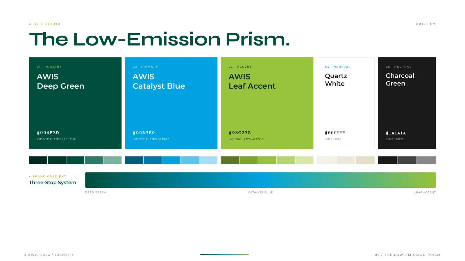
Colour is organised as the Low-Emission Prism — Deep Green #004F3D and Catalyst Blue #00A3E0 as primaries, Leaf Accent #98C23A as the spark, Quartz White and Charcoal as neutrals — and, crucially, as a ratio: 60% foundation, 25% voice, 10% spark, 5% fine print. The ratio is what stops the accent from becoming the brand the first time someone builds a slide deck.
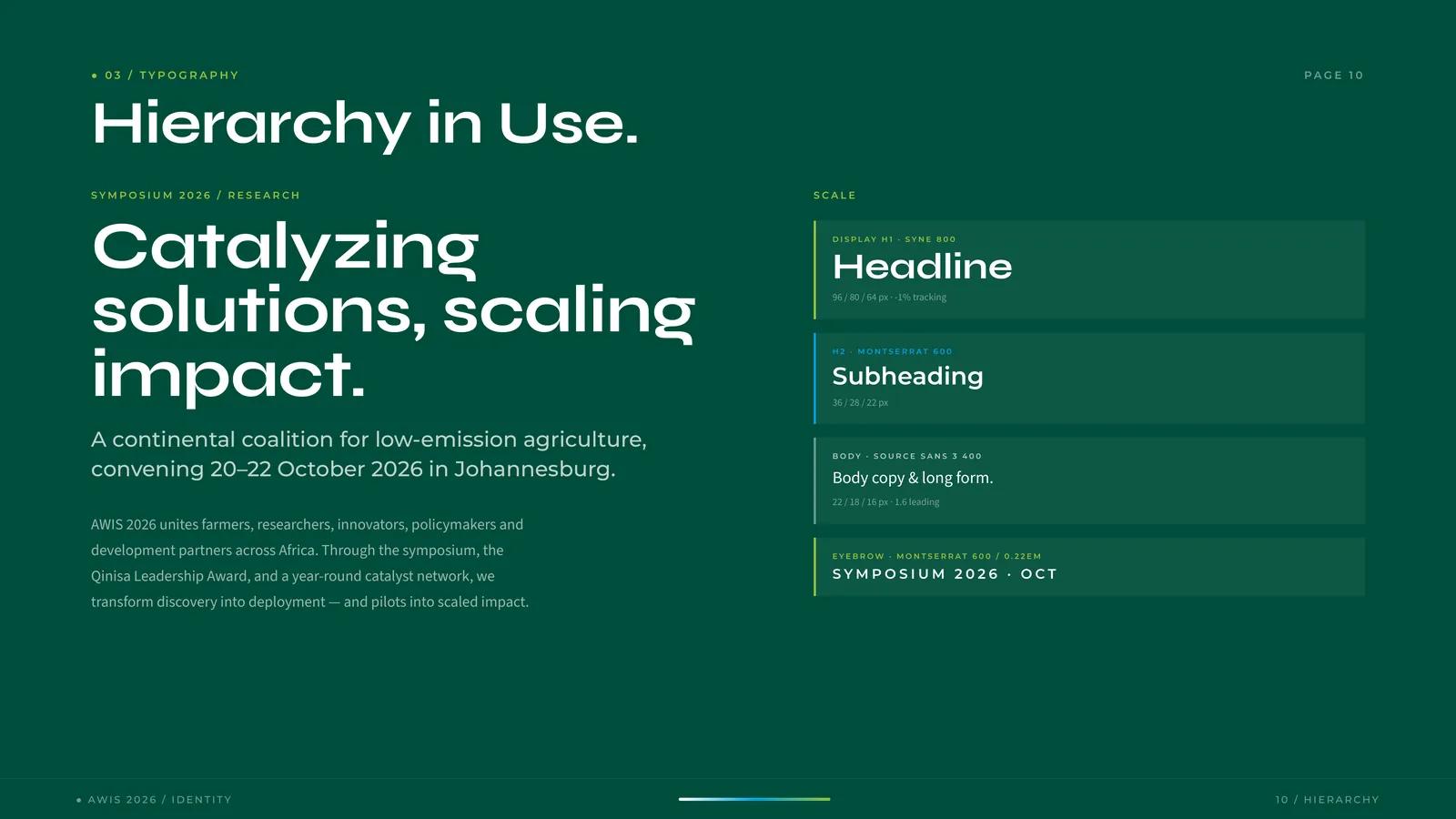
Type pairs Syne ExtraBold for display with Montserrat SemiBold sub-heads and Source Sans 3 for long-form body — a display face with enough character to hold a conference stage, over two faces that stay legible in a programme, a letter and a research abstract.
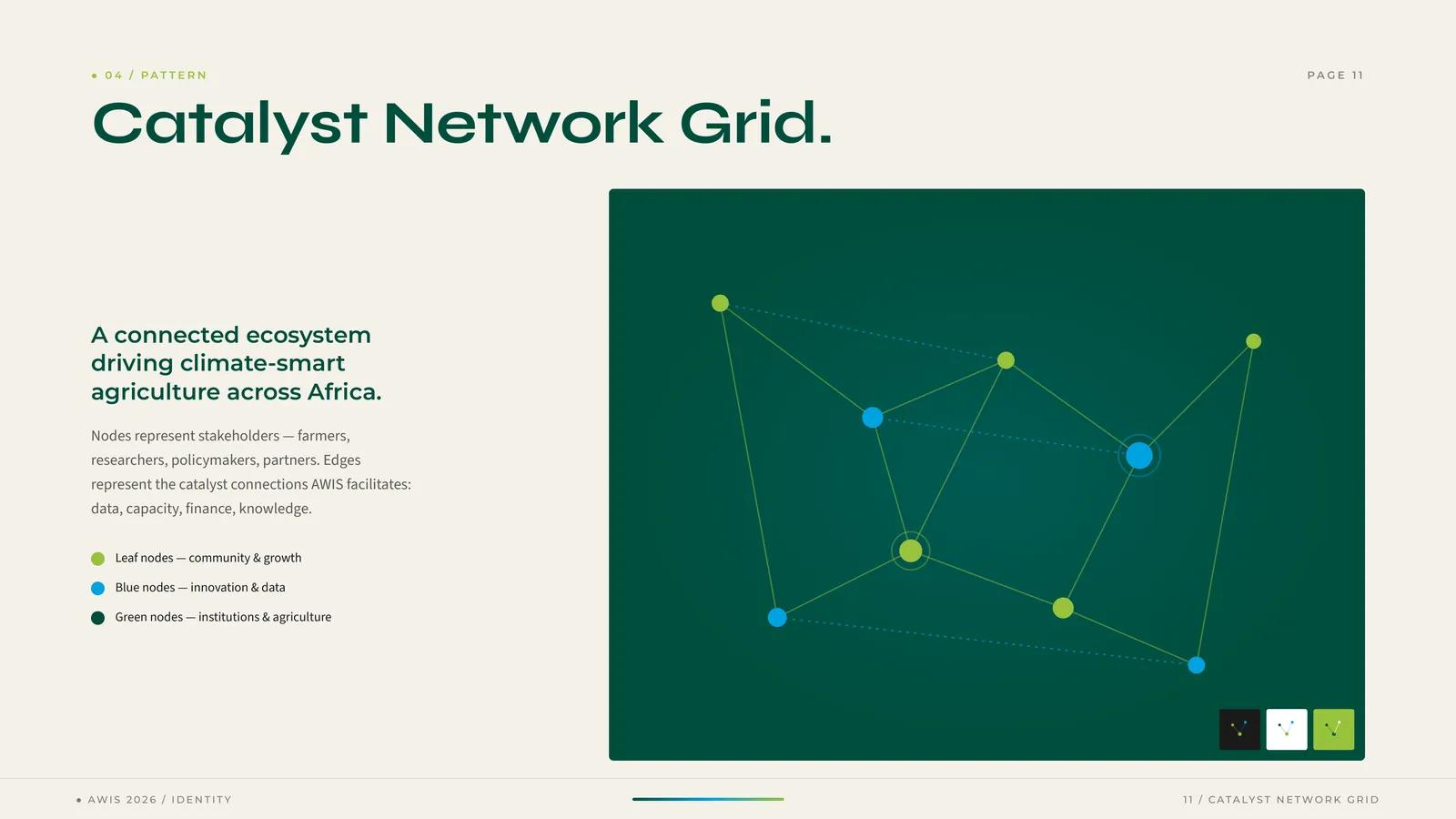
The Catalyst Network Grid turns the organisation’s actual argument into a pattern: nodes are stakeholders — farmers, researchers, policymakers, partners — and edges are the connections AWIS facilitates, whether data, capacity, finance or knowledge. Node colour follows the palette’s logic, so the pattern is legible rather than decorative.
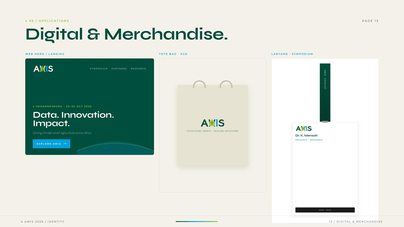
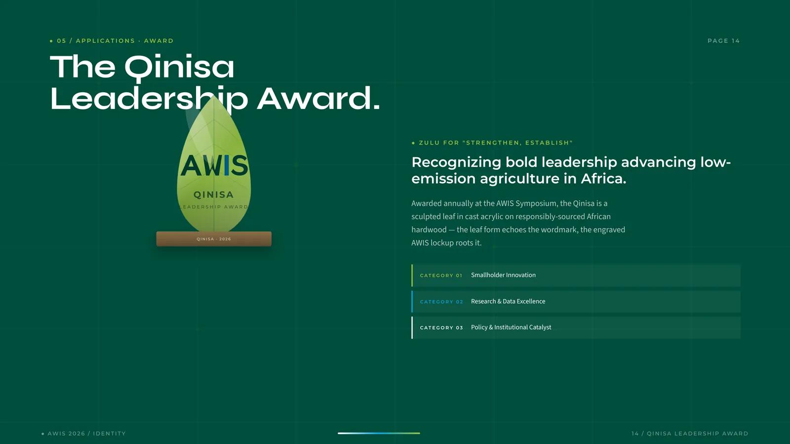
The identity also had to become an object. The Qinisa Leadership Award — Zulu for “strengthen, establish” — is a sculpted leaf in cast acrylic on responsibly-sourced African hardwood, echoing the wordmark’s leaf forms with the engraved lockup rooting it, across three categories: smallholder innovation, research and data excellence, and policy and institutional catalyst.
The verbal identity is written as a boundary rather than an aspiration:
- We are — confident, catalytic, grounded in evidence, generous with credit, specific about outcomes.
- We are not — vague, performative, self-congratulatory, donor-speak, buzzword-led.
Impact
Volume 01 was delivered in May 2026, five months ahead of the symposium, covering the wordmark and its degradation rules, the colour ratios, the type system, the pattern, stationery, digital and merchandise applications, the award object and the voice. A secretariat can brief a printer, a web build and a fabricator from one document.
The symposium runs 20–22 October 2026 in Johannesburg. This case study is scoped to the identity system as delivered; no attendance, partnership, funding or awareness outcome is claimed.