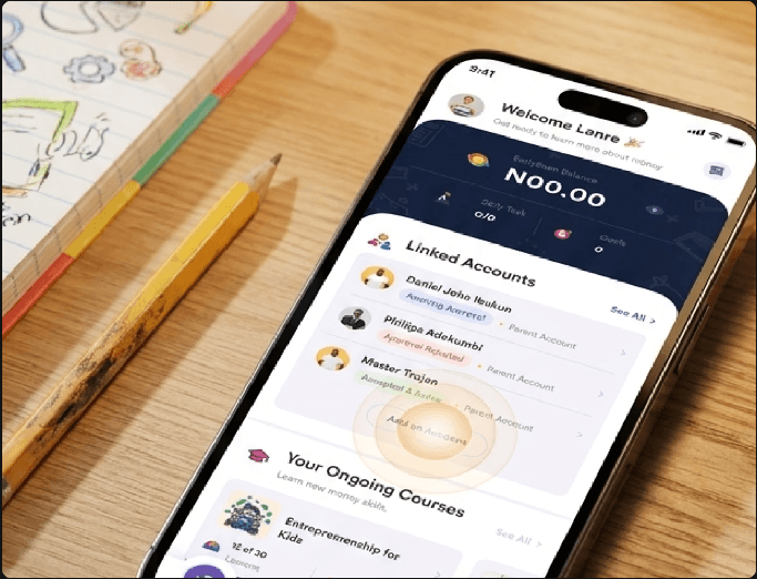
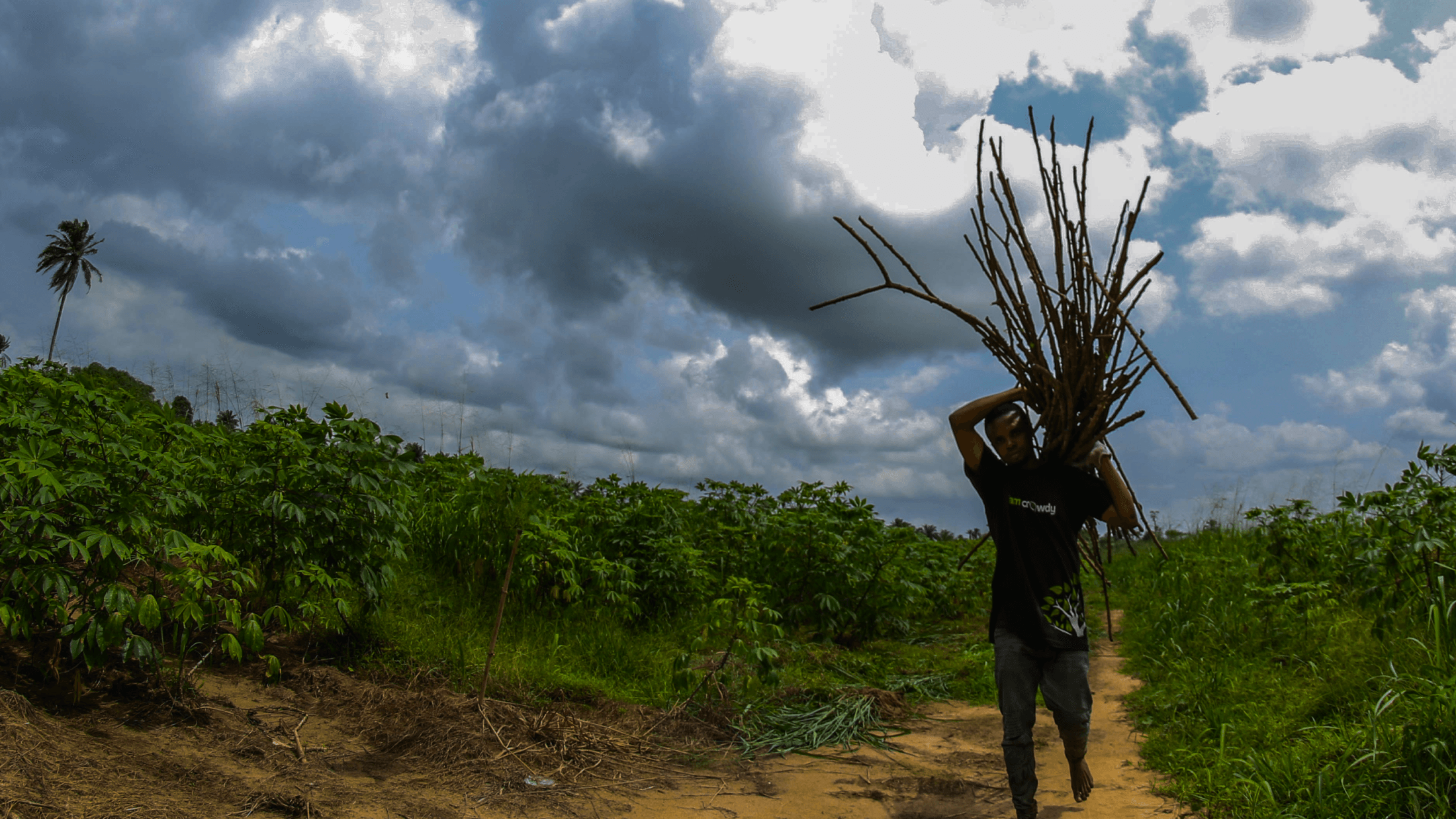
Kolibri Coach Dashboard & Test Assessment System
Coach and teacher dashboard for Kolibri, the offline-first learning platform deployed in low-connectivity classrooms globally — enabling educators to track learner progress without internet access.
The Challenge
How do you design data visualization for educators who may have limited tech literacy, in offline-first environments, across wildly different educational contexts? Kolibri serves learners from rural India to refugee camps to remote Pacific islands — each with unique needs and constraints.
My Role
As Senior Product Designer, I led the design end-to-end:
- Research and usability testing with educators across multiple countries
- Wireframes and interaction design for complex data visualizations
- High-fidelity prototyping and design system compliance
- Developer handoff and design QA
Research & Discovery
Through usability testing with educators across multiple countries, I identified critical pain points:
- Import discoverability failures — Most users couldn't find where to start importing content
- Content preview gaps — Educators didn't have confidence about what they were downloading
- Mastery tracking confusion — Unclear how to identify struggling learners at a glance
Key Design Decisions
Learner-Centric Mastery Bars
Red/yellow/green color system for low/partial/strong mastery. At a glance, educators can identify which learners need intervention.
Test Readiness Signals
Added confirmation modals and readiness indicators so educators feel confident before assigning tests to learners. Critical for offline-first environments where mistakes are costly.
Interactive Learning Objective Detail Modals
Filter chips and progressive disclosure patterns let educators drill down into specific learning objectives without overwhelming the interface.
Sparkline Visualizations
Compact trend visualizations for tracking learner progress over time. Designed to work even at small sizes and low bandwidth.
Design System Compliance
Every component built using exact Kolibri design tokens. Typography: Noto Sans. Primary: #4368F5. Border radius: 4px — consistent with the platform's accessibility-first system.
Impact
Reduced time to identify struggling learners from minutes to seconds through at-a-glance mastery visualization. Test readiness signals and confirmation flows minimized costly mistakes in offline-first environments.
What I'd Change
Given more development time, I'd add more granular filtering options for large classroom sizes (100+ learners), and explore mobile-optimized views for educators accessing the dashboard from phones in low-connectivity areas.