DESIGN / PRODUCT / UX — August 2017
Farmcrowdy Product Design
Overview
Farmcrowdy is Nigeria’s leading agtech platform focused on connecting small-scale farmers with retail investors (called sponsors) to finance farm processes, boost food production, impact farmers positively while also educating users on farming practices and providing a healthy return for sponsors.

Problem
There are over 66 million small-scale farmers involved in the agriculture value chain in Nigeria, many of them operate only at a small scale do not have the funds and skills to maximize revenue from their farming
businesses, even though most of these farmers have extra farmlands but do not have the finances to expand their farm operations.
They are mostly unbanked and find it difficult to securing access to loans that they need to expand their farming activities. Even when they do get loans, many of them don’t know the right market to sell their farm
produce to earn a decent income from farming as a business.
On the flip side are a large majority of middle-class Nigerians who have the resources and interest in agriculture, but unfortunately, they do not have the time, experience and skill to get involved in the sector.
Design
Create a solution that connects small-scale farmers with these sponsors.
Sponsors who are excited about impacting the lives of the farmers, want to play a part in the agricultural value chain and are also looking to earn decent returns at sale when the planting to harvest cycle is completed.
Roles and Responsibilities
Product Design, Visual Design and Brand Strategy, User Experience Design, User Research and Product Development.
Users and Audience
The Farmcrowdy platform was designed for the following categories of users;
- Retail and big-ticket investors (farm sponsors)
- Farm enthusiasts
- Farmers
Scope and Constraints
The platform needed to allow users to do the following:
- Create an account
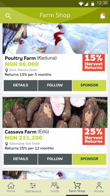
- Browse through a variety of farm offers
- View Farm offer details including farm location, investment value (farm unit price) and tenure
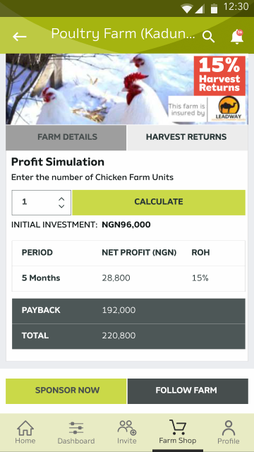
- Calculate expected returns from investment in each farm offer
- Add multiple farm units to a cart
- Adjust content on a cart and complete payment
- Follow Farm offers
- Track activities on all farms that are paid for or followed with push notifications and updates on a web platform and mobile app
Process

Discovery
This was a huge challenge because I was designing with no precedent. I could not find any other web or mobile app that allowed users to invest virtually in agriculture and farming in Nigeria or Africa.
User Research
We carried out several interviews with potential users - farmers, retail investors, institutional investors, and various stakeholders in different points of the agricultural value chain, to understand their critical pain
points and refine our feature set to solve them.
Outcomes
Here are some screens from the final product.
Web app screens.

Farmcrowdy Landing hero section

Users can visit the Farmshop either from the navbar or via the 'Start your Farm' section on the Landing Page.

Users can browse through a variety of farm offers.

Users can view farm offer details including farm location, investment value (farm unit price) and tenure. They can also calculate expected returns from investment in each farm offer.
Mobile app screens.

Login screen

Home

Dashboard

Farm Shop

Farm Offer Details

Farm Profit Calculator

Farm Updates
I created high-fidelity prototypes of the original UX using Figma.
Web app prototype
Mobile app prototypeLearnings
What have I learned?
Designing an effective UX for the Farmcrowdy platform and mobile app was the biggest challenge I had ever faced in my design career back in 2017. I learnt the importance of iteration in design, especially the need to open yourself to continuous iteration, away from your initial assumptions and closer to understand the users and their needs; with a realization that these needs still will evolve and change over time, and the product needs to evolve along with them.
Asking questions from every possible category of user, not trying to re-invent the wheel when it came to features that already existed in other products that I could easily adapt and most importantly, understanding that sometimes, it was okay to just Google something I didn't understand and learn were other key learnings I took from this project.
It’s worthy to note that even though the platform has undergone many changes since then and now has a completely different business focus, the UX I worked on resulted in Farmcrowdy generating over $25 million in sponsorship revenue, $2.5 million in equity investments, and the business spawning an entire industry of copycat agriculture investment firms who are still using the underlying UX I developed years ago.