

DESIGN / PRODUCT / UX — September 2020
Farmcrowdy Foods Product Design
Overview
Farmcrowdy Foods is an online marketplace that allows users, both individuals and businesses, to conveniently purchase highly affordable fresh organic food, meat products and groceries direct from the comfort of their mobile devices.

Problem
Farmcrowdy Foods was developed primarily to address existing problems in the Nigerian agriculture and food supply value chain. In essence, find a way to promptly deliver organic groceries to shoppers at an affordable cost?
A vast majority of city-dwellers rely on purchasing their food products directly from local wet markets like Mile-12 and Oko-Oba abattoir. These markets largely do not adhere to standard hygienic practices and safety precautions thus increasing the risk of contaminated food, unfit for human consumption, being sold to the public.
Also to be considered is the lack of a formal distribution framework which leads to food being transported via informal means and contributes to food waste and increases the risk of spreading deadly diseases including
Cholera, Salmonella and COVID-19 amongst others.
Design
Build a mobile app where users can effortlessly order from a variety of fresh organic groceries at affordable price points.
Roles and Responsibilities
Product Design, Visual Design and Brand Strategy, User Experience Design, User Research and Product Development, defining revenue model and messaging look and tone.
Users and Audience
User research was conducted to determine the demographics of potential consumers — their needs, expectations, and motivations to shop online for fresh organic food and groceries.
User Goals
- Shop for fresh, organic and affordable organic groceries through the online store and get them promptly delivered to their homes at an affordable cost.
Scope and Constraints
The platform needed to allow users to do the following:
- Create an account or sign-in (for existing users)
- Browse through a selection of fresh food products and groceries, all organized by categories
- View product details, including quantity and pricing
- View product bundle packages
- Add preferred products to their basket
- Add delivery address
- Checkout items by entering card details to make payment
- Have order delivered to a preferred location
Process

Discovery
I started by researching similar products like Amazon’s Whole Foods and Instacart to compare the UX flows, feature sets and interaction choices.
User Research
We created a user research survey and conducted open-ended user interviews to understand user pain points and empathize with them. We focused on the meat selling section of the app by first visiting local abattoirs and talking to the meat sellers.
We then developed a survey targeted at our identified core user base including young professionals and housewives, asking questions about their decision-making process when buying meat. We utilized the findings of the primary and secondary research to better understand the personas of our potential target segment.
The data collected from this stage helped us define our brand strategy and decide which products were most advantageous to hold on our inventory as well as informing us about the buying preferences and habits of our target market.
Cross-section of survey responses:


Outcomes
Screens from the final design
Here are some screens from the final product.

The Splash Screen uses bright illustrations of food items that are available for purchase on the app.

One of three onboarding screens, ushering the user into the experience of using the app.

The app allows signup with phone numbers. The app then generates a verification code that is sent to the phone number which the user uses to sign up.

The user can use the verification code sent to them to verify their phone number and continue the signup process.
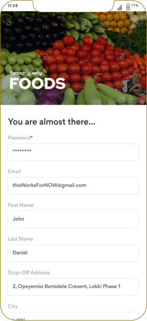
After verification of the users phone number the app then collect relevant details from the user that will allow for easy delivery/pick up of whatever items the user proceeds to purchase.

Users can then login with their emails or phone numbers and won't have to go through the sign up process subsequently.

The home screen is populated with distinct cards arranged by product categories.

The user can click through to any product category and access the product details including pricing and descriptions of the products within said category.

Users can click on an individual product to see more details including sizes and pricing and can add products to the basket and continue shopping.

The basket is the users cart. When the user completes shopping, they can come here to go over their purchase, edit as they choose and confirm drop-off location.

Here, users confirm whether they want to use the default drop-off inputed during onboarding flow or choose to add a new drop-off.
They can also confirm the delivery date and checkout — which opens an external payment link.

Users get a confirmation notification after payment is completed and can choose to continue shopping.

Users can view orders that have been completed and delivered.

Users can track orders that have been completed and are awaiting delivery.
A high-fidelity prototype was created using Figma
The Farmcrowdy Foods app landing page is available at https://foods.farmcrowdy.com
Live versions of the app can be downloaded on the Google Playstore and Apple Appstore.
Proposed Future Features
- Reorder functionality
- Recommended Sections
- Recipe Suggester
- Personal Shopping Assistant
Learnings
What have I learned?
Researching, designing and evaluating Farmcrowdy Foods was a great learning experience. In a limited time, we came up with a simple yet effective solution based on effective user research, testing and feedback as well as
deep collaboration with my teammates.
The user surveys we conducted helped us shutter a number of the initial assumptions we had made regarding user behaviour and helped us sharpen our focus on a core number of features that were designed and implemented in
the final version of the app.
Within 10 weeks of launching the product, we had onboarded 2,000 users and fulfilled over 600 unique orders with a total combined value of $34,000.


